Lab Theory
The Challenge
Rubicon Organics was launching Lab Theory as the most expensive cannabis concentrate on the market, but "premium" had become meaningless in the category. Every brand claimed craft quality. Every package featured gold foil and black backgrounds. Meanwhile, the audience Rubicon wanted to reach (legacy cannabis consumers fluent in drop culture and streetwear) saw through the conventional luxury signalling immediately.
The Discovery
The concentrates themselves were genuinely premium: precise extraction, clinical methodology, laboratory-grade quality control. But the experience of consuming them isn't clinical at all. How do you build a brand that honours both the process rigour and the psychedelic experience without defaulting to either sterile medical aesthetics or tired cannabis clichés?
The Insight
Lab Theory exists in the tension between laboratory precision and mind-altering experimentation. The brand needed to feel like both at once: scientific enough to justify the premium price, experiential enough to connect with culture-literate consumers who expect brands to have a point of view.
The Outcome
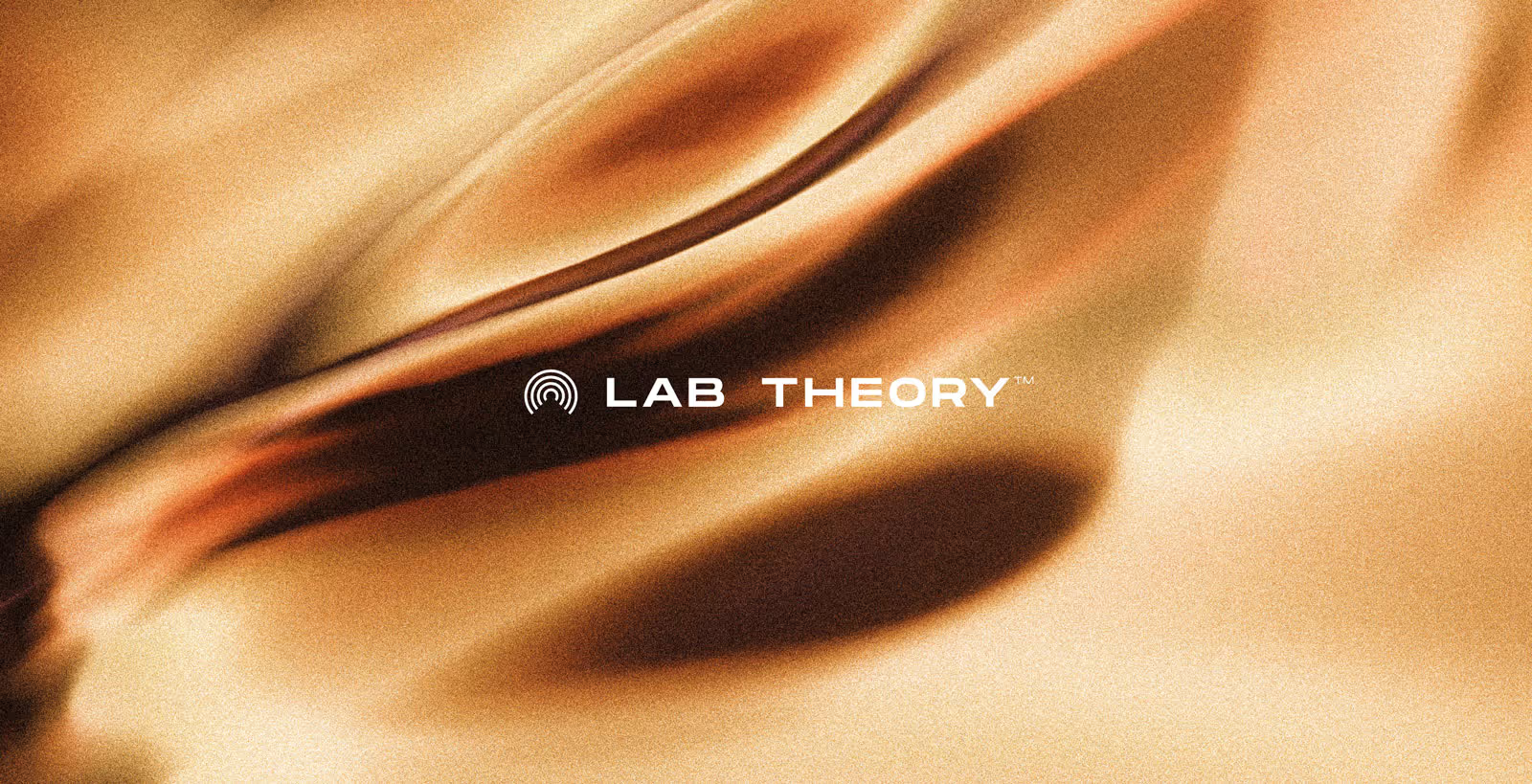
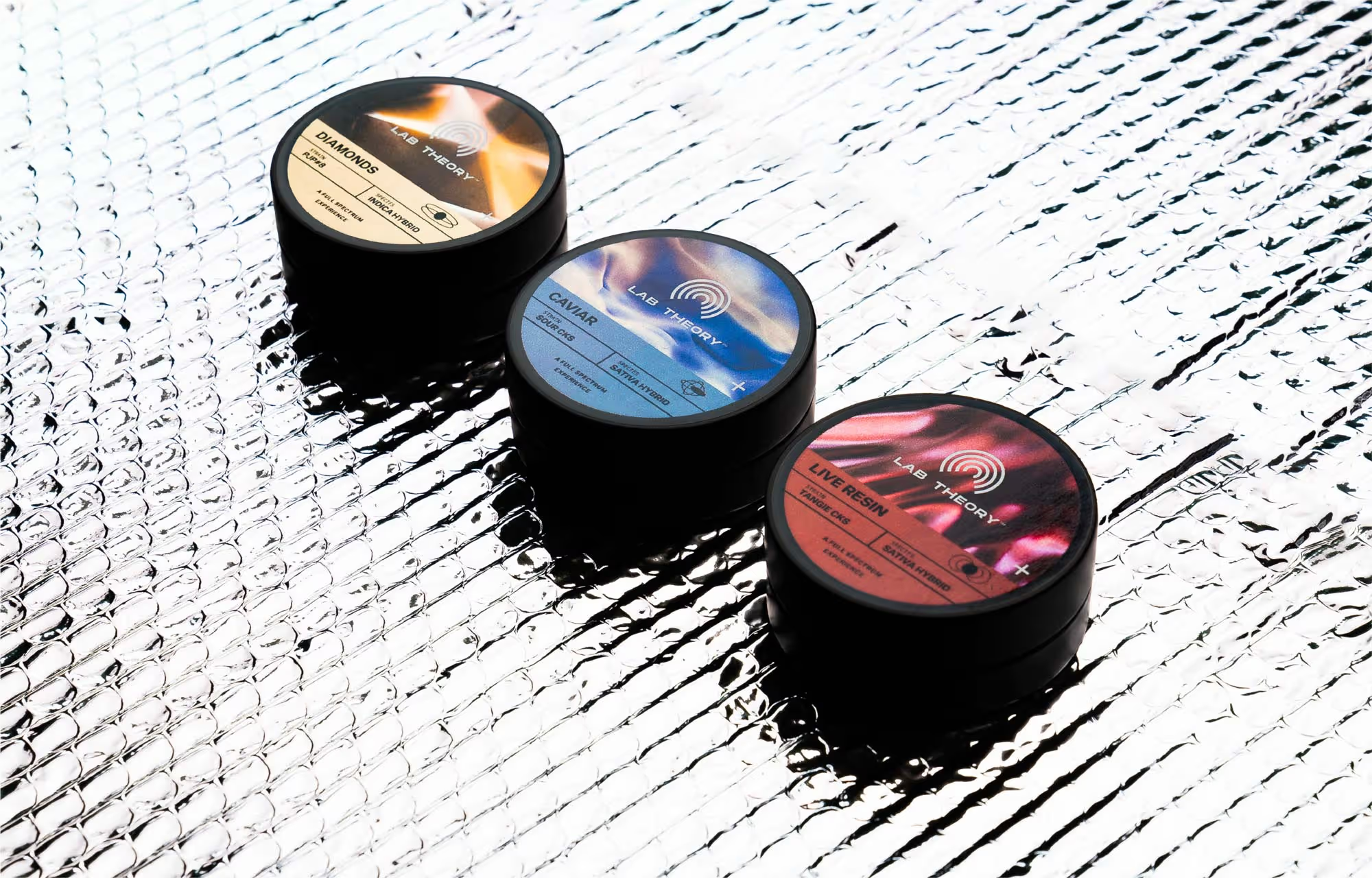
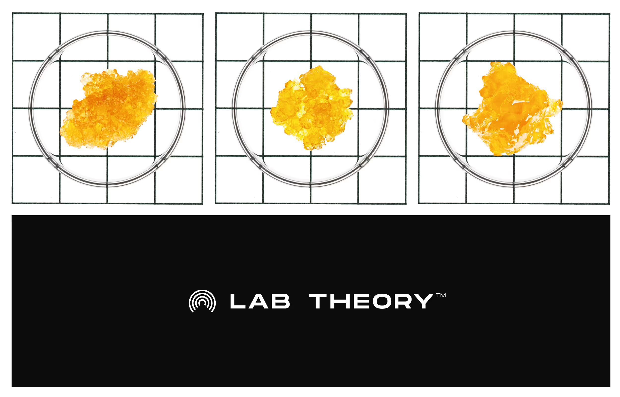
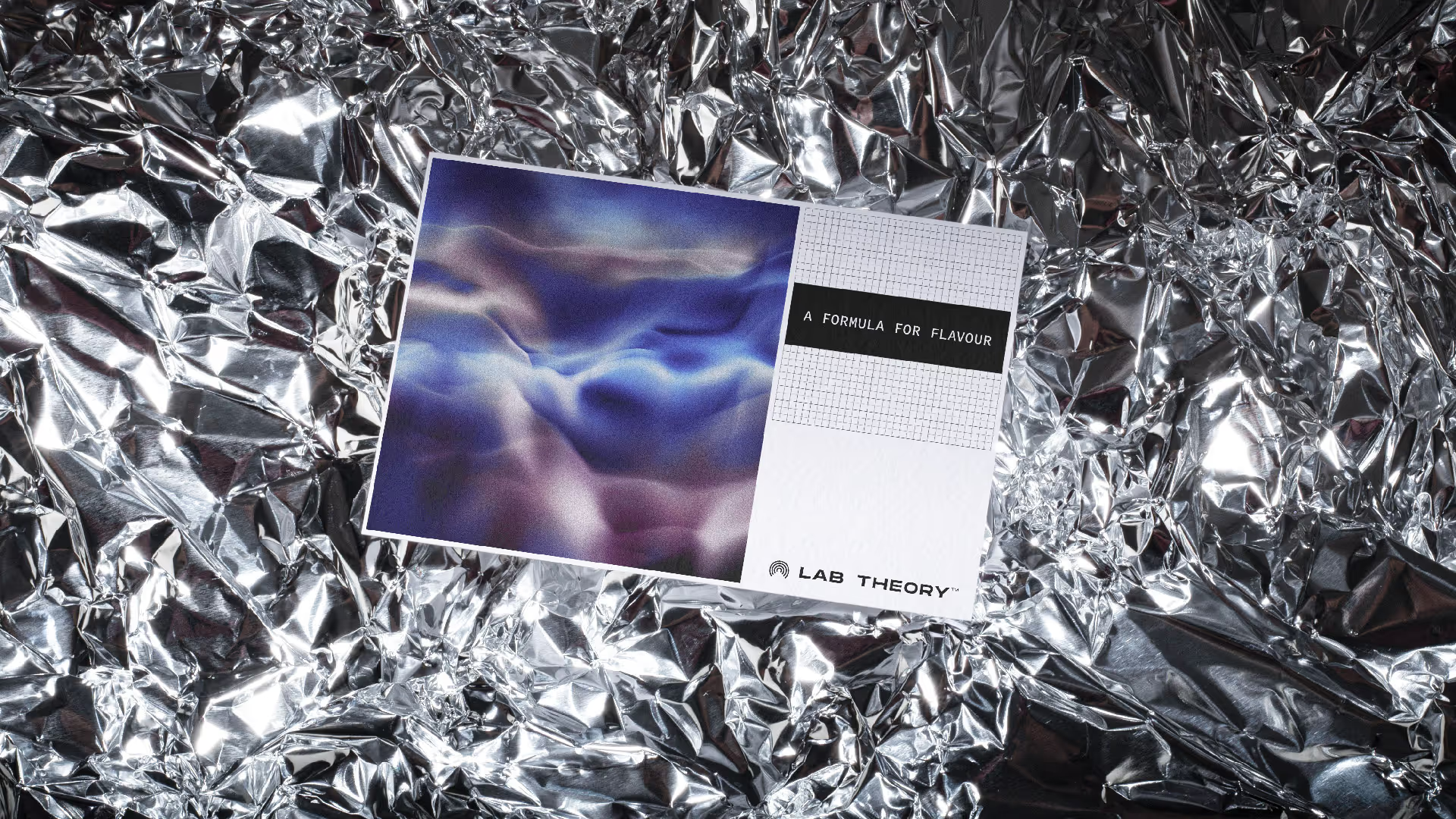
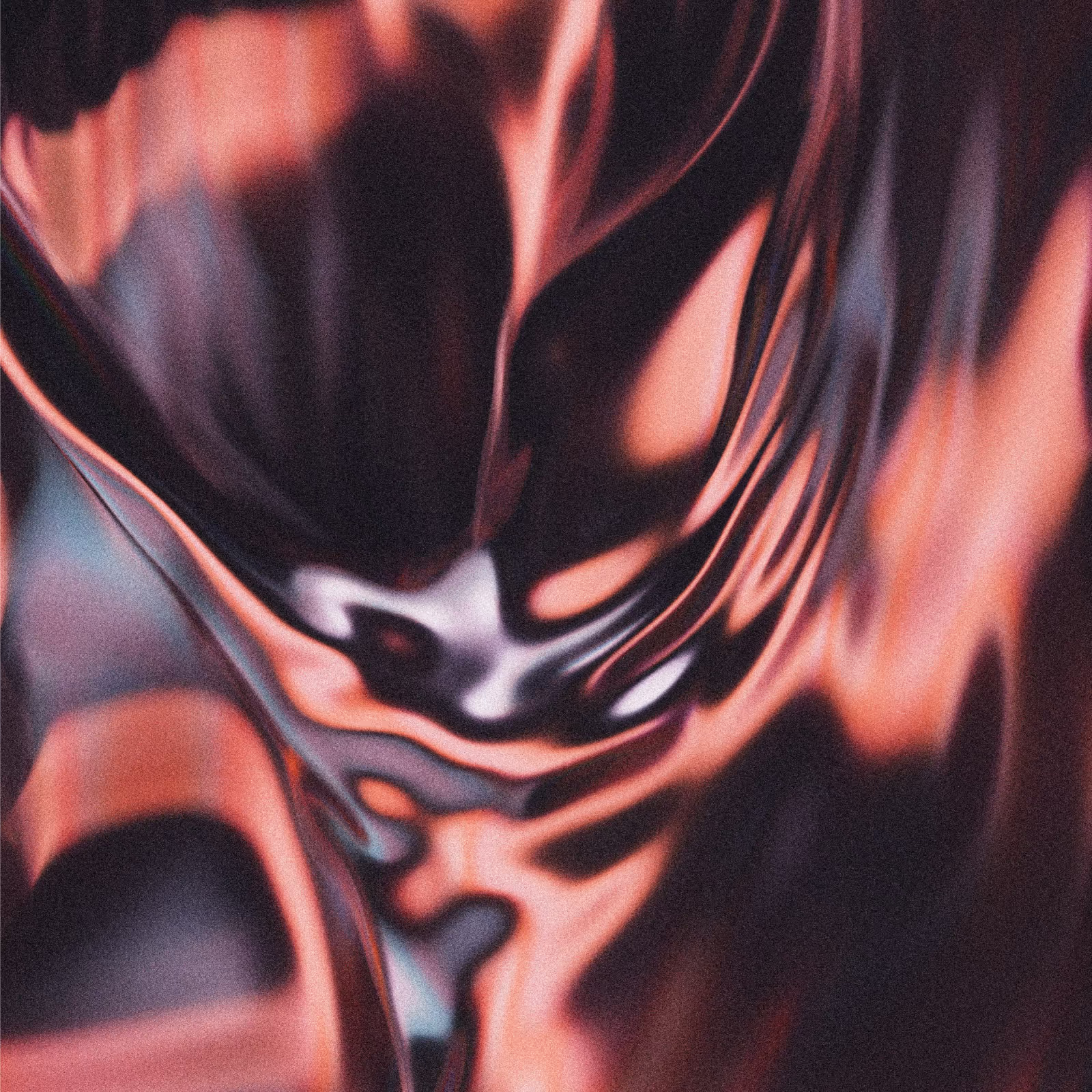
We leaned into the duality. Working with a 3D artist, we developed morphing gradient textures that evolve across products, suggesting both chemical reactions and altered perception. Extreme macro photography of the actual concentrates in petri dishes grounds the visual language in the real product while creating unexpectedly beautiful imagery. The result is a visual system that works on two levels: eye-catching enough to stand out on dispensary shelves, clinical enough to communicate process and quality at point of sale.
Credits
Creative Direction: Skeleton Crew Creative Studio 3D Artist: Valentin Heinrich