Pasitha
The Challenge
The essential oils market had calcified into two exhausted aesthetics: cold and medicinal, or earthy and boho. Pasitha's waterless nebulising diffusers were genuinely different technology. No candle smoke, no toxic plumes, no mould from water-based systems. But the product innovation risked being buried under category conventions. How do you break a brand out of visual clichés when the entire category looks the same?
The Discovery
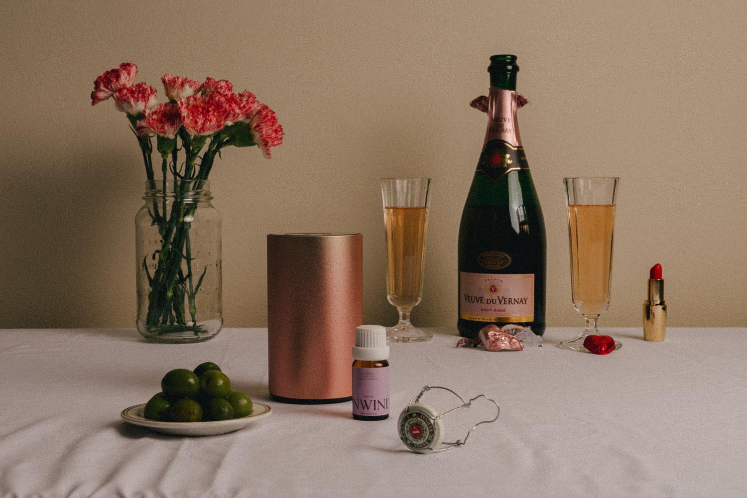
We saw what other brands missed: these aren't products you use and put away. They live in your space. On your shelf. On your nightstand. Essential oil diffusers are part of your home's aesthetic, yet the category treated them like bathroom cabinet products, covered in botanical imagery and wellness clichés, designed to be hidden.
The Insight
Pasitha needed to be positioned as a lifestyle brand, not a wellness brand. The visual language should reflect what makes the technology clean: pure essential oil diffused into fine mist. No additives. No compromise. Understated design that earns its place in considered interiors.
The Outcome
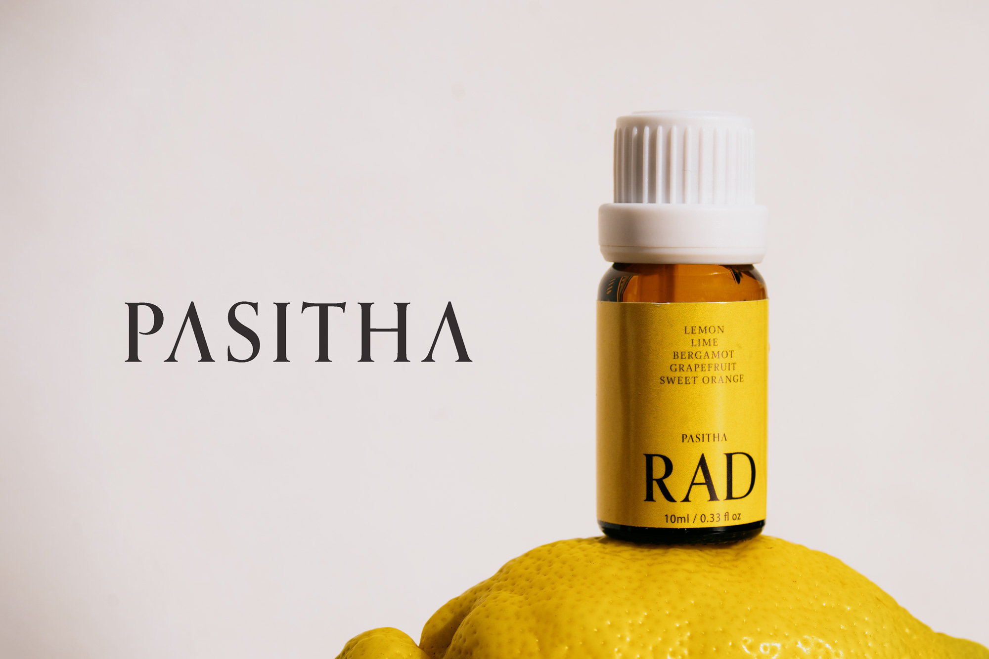
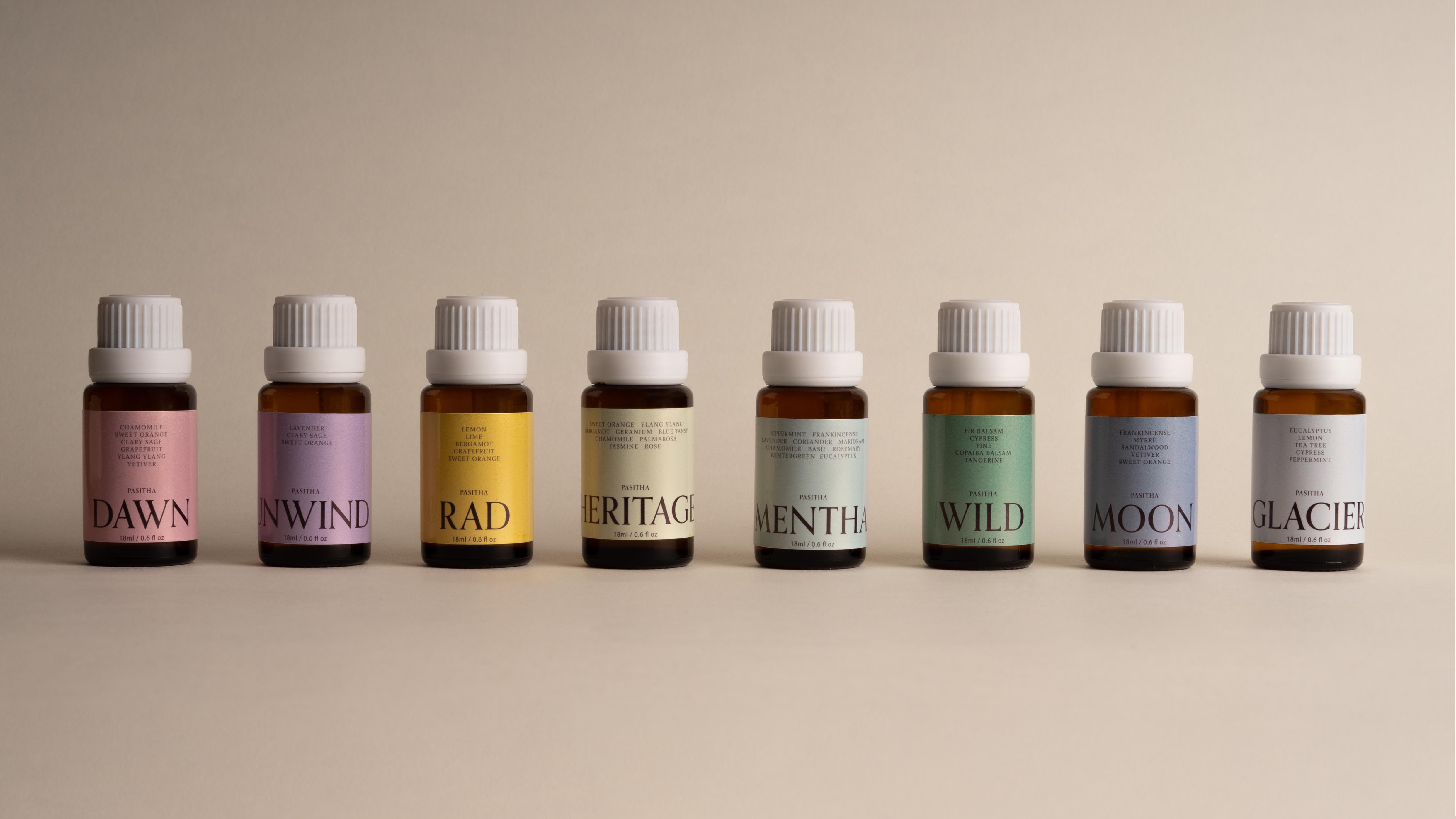
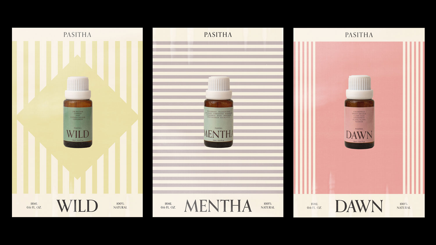
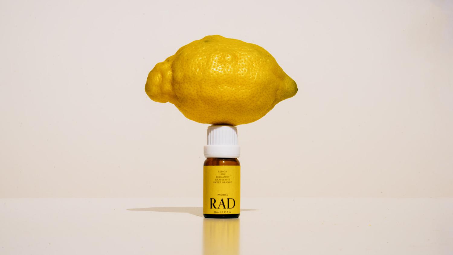
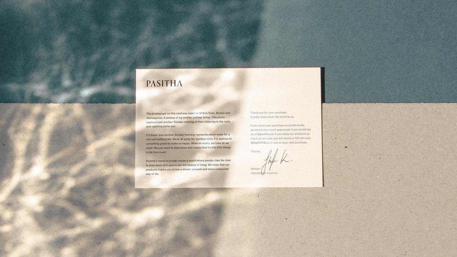
We stripped away the botanical wallpaper. Muted tones, refined typography, clean systems that let the product be the hero. The brand feels at home next to your design objects, not hidden in a cupboard with supplements.
Credits