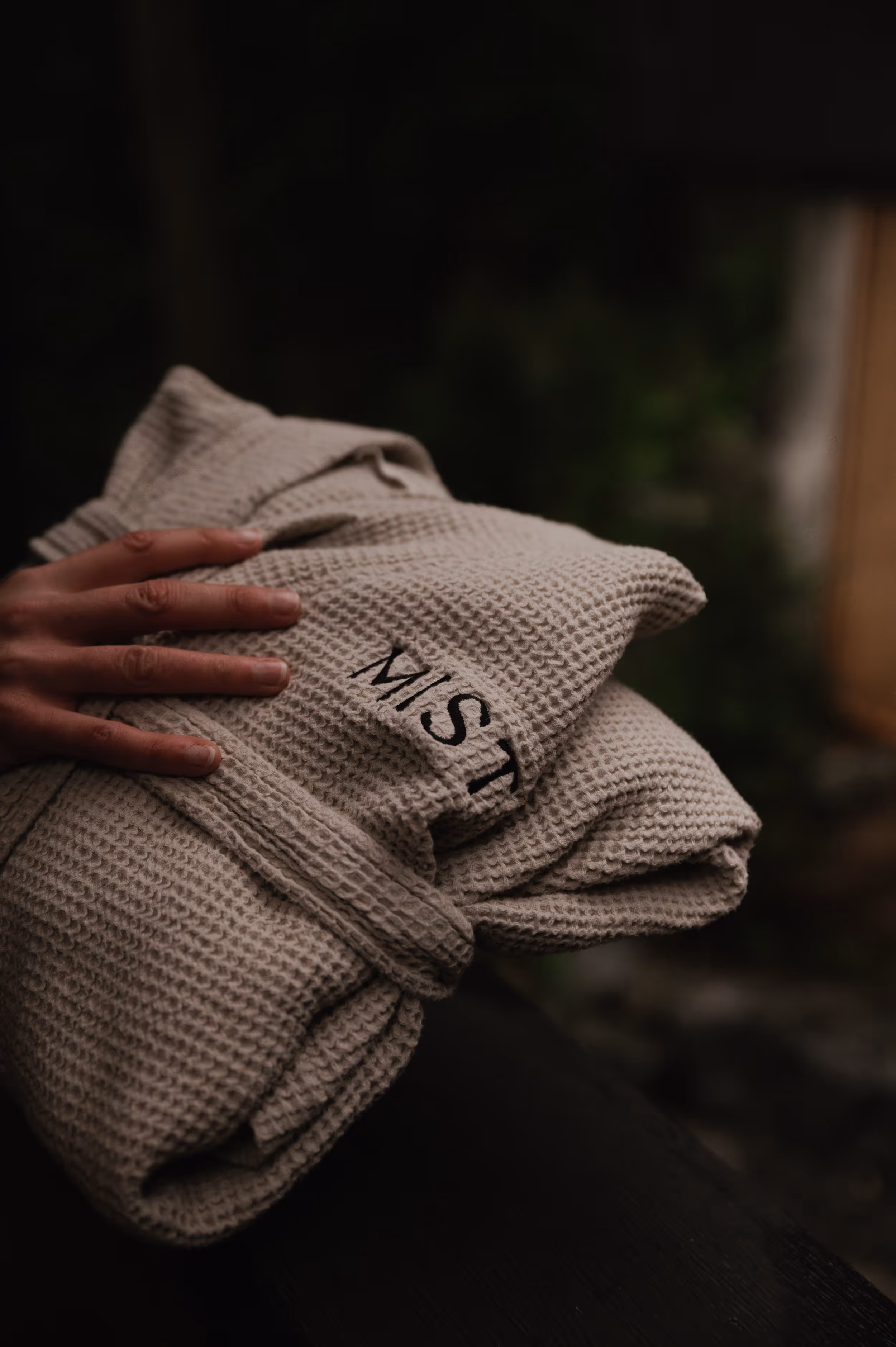

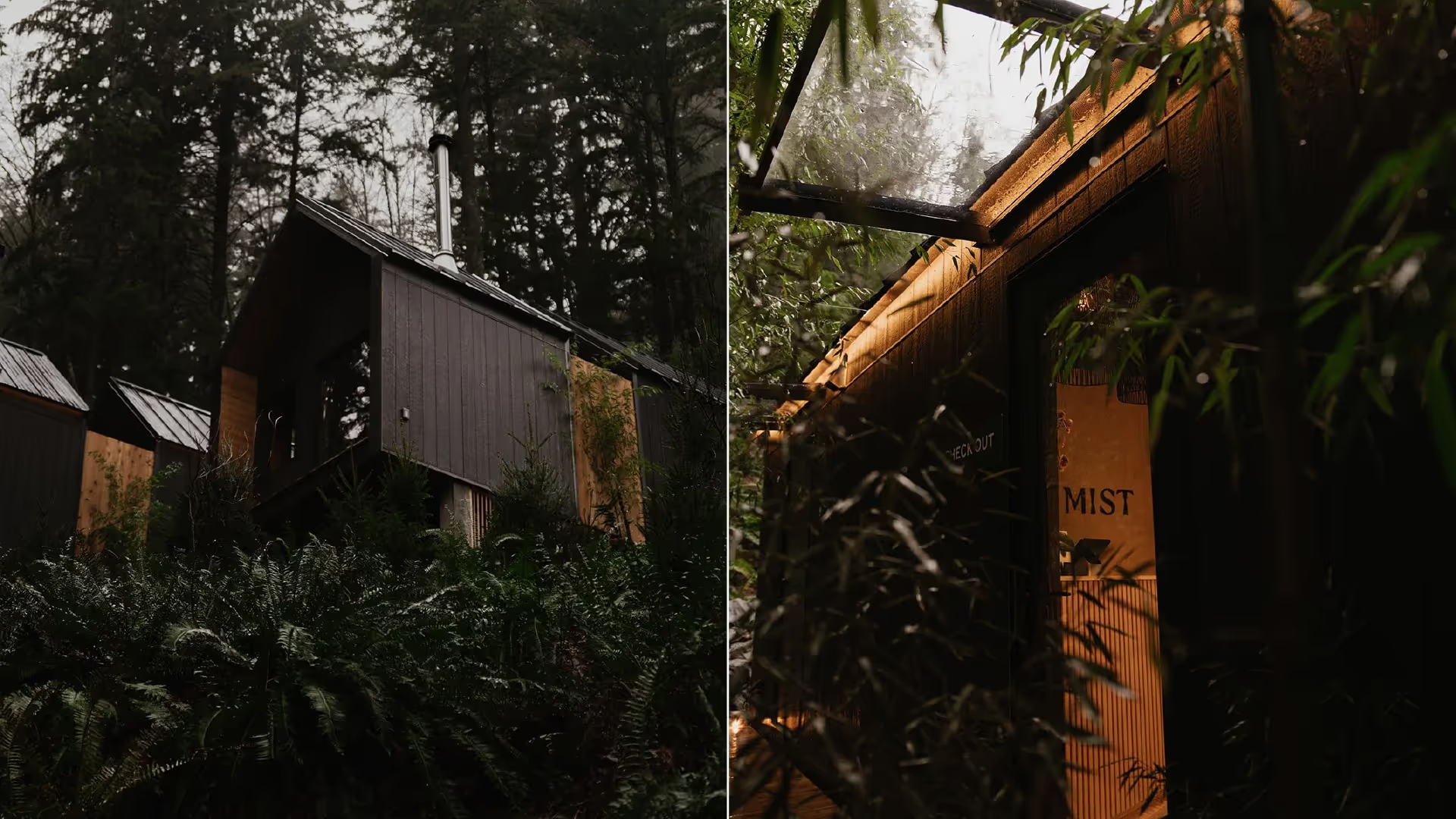
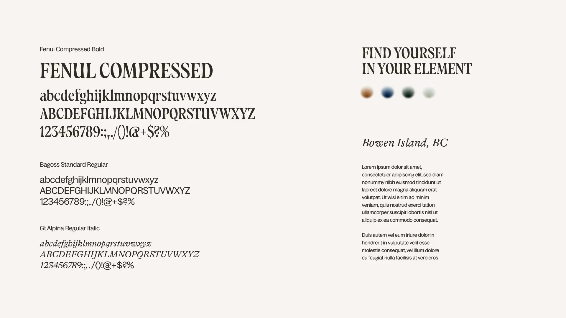
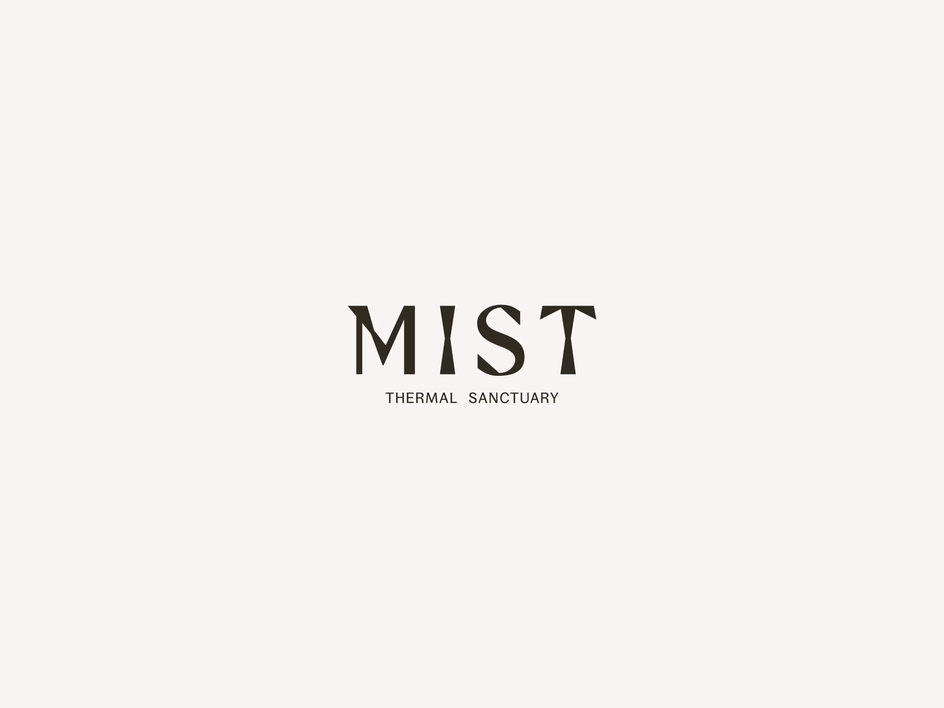


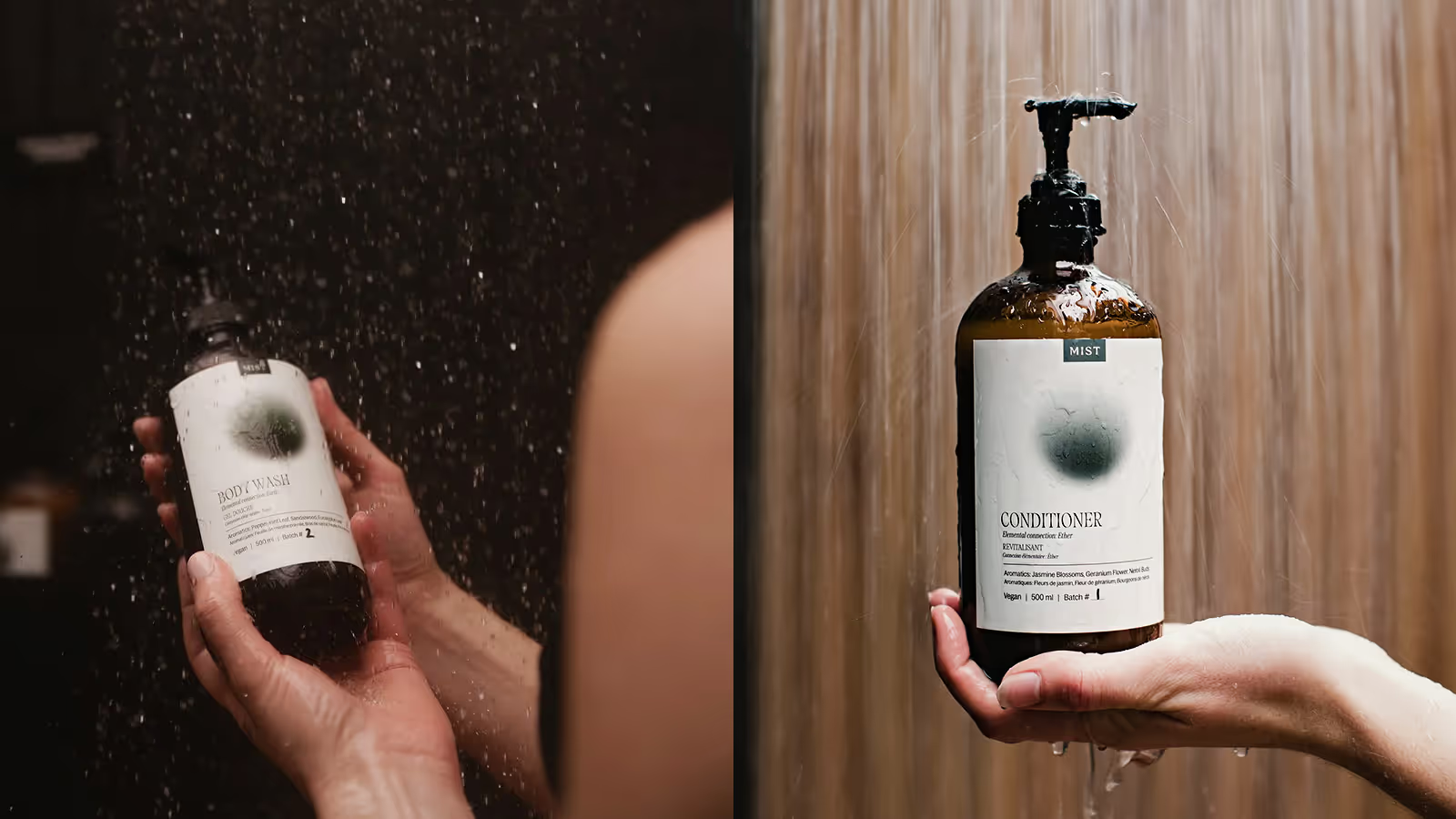

Mist Thermal Sanctuary
Brand Identity System
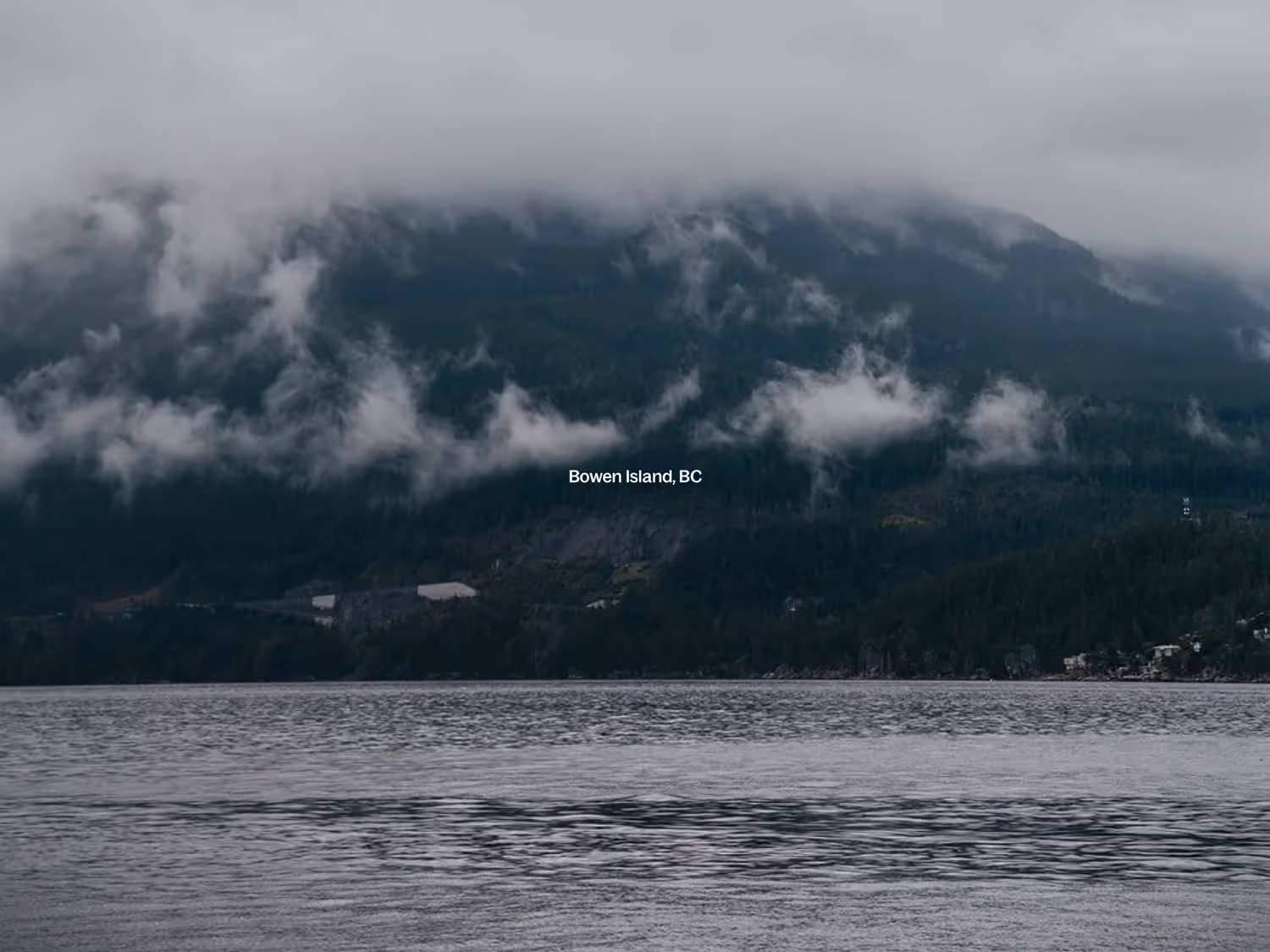
Bowen Island, Canada
The Challenge:
In a wellness landscape cluttered with performative self-care and Instagram-ready experiences, Mist's founders wanted to create something genuine and elemental - but struggled to articulate what made their vision distinct.
The Discovery:
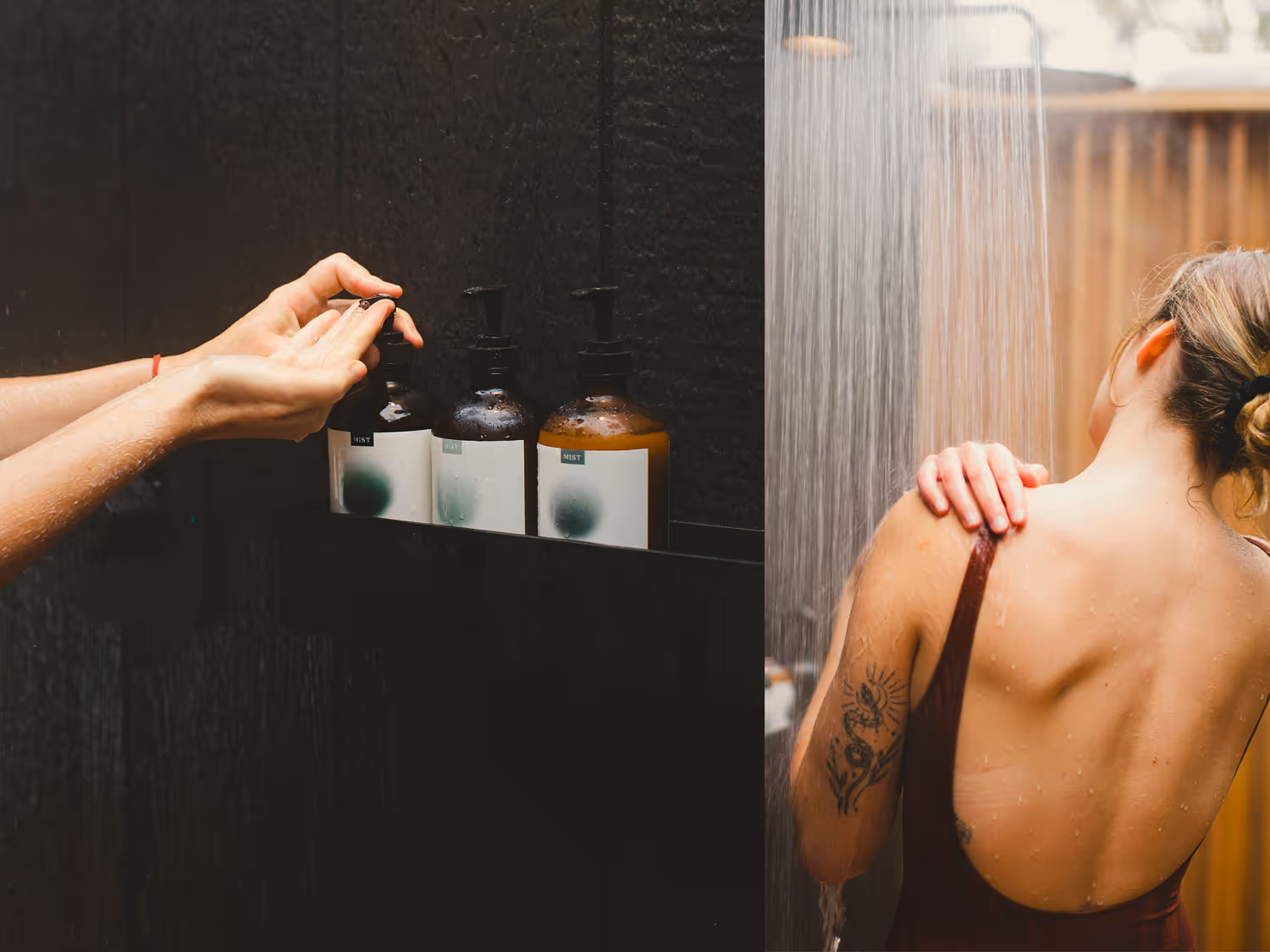
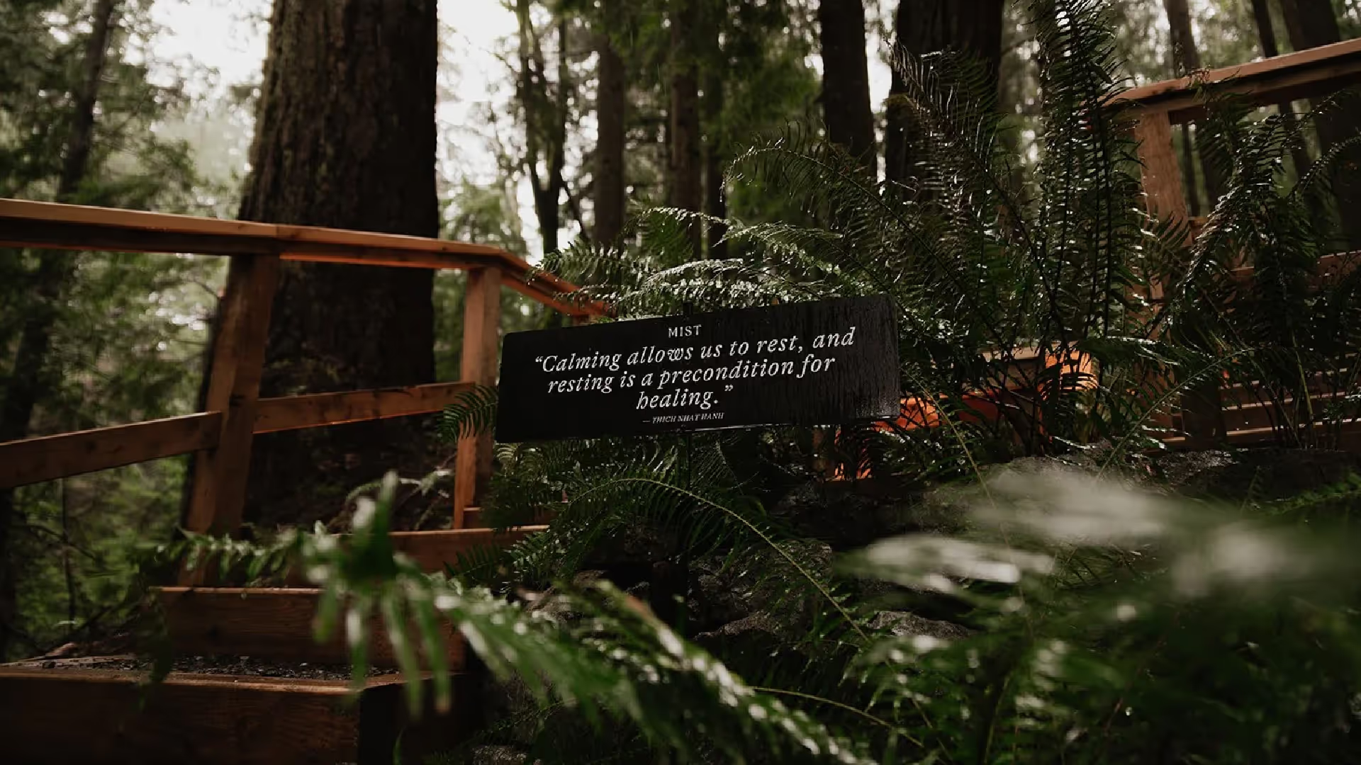
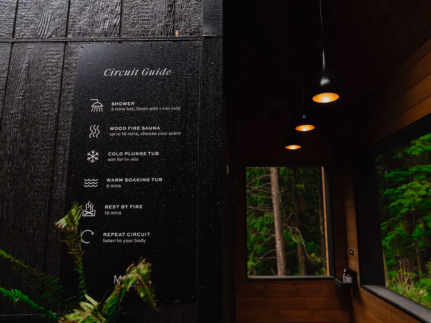
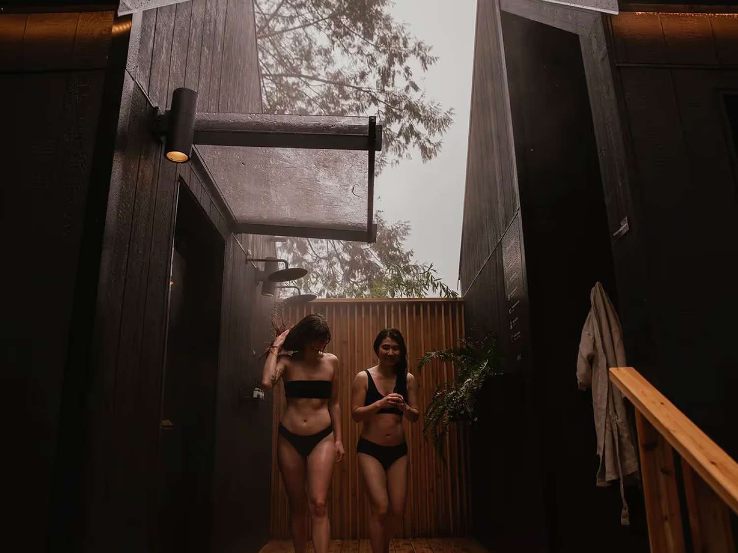
Through strategic conversations, we uncovered their core belief: restoration happens through simple, timeless rituals - the kind humans have practiced for millennia. Sauna. Cold plunge. Fire. Silence. The atmospheric mist that moves through BC's coastal forests became both metaphor and experience.
The Outcome:
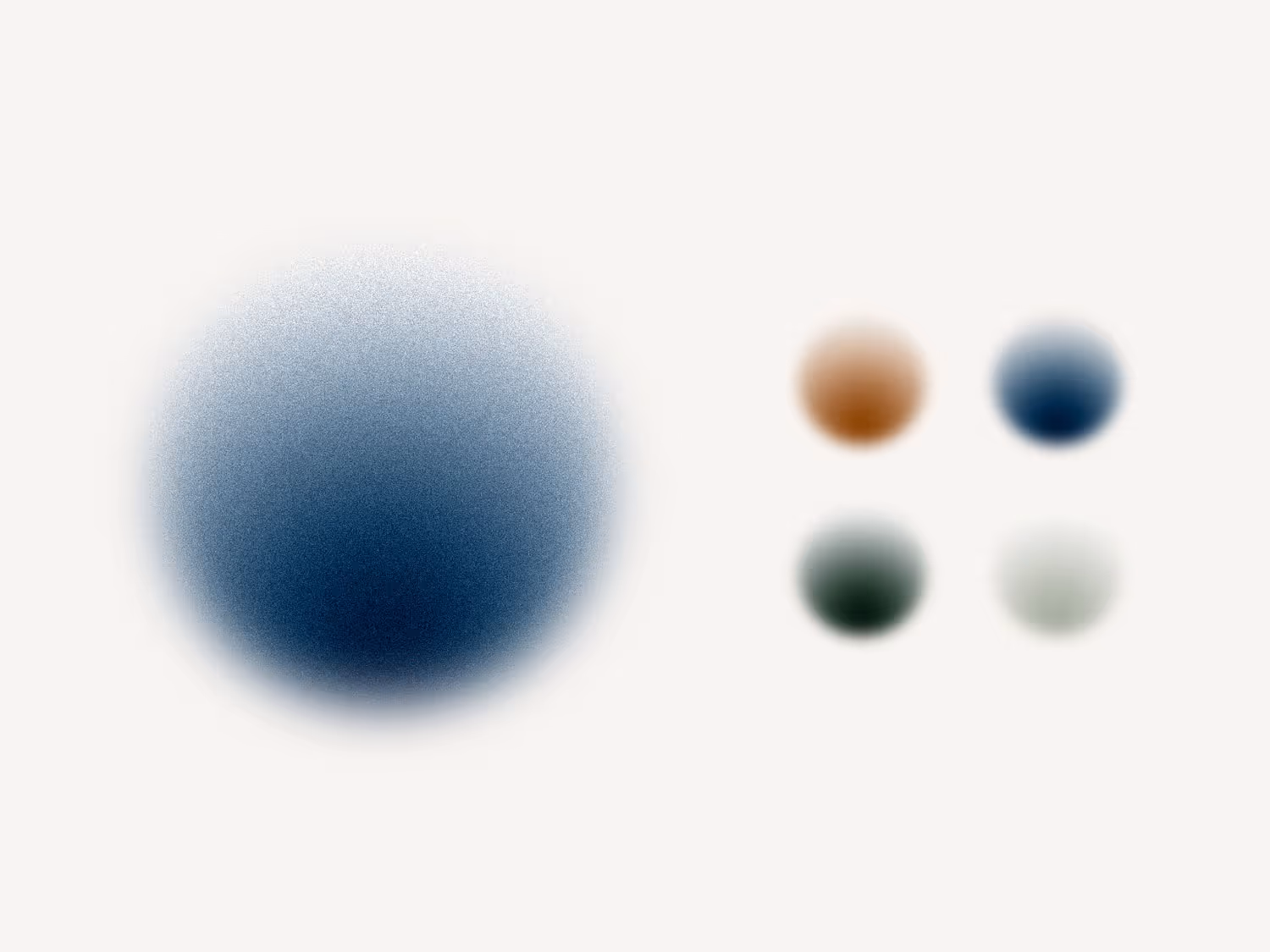
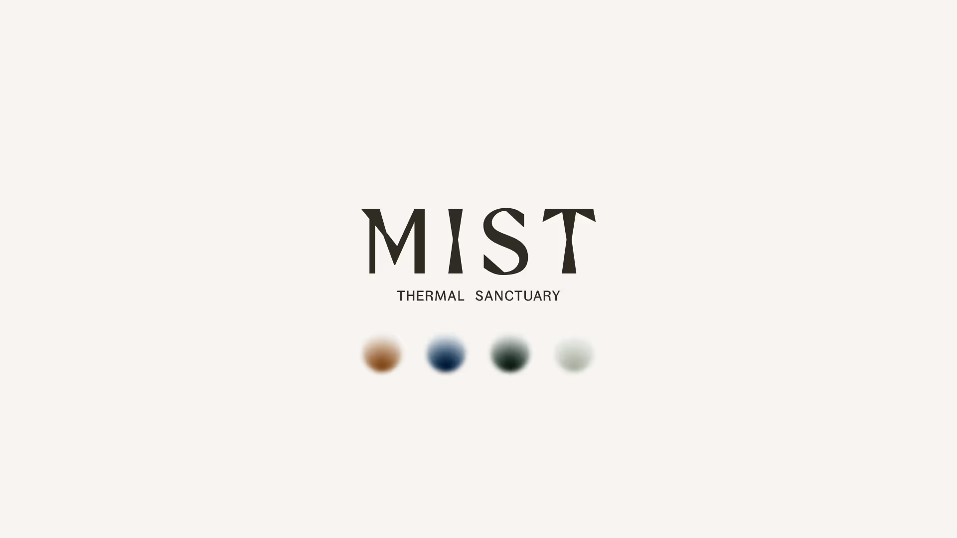
Rather than trends-driven wellness aesthetics, we built a visual system around the four elements themselves - fire, water, earth, air. Each shapes both the physical experience and brand language, grounding Mist in the rituals of nature rather than the performance of self-care.
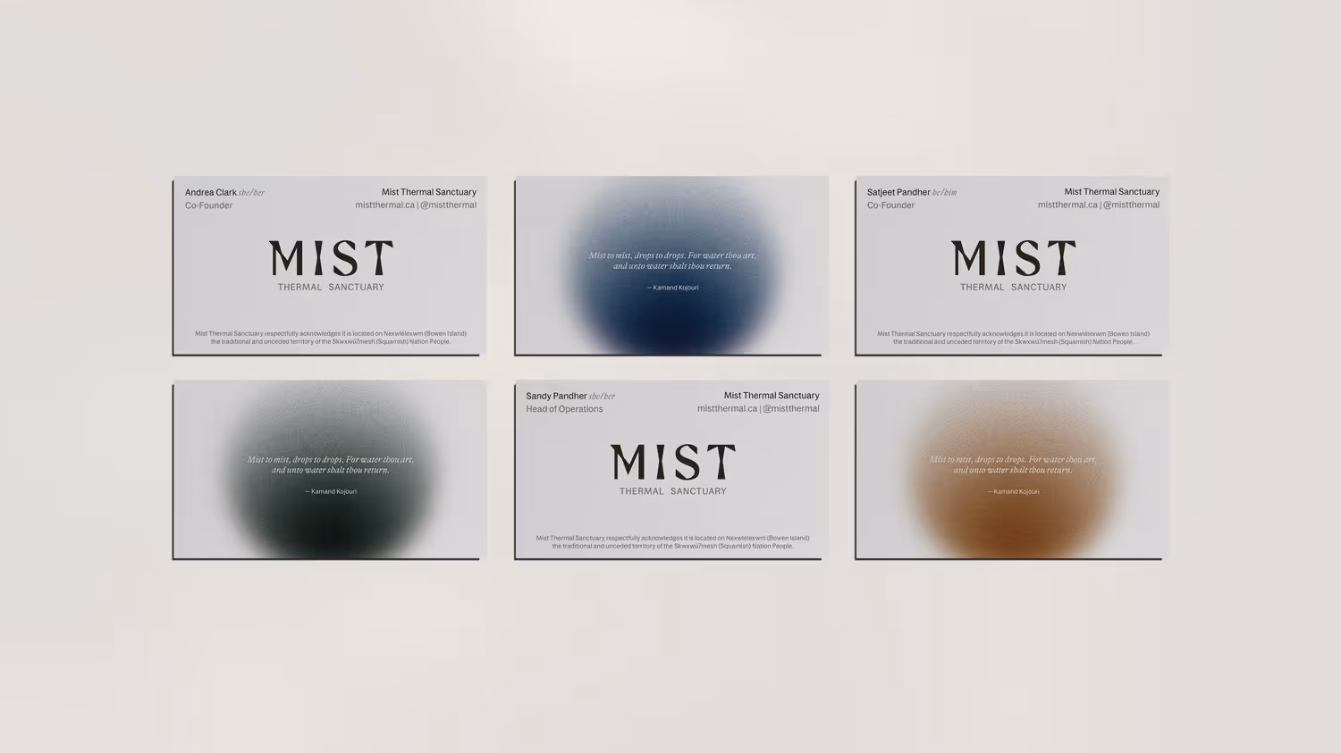
We developed the strategic framework, visual identity, web experience, environmental signage, packaging, and merchandise - everything aligned to elemental simplicity.
In a wellness landscape cluttered with performative self-care and Instagram-ready experiences, Mist's founders wanted to create something genuine and elemental - but struggled to articulate what made their vision distinct.
The Discovery:
Through strategic conversations, we uncovered their core belief: restoration happens through simple, timeless rituals - the kind humans have practiced for millennia. Sauna. Cold plunge. Fire. Silence. The atmospheric mist that moves through BC's coastal forests became both metaphor and experience.
The Outcome:
Rather than trends-driven wellness aesthetics, we built a visual system around the four elements themselves - fire, water, earth, air. Each shapes both the physical experience and brand language, grounding Mist in the rituals of nature rather than the performance of self-care.
We developed the strategic framework, visual identity, web experience, environmental signage, packaging, and merchandise - everything aligned to elemental simplicity.
Credits:
Copywriting – Mimi Young
Photography – Jenna Pullen, Jeanie Ow
Copywriting – Mimi Young
Photography – Jenna Pullen, Jeanie Ow
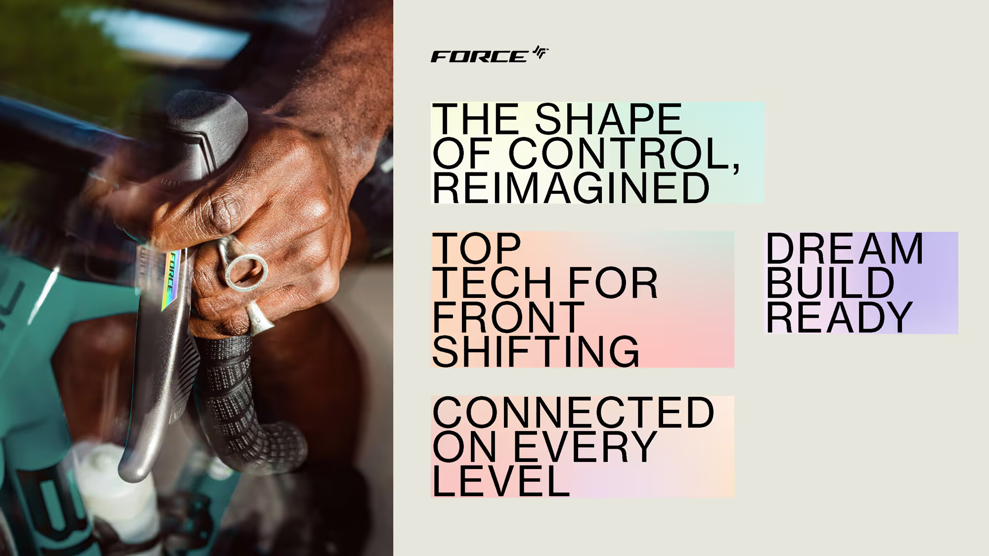
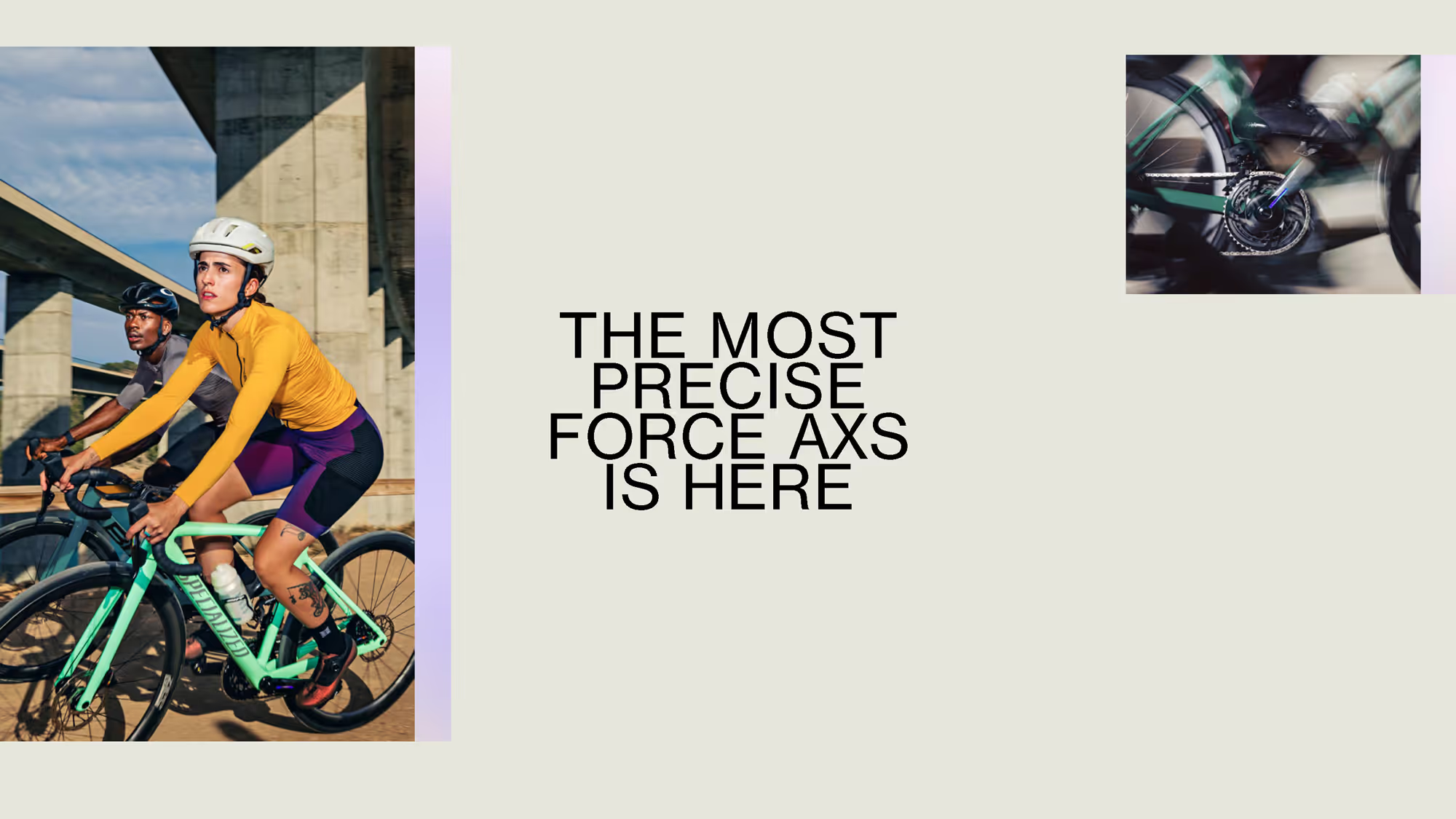
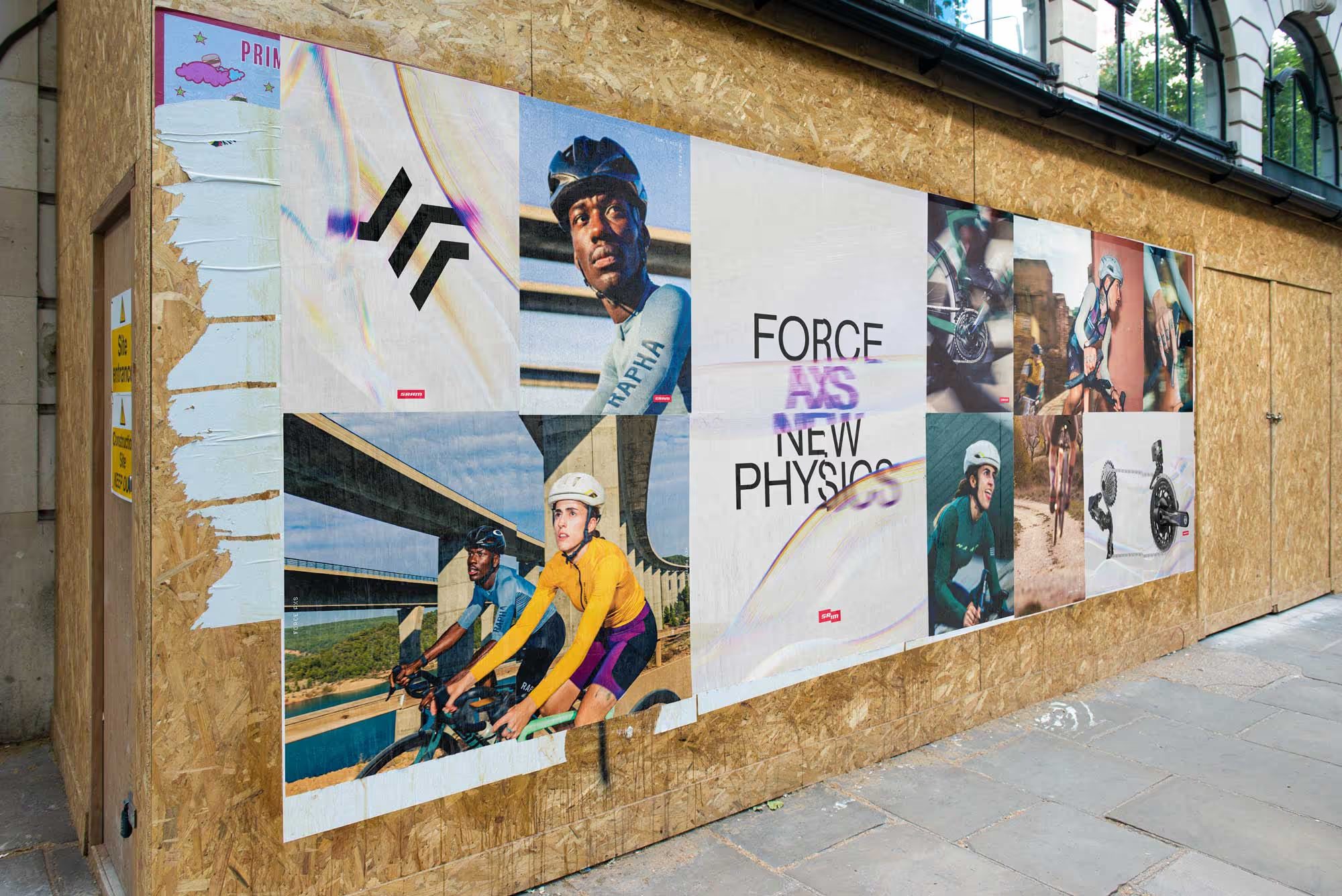
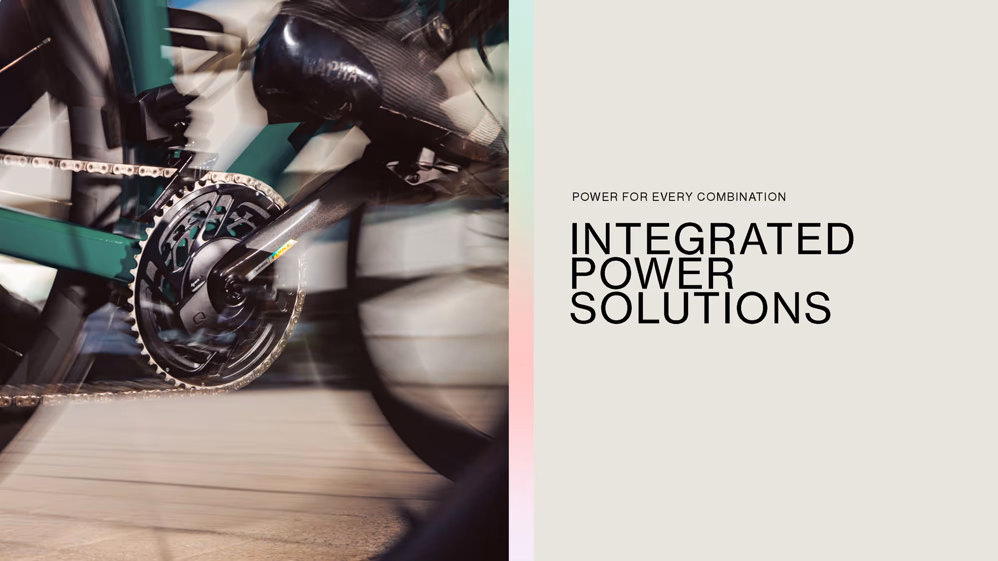
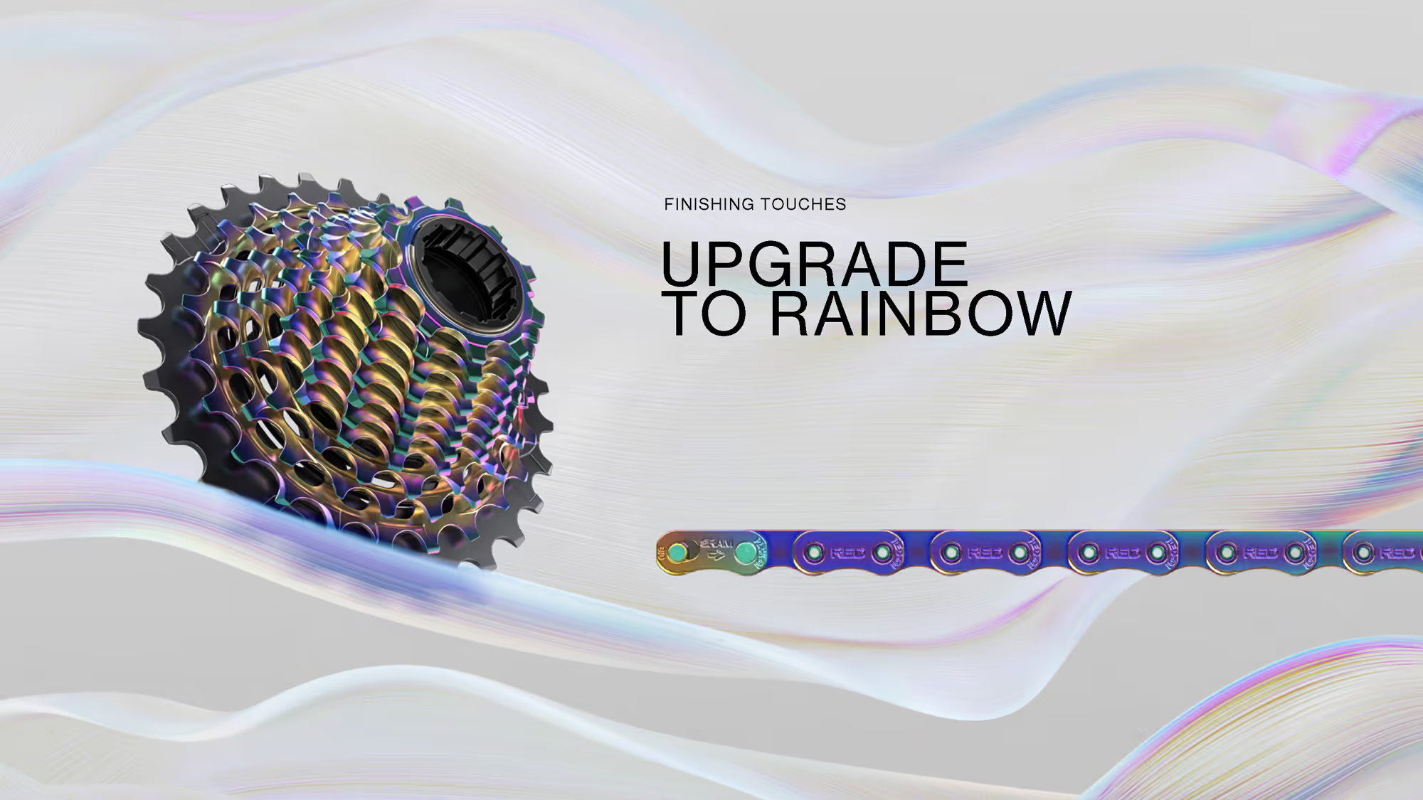
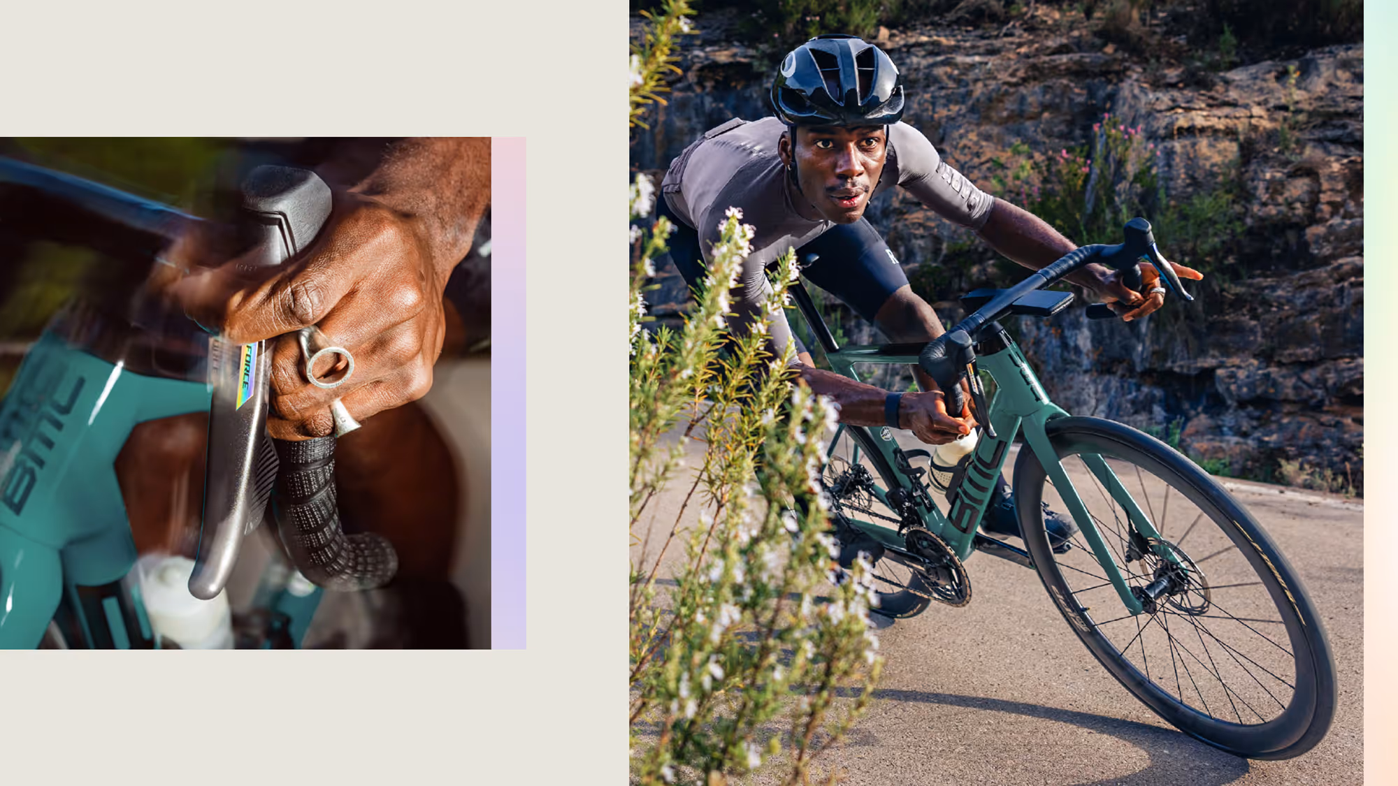
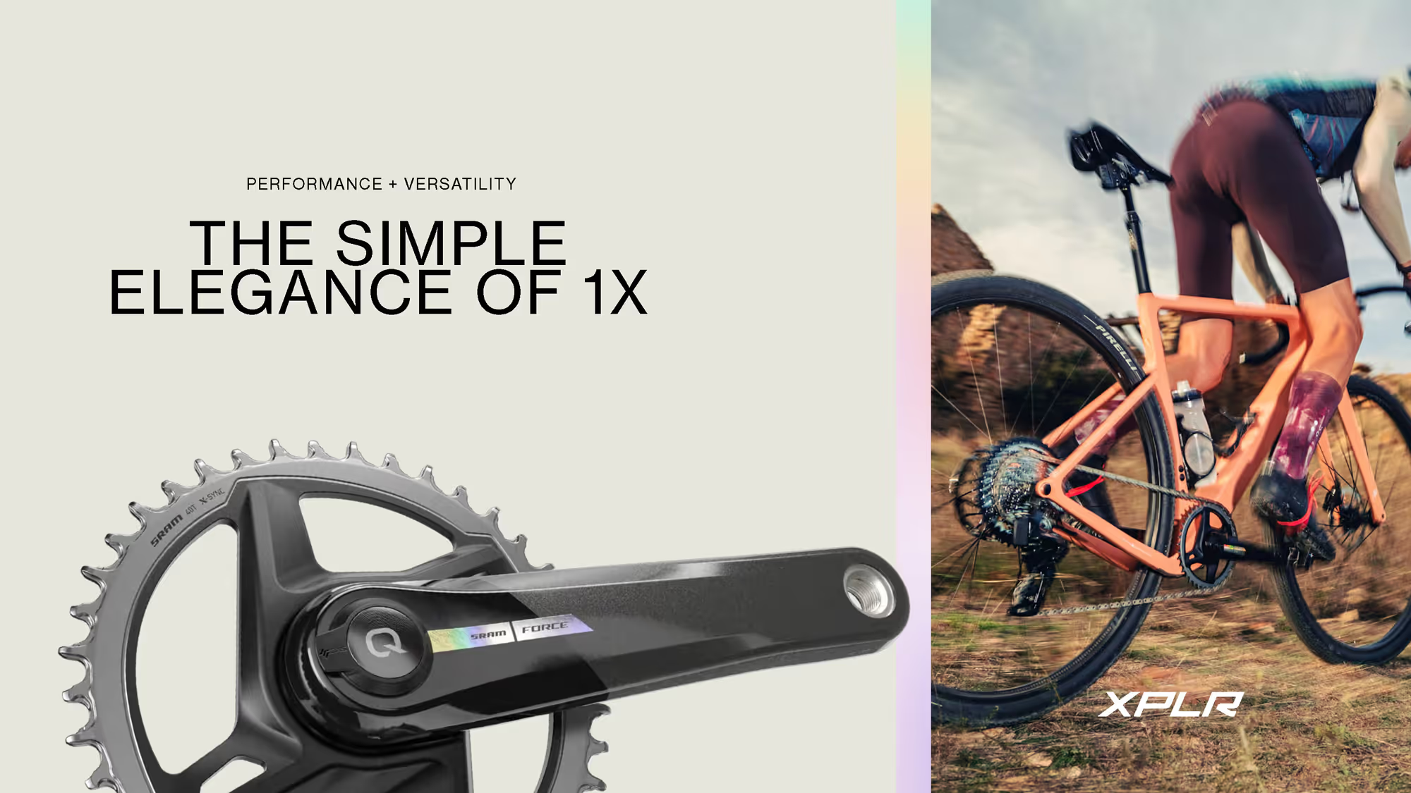

SRAM — Force AXS
Campaign Identity
Vancouver, Canada
The Challenge:
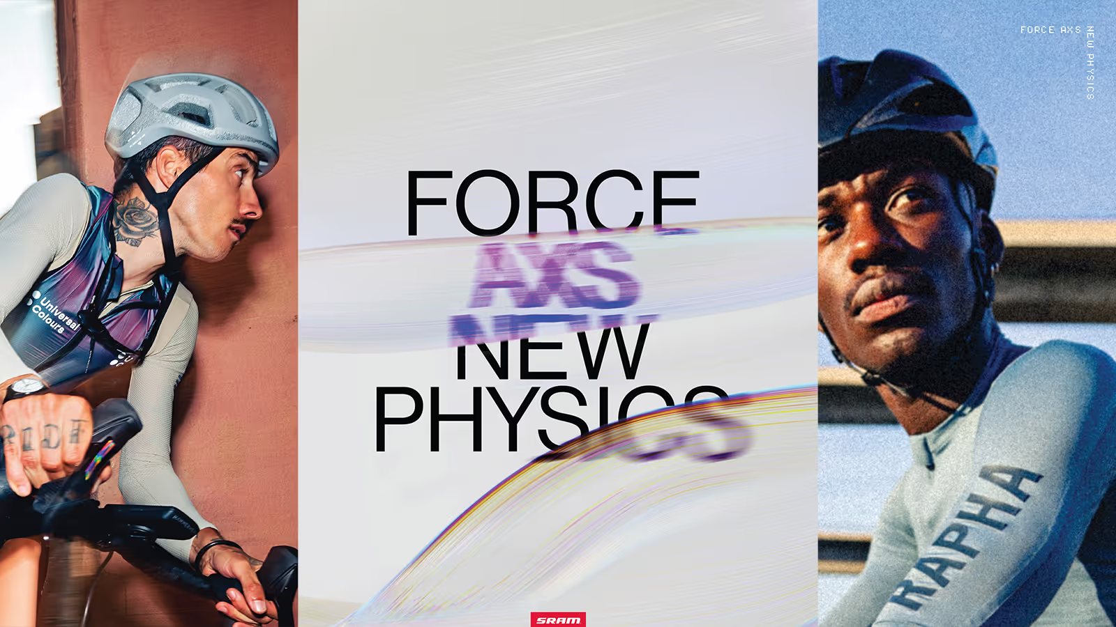
SRAM had brought revolutionary wireless electronic shifting down from pro racing to the enthusiast level - but how do you communicate what changes when friction disappears? When cables and mechanical limitations are removed, riding fundamentally transforms. Shifts happen at the speed of thought. Your position on the bars no longer dictates your gearing options. This wasn't an upgrade, it was a different framework for how bikes work.
The Discovery:
Through collaboration with SRAM's product and marketing teams, we identified the core tension: the technology was invisible, but the transformation was profound. Traditional bike marketing focuses on specs and incremental improvements. Force AXS needed language that captured a paradigm shift - where the old rules, the compromises, the limitations simply no longer apply.
The Insight:
New Physics. Not just wireless. Not just electronic. A fundamental rewrite of the relationship between rider and machine. The campaign needed to make this invisible revolution visible.
The Outcome:
We built a campaign identity system that rejected incremental upgrade language in favor of transformation. Visual language that felt like a reset, not a refinement. Messaging that positioned Force AXS as the point where everything changes - the moment when thought becomes action without mechanical translation.
Campaign strategy, visual identity, launch materials, retail systems, digital experience - everything aligned to one idea: the old physics no longer apply.
Credits:
Creative Direction — Good Fortune Collective
3D Production — Studio Tendril
Creative Direction — Good Fortune Collective
3D Production — Studio Tendril
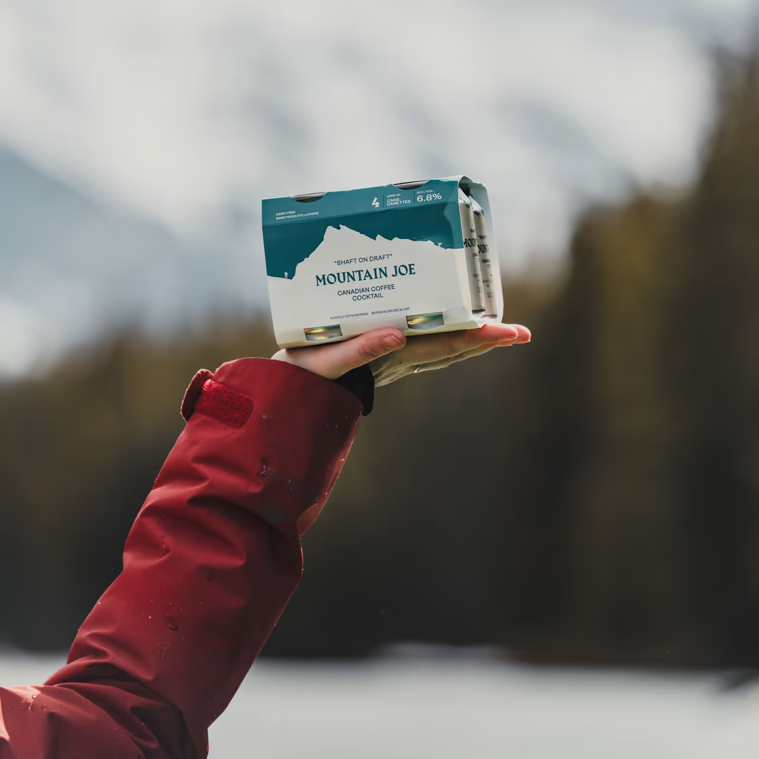
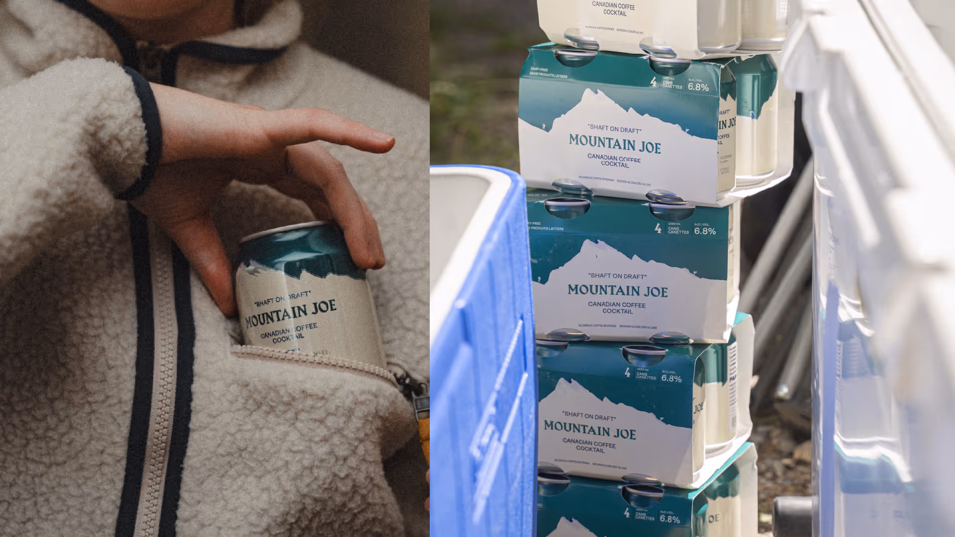
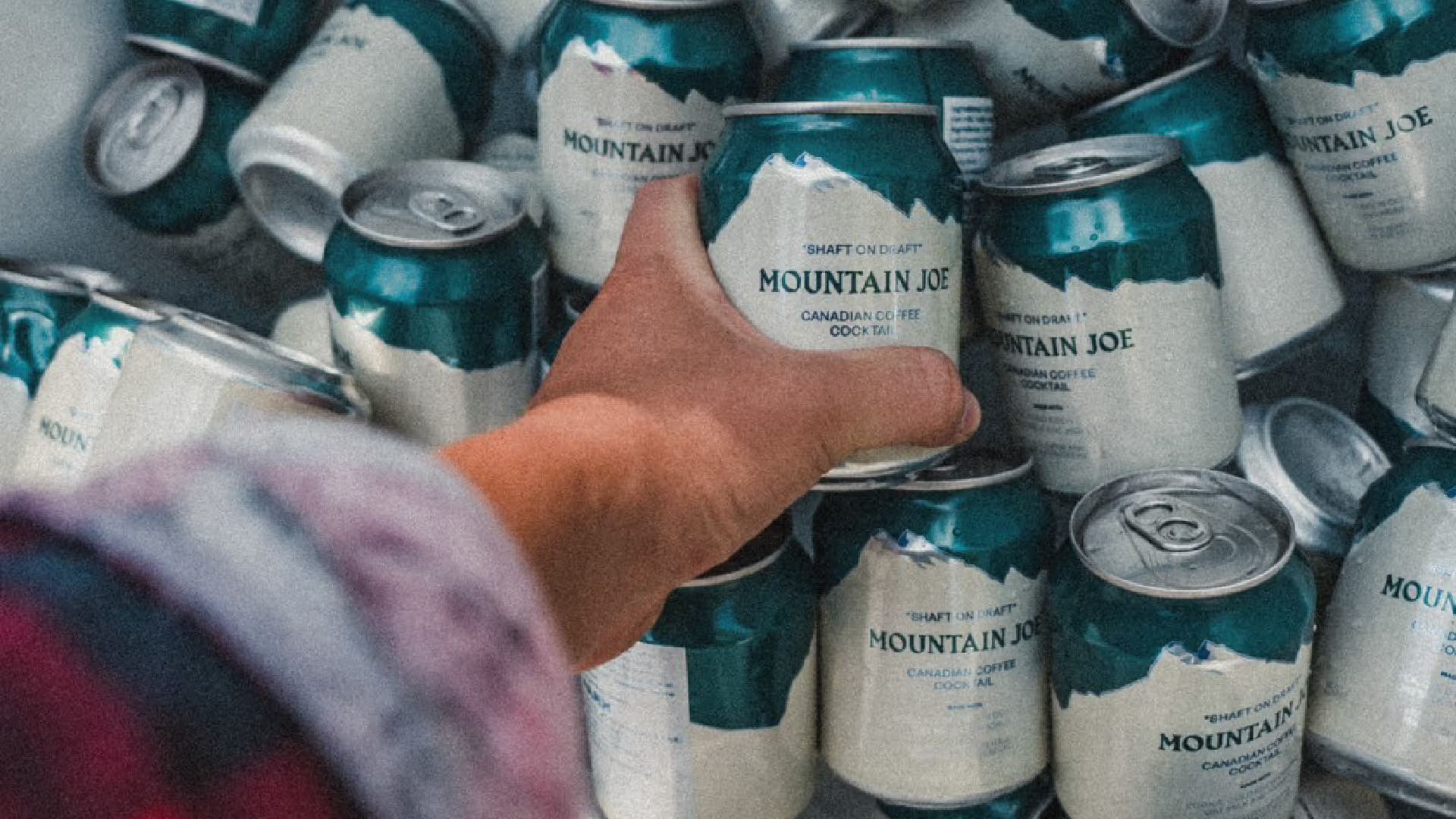
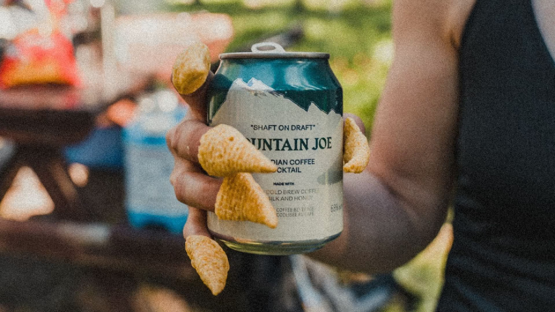
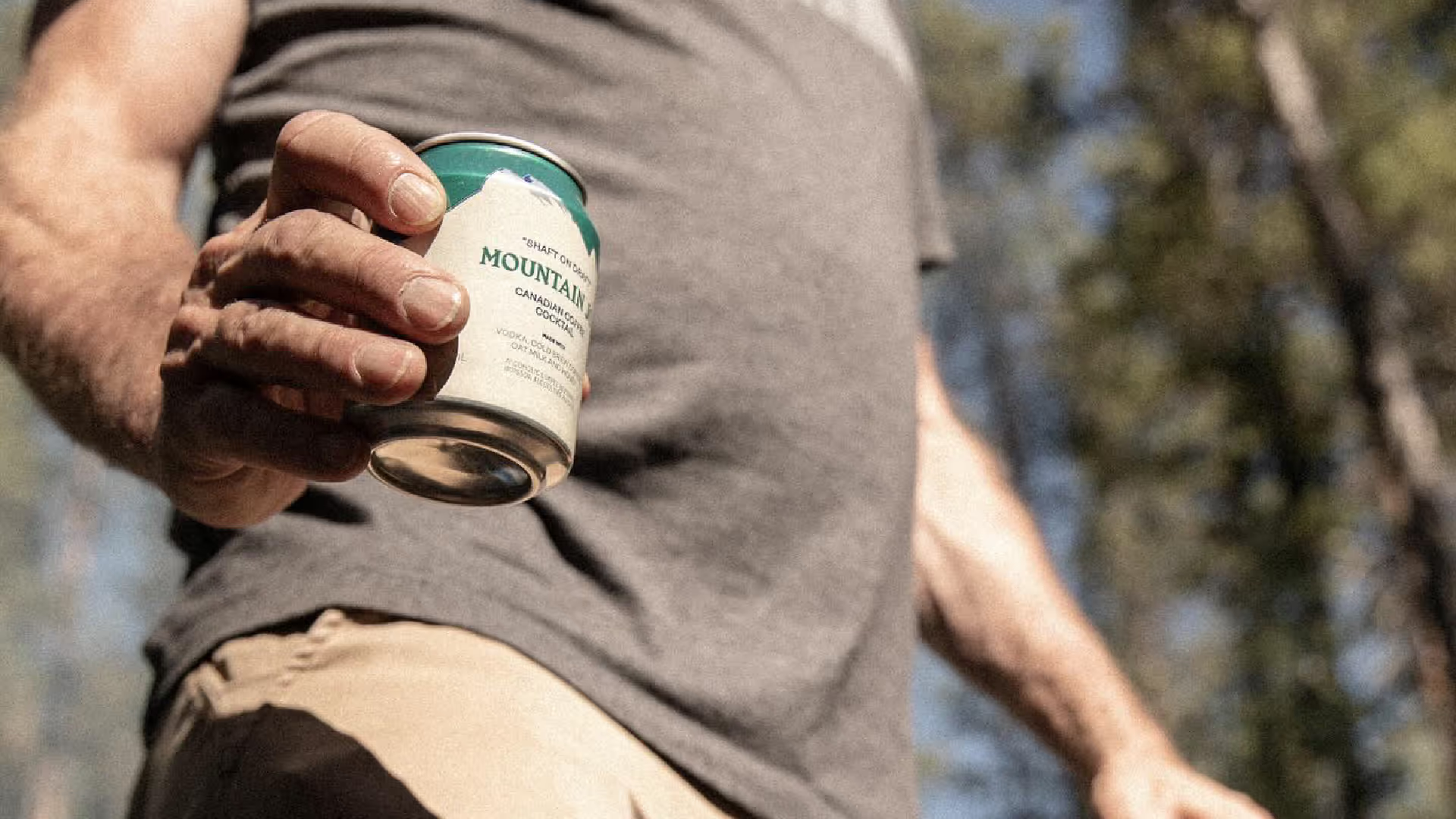

Mountain Joe
Brand & Packaging Design
Banff, Canada
The Challenge:
Park Distillery's 'Shaft' cocktail had become a Banff legend - outselling beer on tap at their restaurant - but existed only behind the bar. The founders wanted to can it for wider distribution, but faced a fundamental branding problem: how do you bottle a local sensation without losing what made it special? The drink belonged to Banff. Could a packaged product carry that sense of place?
The Discovery:
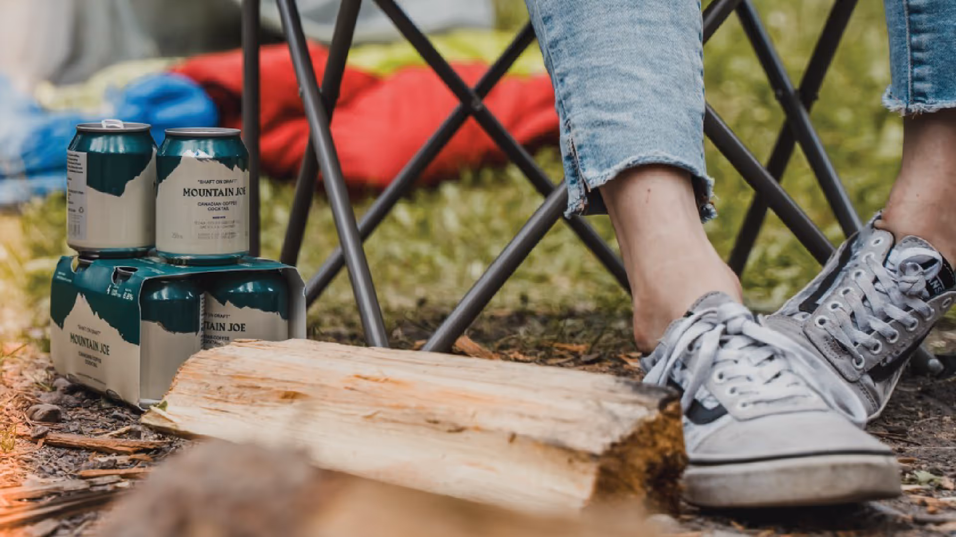
Through conversations with the Park Distillery team, we uncovered what made the Shaft more than just a cocktail - it was part of Banff's après culture. The rituals after a day on the mountain. The energy of the town at the base of Mount Rundle. Spend any time in the Rockies and you notice the repetition: Parks Canada ranger uniforms become synonymous with the region itself. The drink wasn't succeeding because of what was in it, but because of where it came from.
The Insight:
Mountain Joe needed to feel like an intrinsic extension of the Rockies, not a product trying to reference them. The brand couldn't gesture toward Banff - it had to be Banff.
The Outcome:
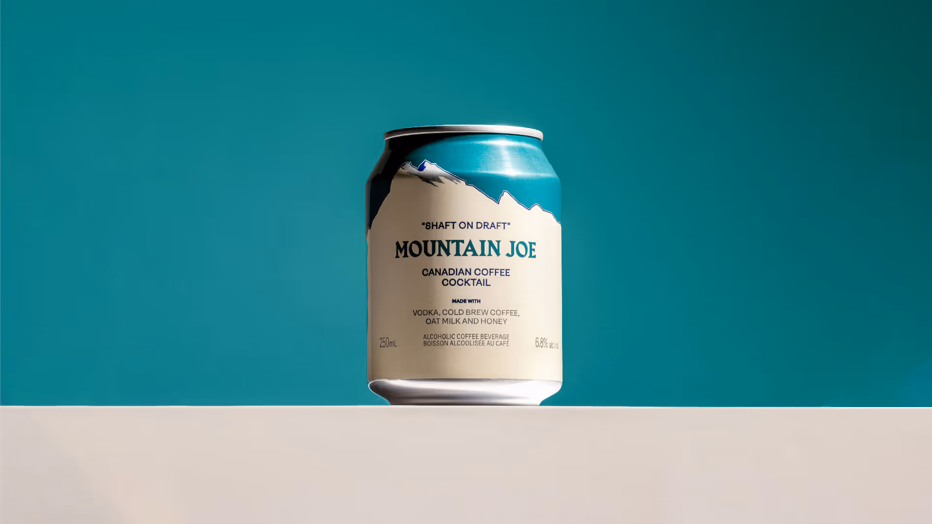
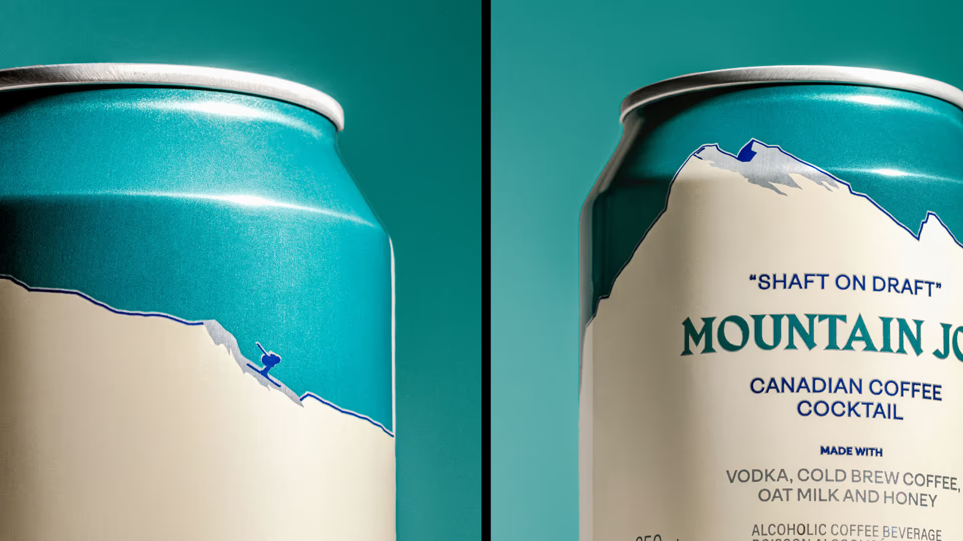
We built the entire identity from the region itself. Mount Rundle's distinctive profile became the structural foundation of the can design. The colour palette came directly from those ubiquitous Parks Canada ranger uniforms - the visual shorthand for the Rockies. The name referenced the coffee-spiked cocktail while grounding it in mountain culture rather than craft cocktail preciousness.
Park Distillery's 'Shaft' cocktail had become a Banff legend - outselling beer on tap at their restaurant - but existed only behind the bar. The founders wanted to can it for wider distribution, but faced a fundamental branding problem: how do you bottle a local sensation without losing what made it special? The drink belonged to Banff. Could a packaged product carry that sense of place?
The Discovery:
Through conversations with the Park Distillery team, we uncovered what made the Shaft more than just a cocktail - it was part of Banff's après culture. The rituals after a day on the mountain. The energy of the town at the base of Mount Rundle. Spend any time in the Rockies and you notice the repetition: Parks Canada ranger uniforms become synonymous with the region itself. The drink wasn't succeeding because of what was in it, but because of where it came from.
The Insight:
Mountain Joe needed to feel like an intrinsic extension of the Rockies, not a product trying to reference them. The brand couldn't gesture toward Banff - it had to be Banff.
The Outcome:
We built the entire identity from the region itself. Mount Rundle's distinctive profile became the structural foundation of the can design. The colour palette came directly from those ubiquitous Parks Canada ranger uniforms - the visual shorthand for the Rockies. The name referenced the coffee-spiked cocktail while grounding it in mountain culture rather than craft cocktail preciousness.
Credits:
Creative Direction — Glasfurd & Walker
Photography — Ian Lanterman & Park Distillery
Creative Direction — Glasfurd & Walker
Photography — Ian Lanterman & Park Distillery

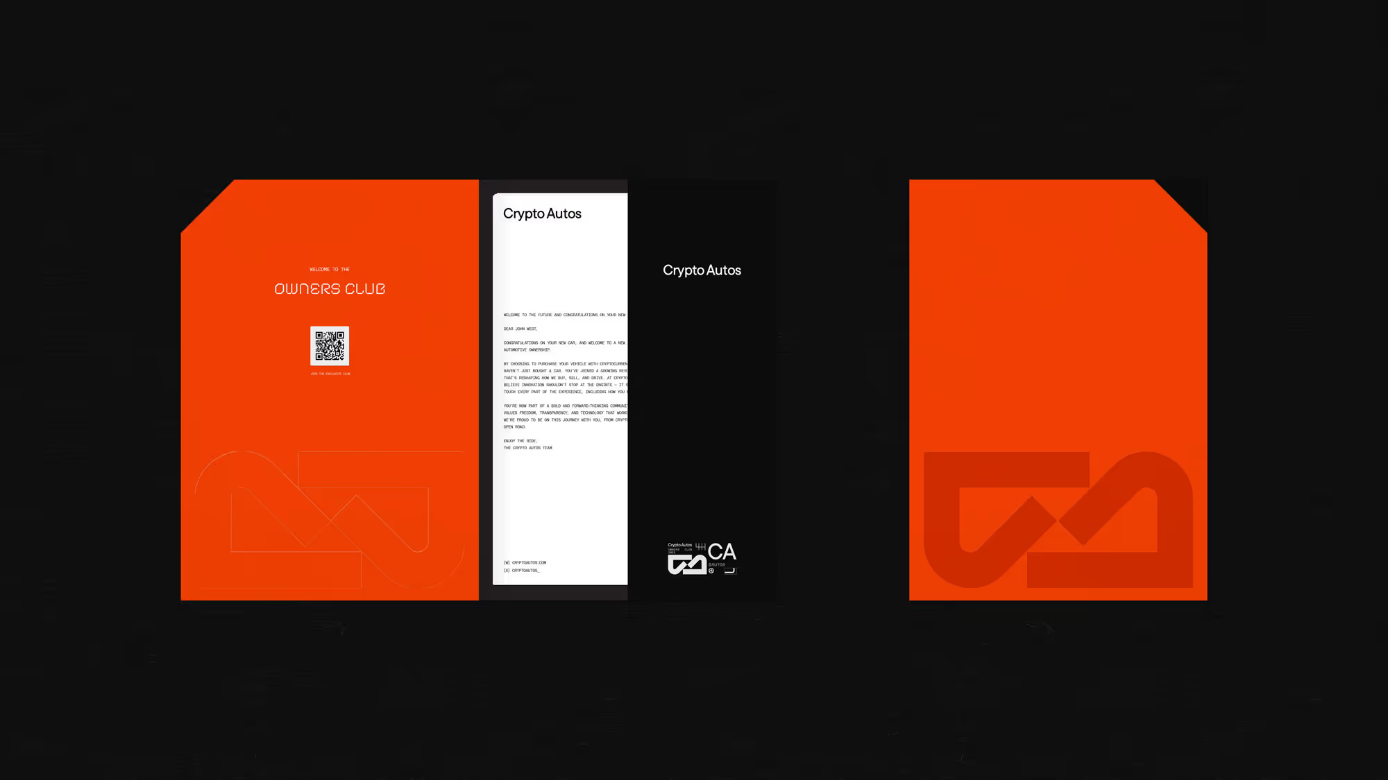
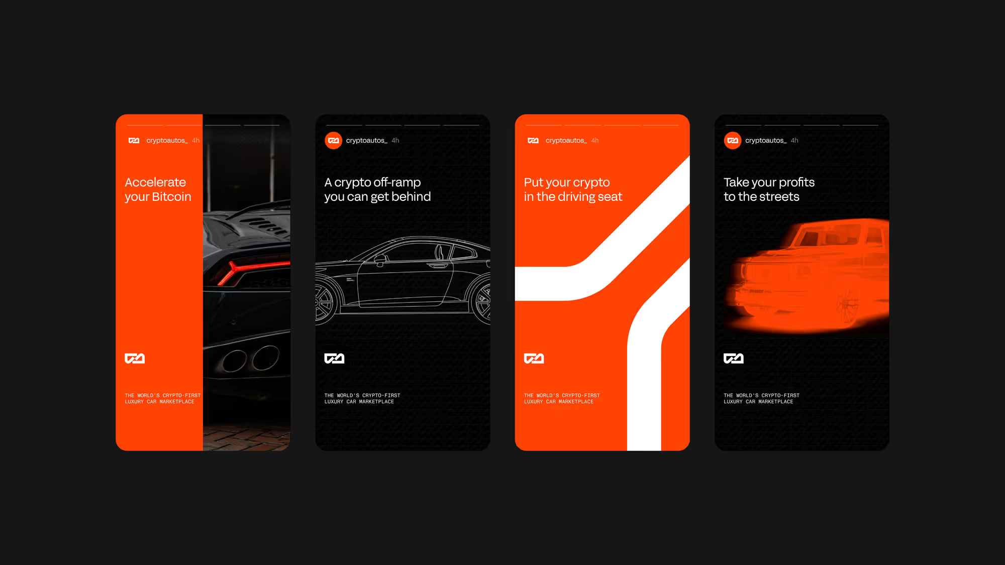
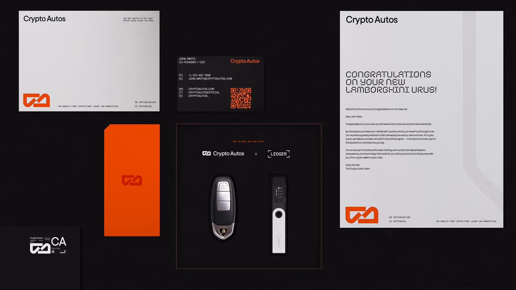

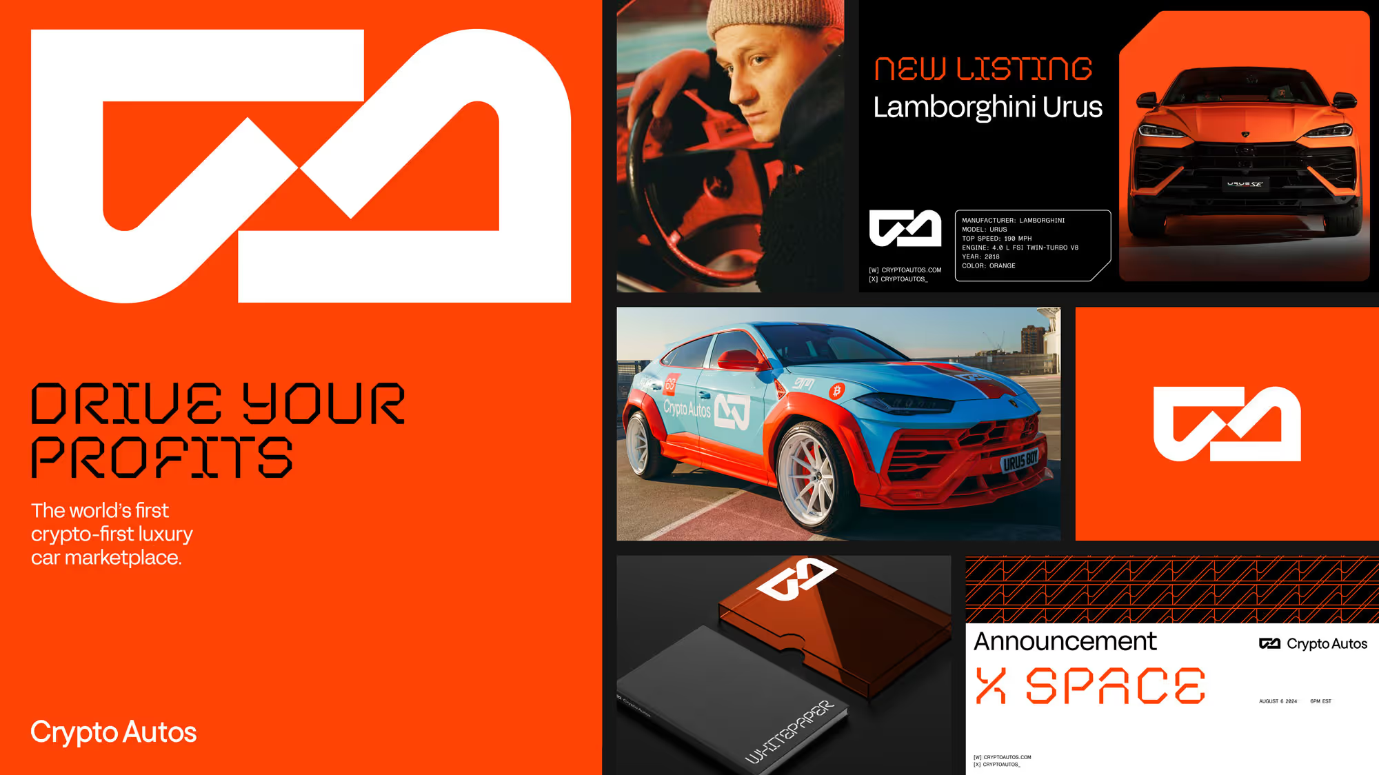
Crypto Autos
Brand Identity System
Dubai, UAE
The Challenge:
Crypto Autos was pioneering something that didn't yet have a visual language - a luxury car marketplace that accepts cryptocurrency. The problem wasn't just aesthetic, it was cultural: crypto brands feel technical and cold. Luxury automotive brands feel traditional and exclusive. How do you bridge two worlds that have completely different visual codes and speak to audiences that don't naturally overlap?
The Discovery:
We saw what the founding team was building toward: a brand that could speak to a new type of customer. Not crypto-native tech enthusiasts. Not traditional luxury car collectors. A hybrid audience who'd built wealth in digital assets and wanted to spend it on physical status symbols. The brand needed to feel native to both luxury and crypto simultaneously - and their existing identity couldn't carry that weight.
The Insight:
Crypto Autos exists at the intersection of luxury, lifestyle, and technology - but the brand couldn't choose one lane. It needed the flex and range to speak credibly across completely different contexts: social media and live events, web experiences and car wraps, crypto communities and automotive collectors.
The Outcome:
We built an identity system with inherent versatility - confident enough for luxury positioning, dynamic enough for crypto culture, sophisticated enough for high-value transactions. A visual language that could shift between technical precision and lifestyle aspiration without losing coherence.
We also developed a campaign and sub-brand for their native token, $AUTOS, which raised $4.4 million USD in 4.5 hours.
Credits:
Creative Direction — Michael Hindle
Creative Direction — Michael Hindle
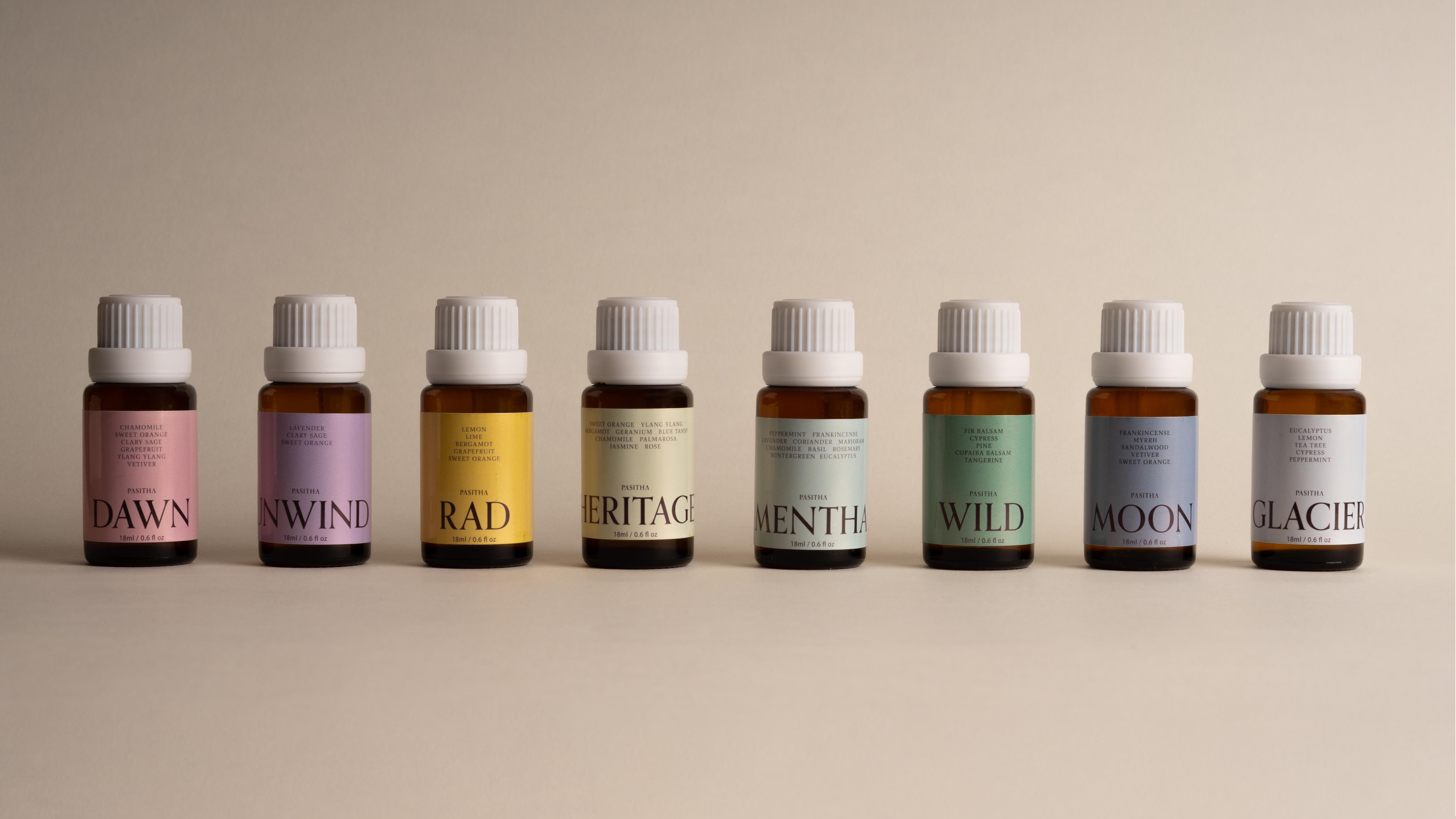

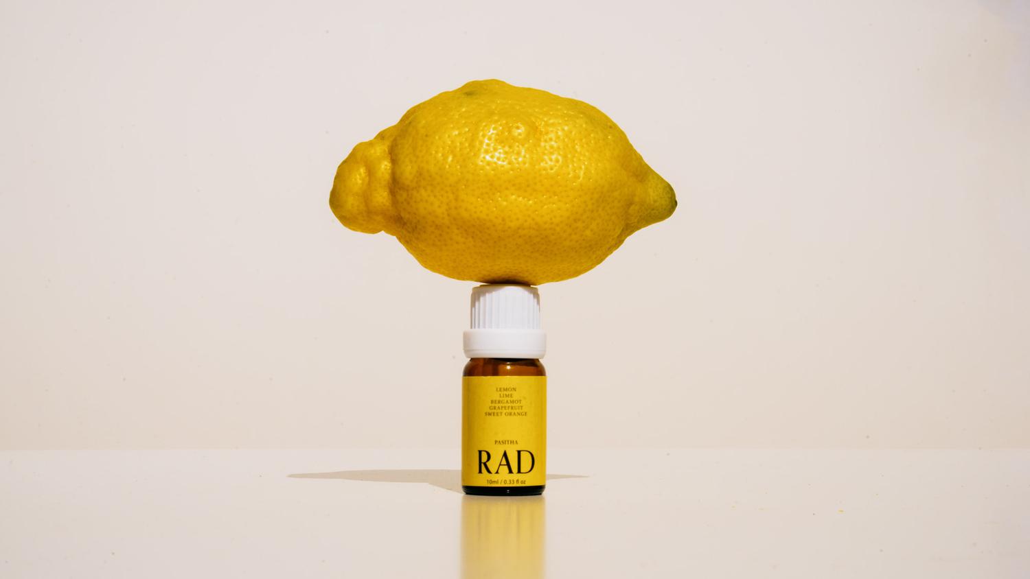
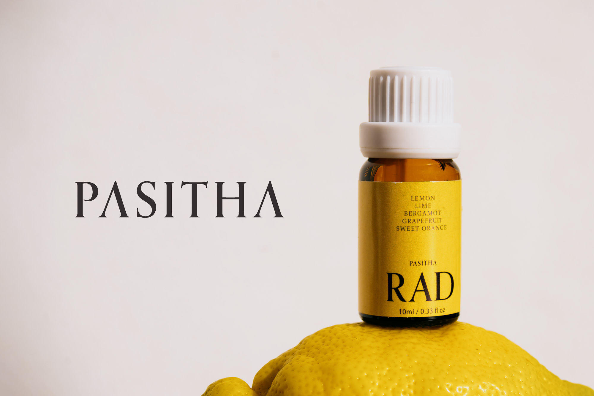
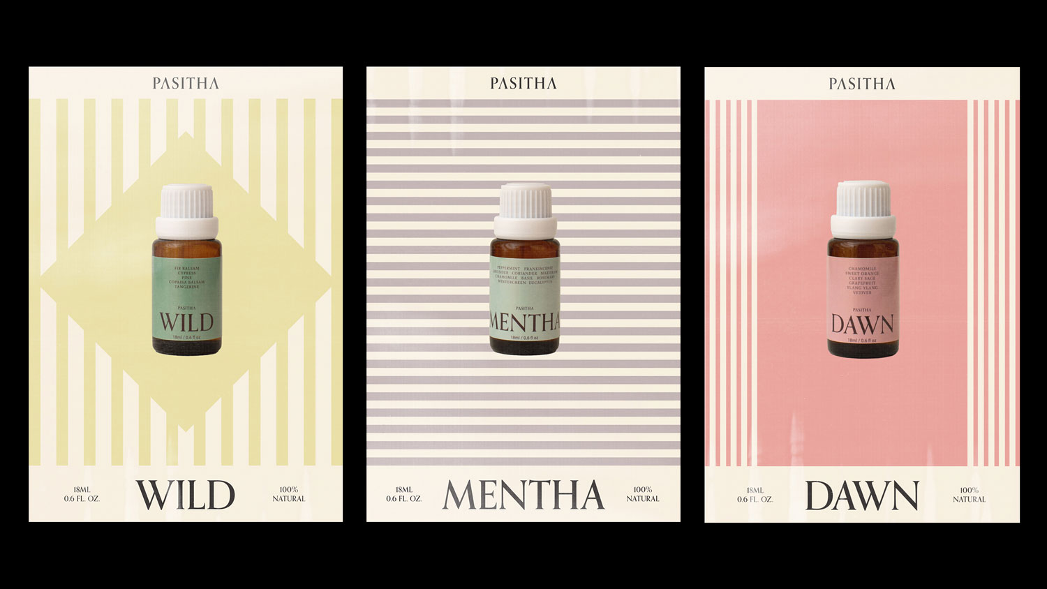
Pasitha
Brand Identity System
Vancouver, Canada
The Challenge:
The essential oils market had calcified into two exhausted aesthetics: cold and medicinal, or earthy and boho. Pasitha's waterless nebulizing diffusers were genuinely different technology - no candle smoke, no toxic plumes, no mould from water-based systems - but the product innovation risked being buried under category conventions. How do you break a brand out of visual clichés when the entire category looks the same?
The Discovery:
We saw what other brands missed: these aren't products you use and put away. They live in your space. On your shelf. On your nightstand. Essential oil diffusers are part of your home's aesthetic, yet the category treated them like bathroom cabinet products - covered in botanical imagery and wellness clichés, designed to be hidden.
The Insight:
Pasitha needed to be positioned as a lifestyle brand, not a wellness brand. The visual language should reflect what makes the technology clean: pure essential oil diffused into fine mist. No additives. No compromise. Understated design that earns its place in considered interiors.
The Outcome:
We stripped away the botanical wallpaper. Muted tones, refined typography, clean systems that let the product be the hero. The brand feels at home next to your design objects, not hidden in a cupboard with supplements.
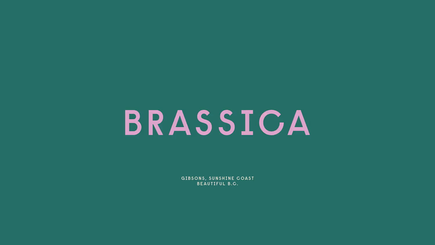
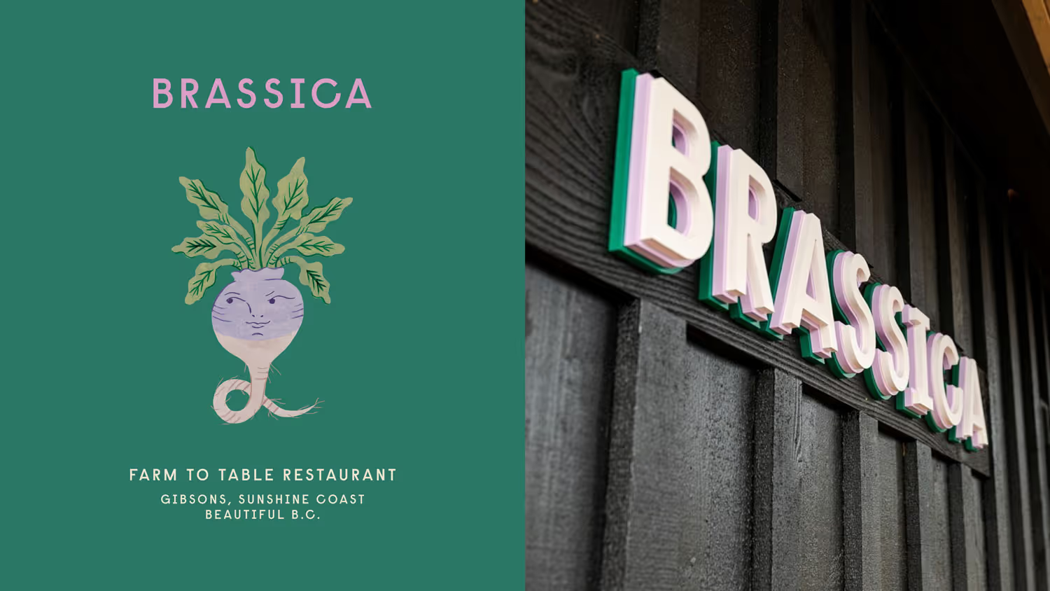
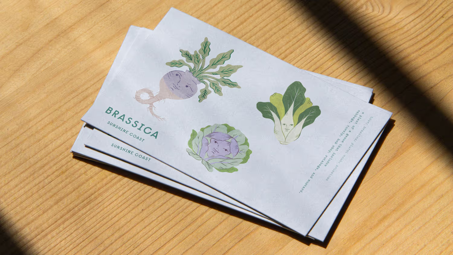
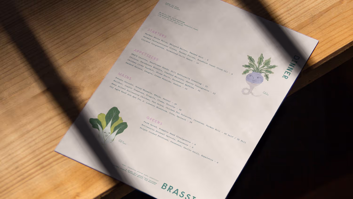
Brassica
Brand Identity System
Gibsons, Canada
Credits:
Creative Direction — Glasfurd & Walker
Photography — Leila Kwok
Illustration – Estée Preda
Creative Direction — Glasfurd & Walker
Photography — Leila Kwok
Illustration – Estée Preda
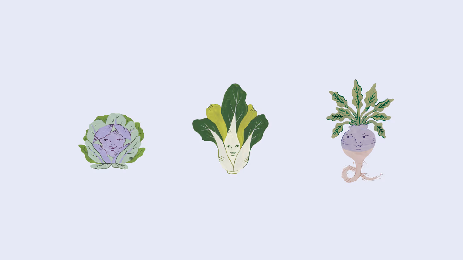
The Challenge:
Farm-to-table restaurants had locked themselves into two tired positions: overly rustic (reclaimed wood, kraft paper, hand-lettered chalkboards) or clinically minimal (white plates, sans-serif, "let the food speak"). Brassica's seasonal, locally-sourced approach deserved something more honest - a brand that reflected their actual philosophy: healthy food doesn't need to be precious.
The Discovery:
The restaurant's name itself offered a way out of category clichés. 'Brassica' - the genus covering cabbages, mustards, and the foundational vegetables of their menu - could become more than botanical reference. It could be the organizing principle for a brand that took seasonal produce seriously without taking itself too seriously.
The Insight:
Brassica needed to feel approachable and thoughtful simultaneously. Rooted in the Sunshine Coast's agricultural landscape, but warm and personality-driven rather than earnest or austere. The vegetables themselves could carry that tone - playful without being cartoonish, whimsical without being childish.
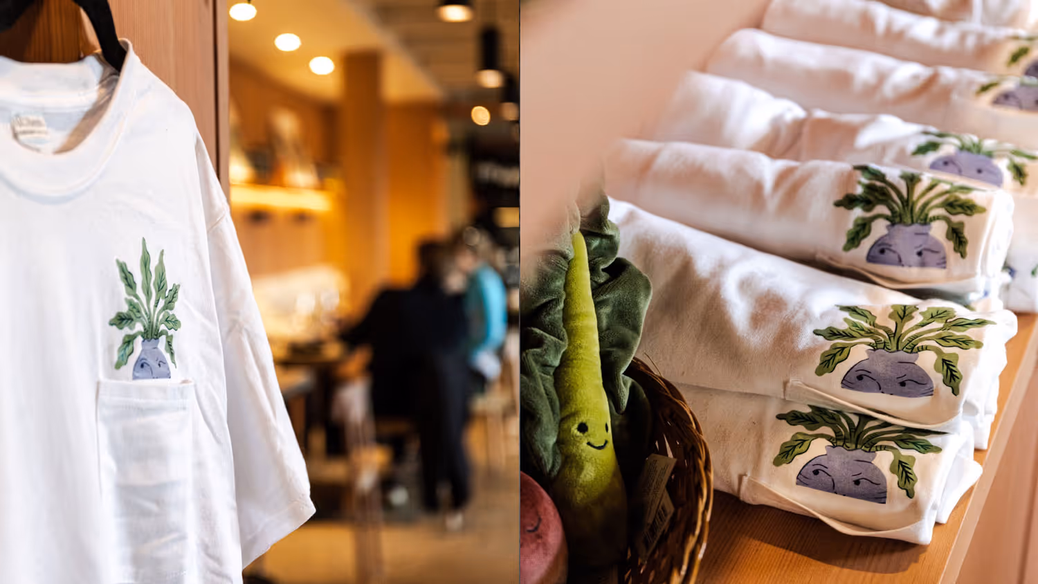
The Outcome:
Working with illustrator Estée Preda, we personified the vegetables that define the restaurant's seasonal menu. The illustrations bring character and warmth while staying grounded in the actual produce. The identity extends into the physical space itself - even the restaurant signage drew from the layered structure of a cabbage, constructed from three stacked wooden layers that create depth and dimension.
Farm-to-table restaurants had locked themselves into two tired positions: overly rustic (reclaimed wood, kraft paper, hand-lettered chalkboards) or clinically minimal (white plates, sans-serif, "let the food speak"). Brassica's seasonal, locally-sourced approach deserved something more honest - a brand that reflected their actual philosophy: healthy food doesn't need to be precious.
The Discovery:
The restaurant's name itself offered a way out of category clichés. 'Brassica' - the genus covering cabbages, mustards, and the foundational vegetables of their menu - could become more than botanical reference. It could be the organizing principle for a brand that took seasonal produce seriously without taking itself too seriously.
The Insight:
Brassica needed to feel approachable and thoughtful simultaneously. Rooted in the Sunshine Coast's agricultural landscape, but warm and personality-driven rather than earnest or austere. The vegetables themselves could carry that tone - playful without being cartoonish, whimsical without being childish.
The Outcome:
Working with illustrator Estée Preda, we personified the vegetables that define the restaurant's seasonal menu. The illustrations bring character and warmth while staying grounded in the actual produce. The identity extends into the physical space itself - even the restaurant signage drew from the layered structure of a cabbage, constructed from three stacked wooden layers that create depth and dimension.
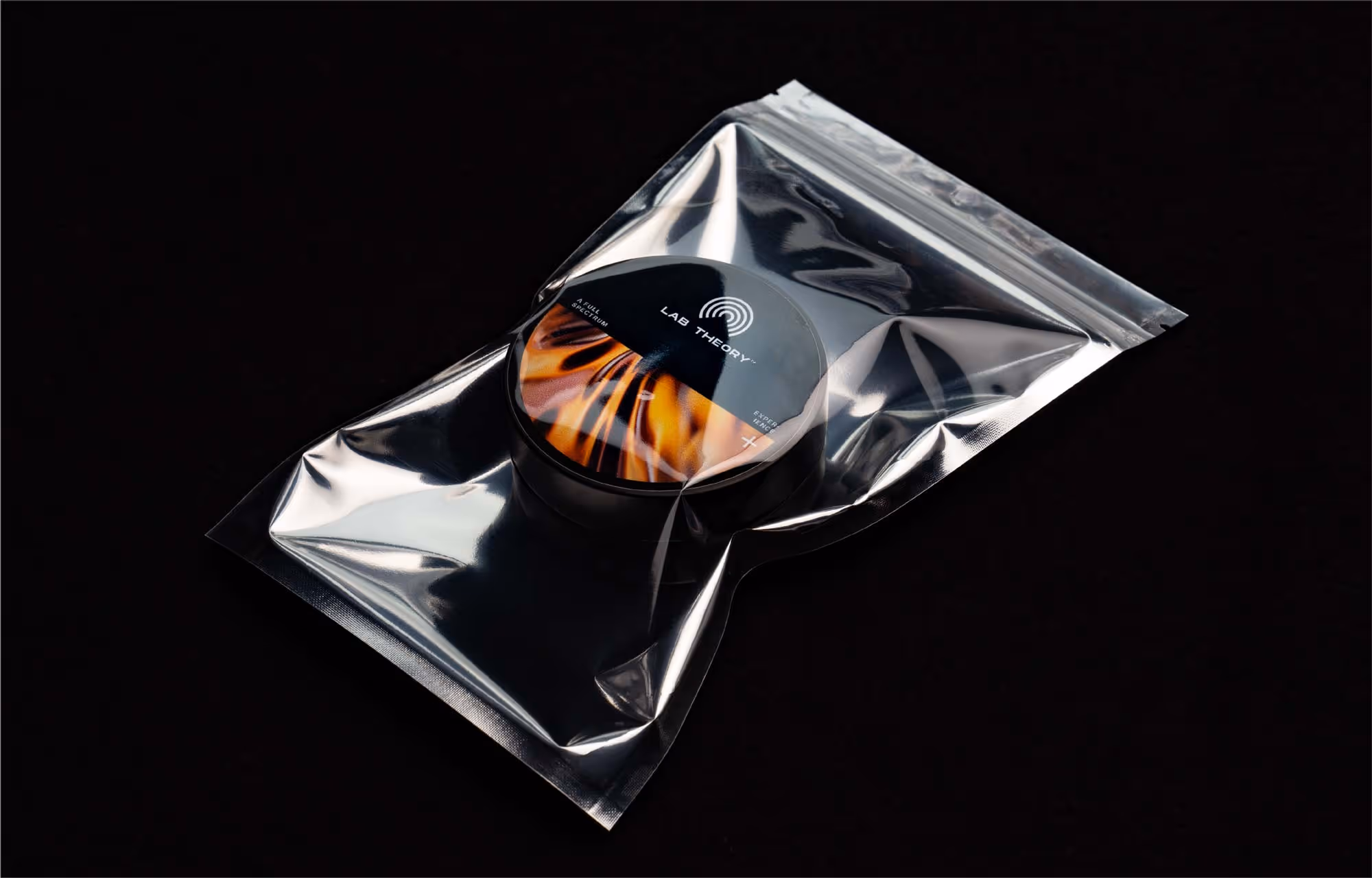
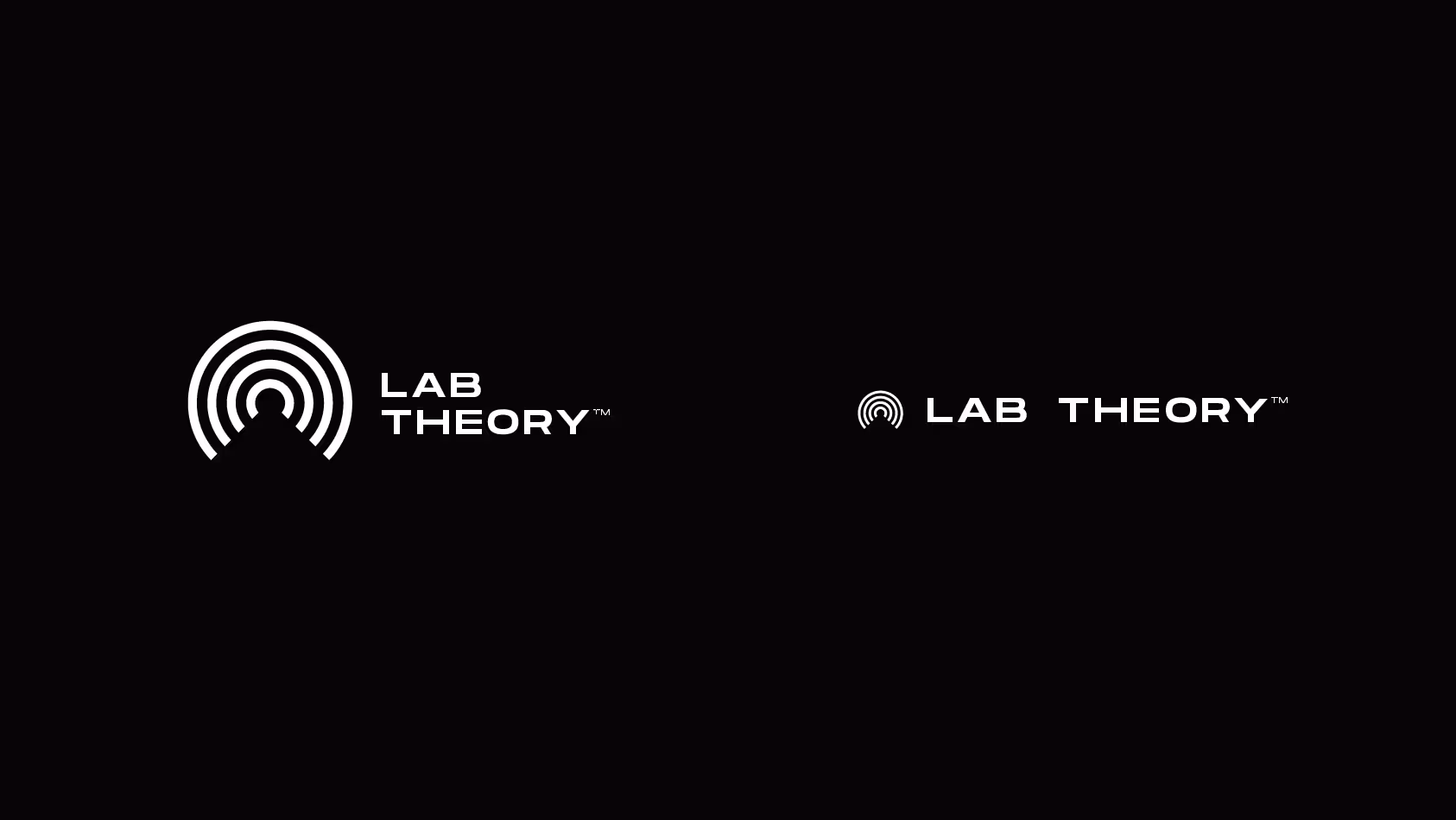
Lab Theory
Brand Identity & Photography
Vancouver, Canada
Credits:
Creative Direction — Skeleton Crew Creative Studio
3D Artist – Valentin Heinrich
Creative Direction — Skeleton Crew Creative Studio
3D Artist – Valentin Heinrich
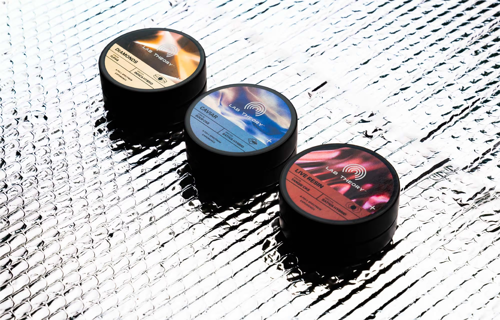
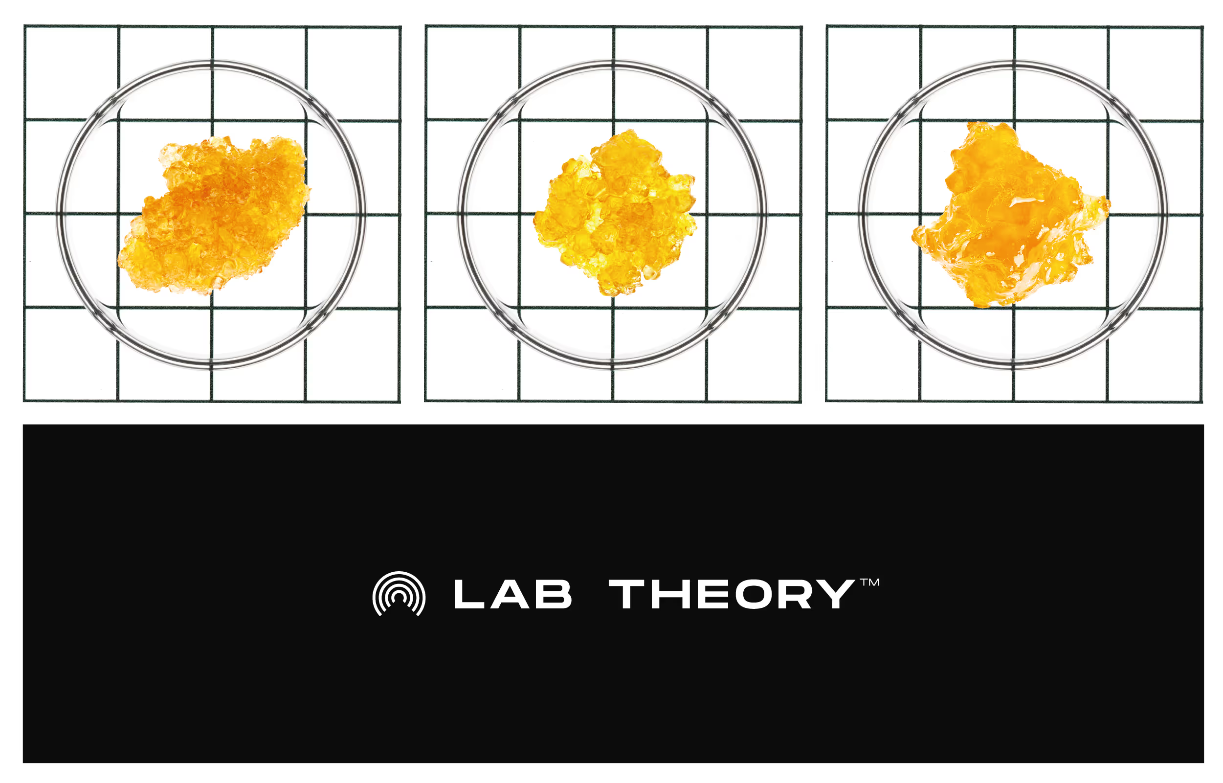
The Challenge:
Rubicon Organics was launching Lab Theory as the most expensive cannabis concentrate on the market - but "premium" had become meaningless in the category. Every brand claimed craft quality. Every package featured gold foil and black backgrounds. Meanwhile, the audience Rubicon wanted to reach - legacy cannabis consumers fluent in drop culture and streetwear - saw through the conventional luxury signaling immediately.
The Discovery:
The concentrates themselves were genuinely premium - precise extraction, clinical methodology, laboratory-grade quality control. But the experience of consuming them isn't clinical at all. How do you build a brand that honors both the process rigor and the psychedelic experience without defaulting to either sterile medical aesthetics or tired cannabis clichés?
The Insight:
Lab Theory exists in the tension between laboratory precision and mind-altering experimentation. The brand needed to feel like both simultaneously - scientific enough to justify the premium price, experiential enough to connect with culture-literate consumers who expect brands to have a point of view.
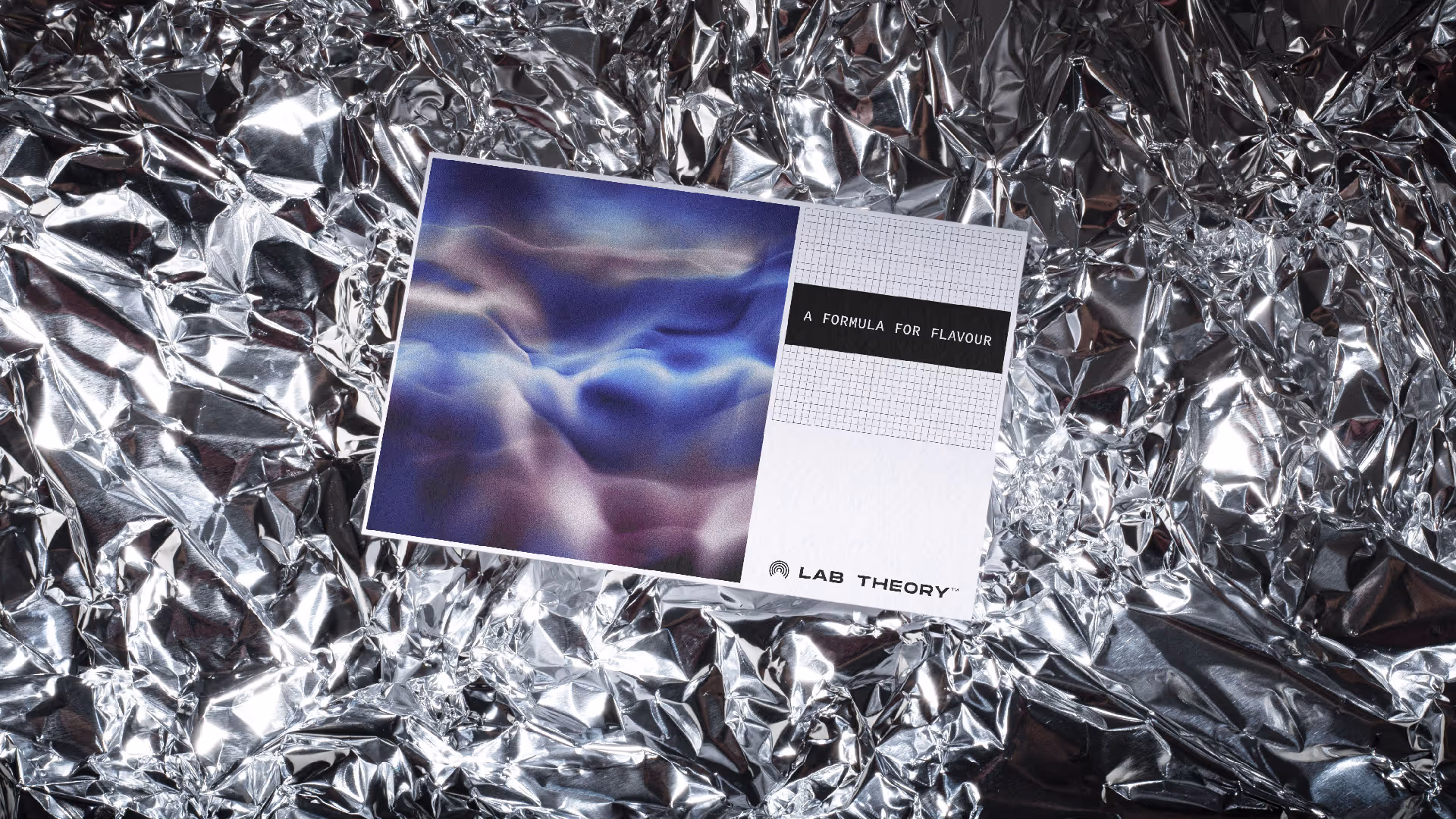
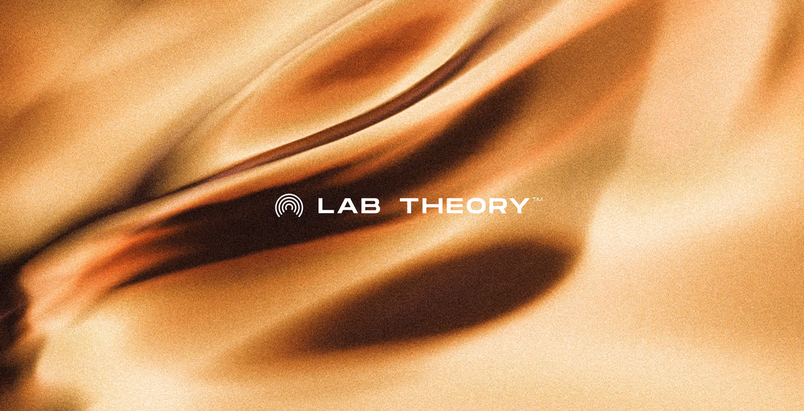
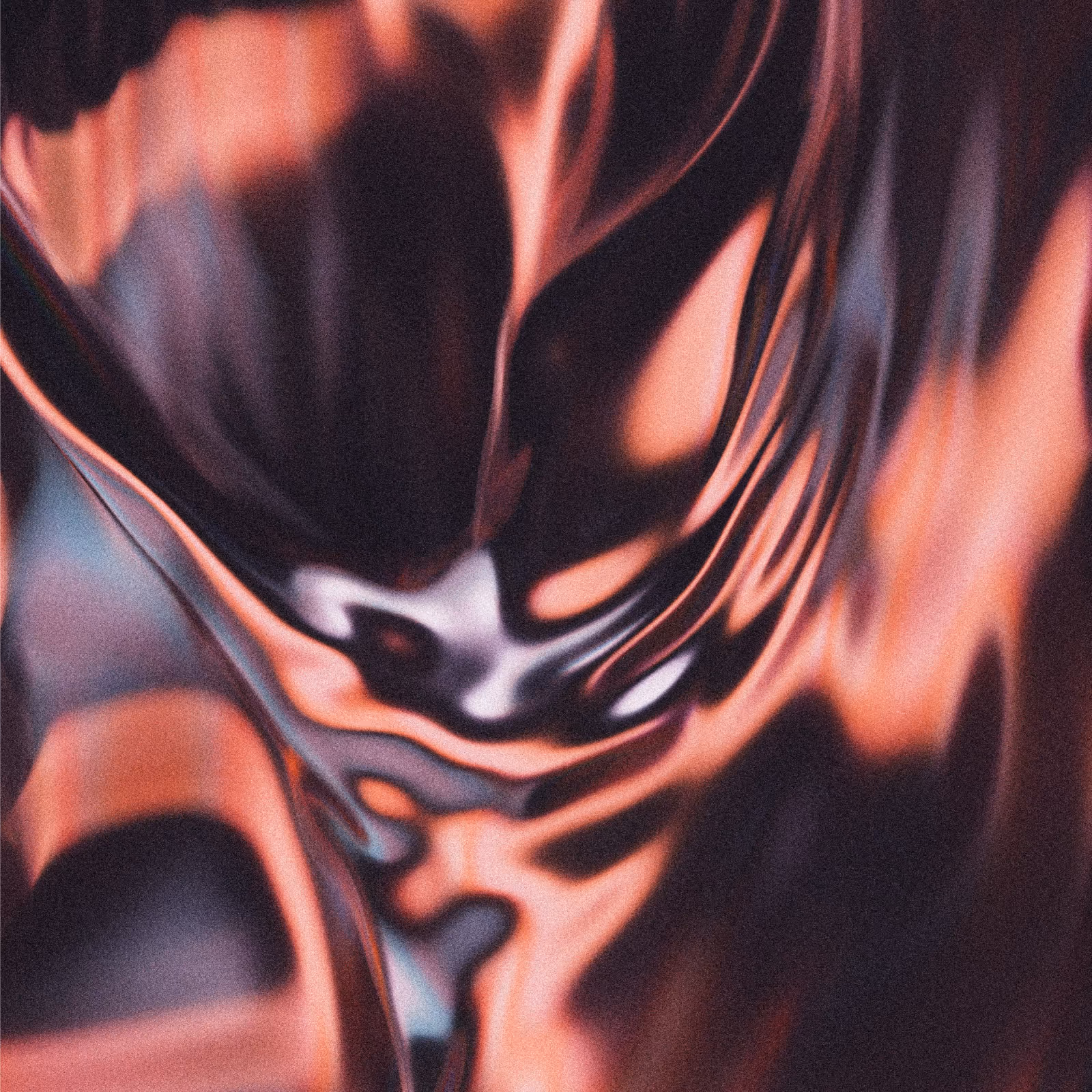
The Outcome:
We leaned into the duality. Working with a 3D artist, we developed morphing gradient textures that evolve across products - suggesting both chemical reactions and altered perception. Extreme macro photography of the actual concentrates in petri dishes grounds the visual language in the real product while creating unexpectedly beautiful imagery. The result is a visual system that works on two levels: eye-catching enough to stand out on dispensary shelves, clinical enough to communicate process and quality at point of sale.
Rubicon Organics was launching Lab Theory as the most expensive cannabis concentrate on the market - but "premium" had become meaningless in the category. Every brand claimed craft quality. Every package featured gold foil and black backgrounds. Meanwhile, the audience Rubicon wanted to reach - legacy cannabis consumers fluent in drop culture and streetwear - saw through the conventional luxury signaling immediately.
The Discovery:
The concentrates themselves were genuinely premium - precise extraction, clinical methodology, laboratory-grade quality control. But the experience of consuming them isn't clinical at all. How do you build a brand that honors both the process rigor and the psychedelic experience without defaulting to either sterile medical aesthetics or tired cannabis clichés?
The Insight:
Lab Theory exists in the tension between laboratory precision and mind-altering experimentation. The brand needed to feel like both simultaneously - scientific enough to justify the premium price, experiential enough to connect with culture-literate consumers who expect brands to have a point of view.
The Outcome:
We leaned into the duality. Working with a 3D artist, we developed morphing gradient textures that evolve across products - suggesting both chemical reactions and altered perception. Extreme macro photography of the actual concentrates in petri dishes grounds the visual language in the real product while creating unexpectedly beautiful imagery. The result is a visual system that works on two levels: eye-catching enough to stand out on dispensary shelves, clinical enough to communicate process and quality at point of sale.
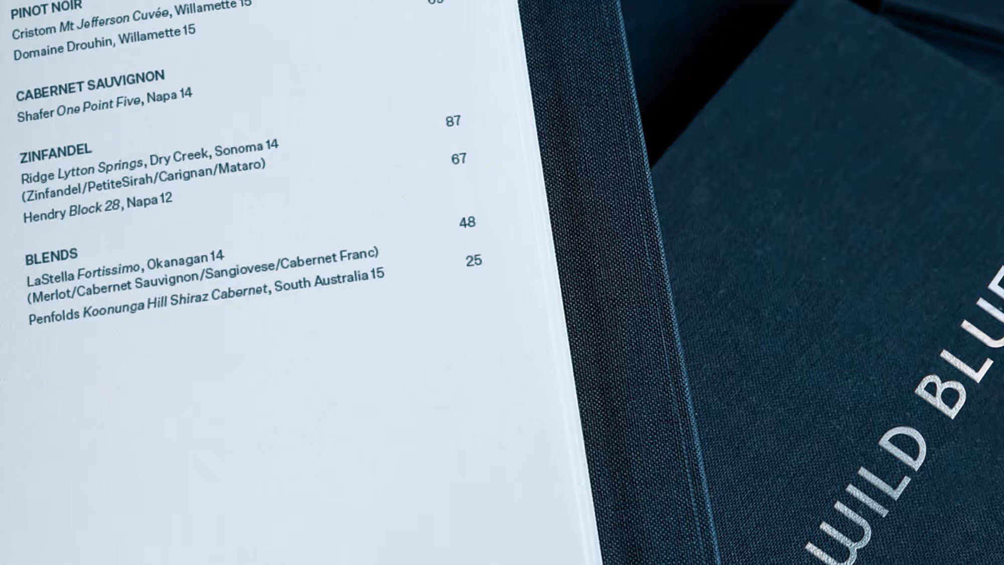

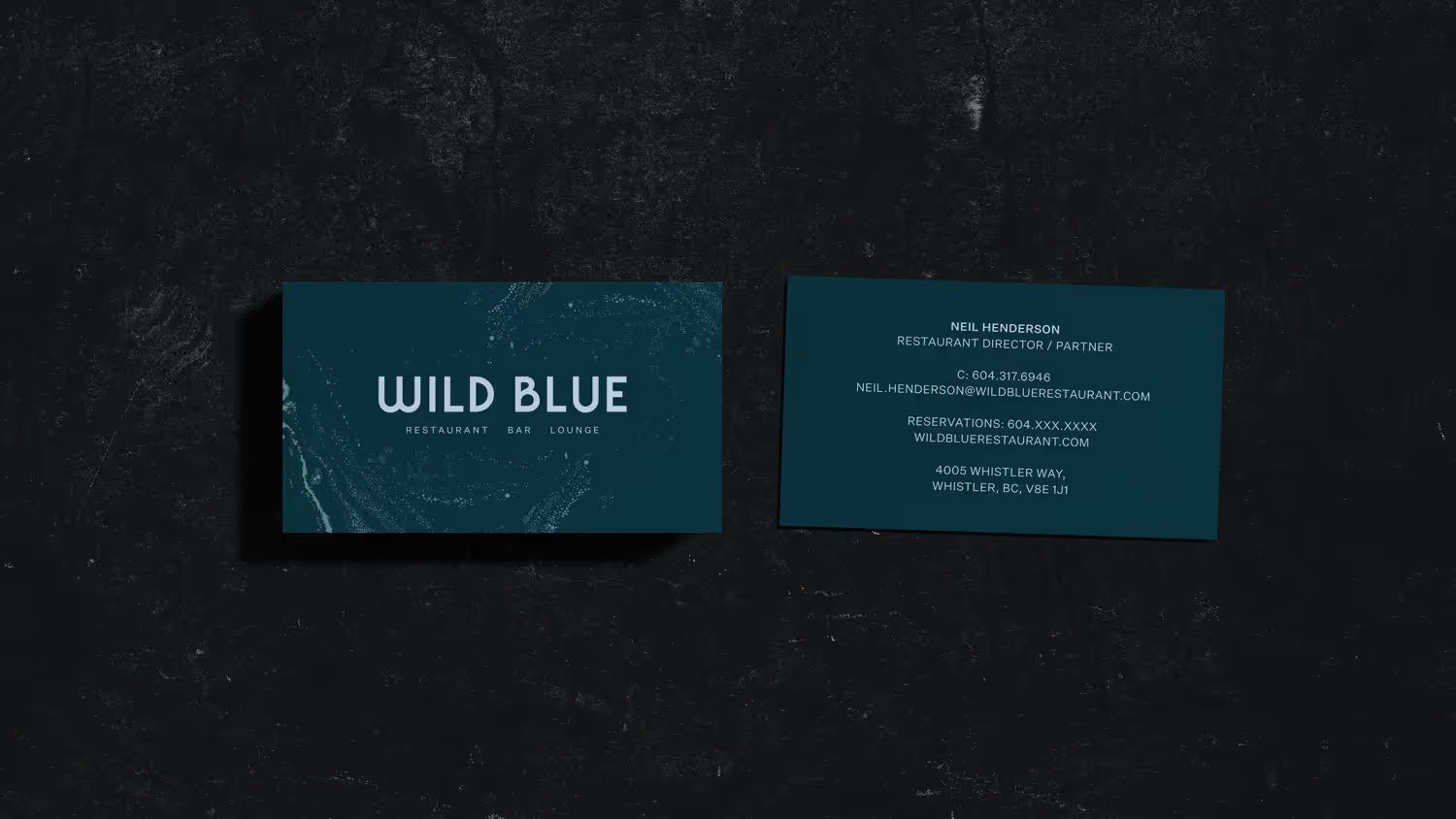

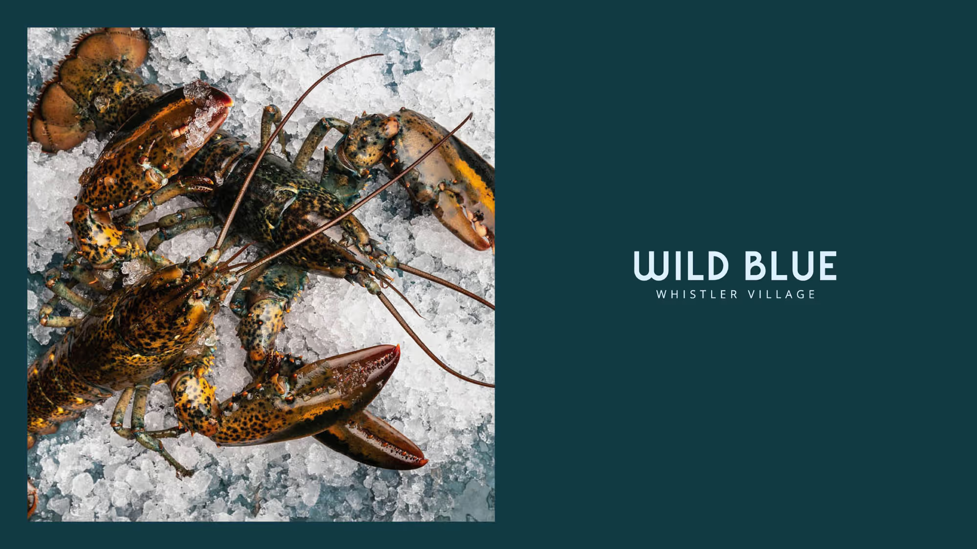
Wild Blue
Brand Identity System
Whistler, Canada
The Challenge:
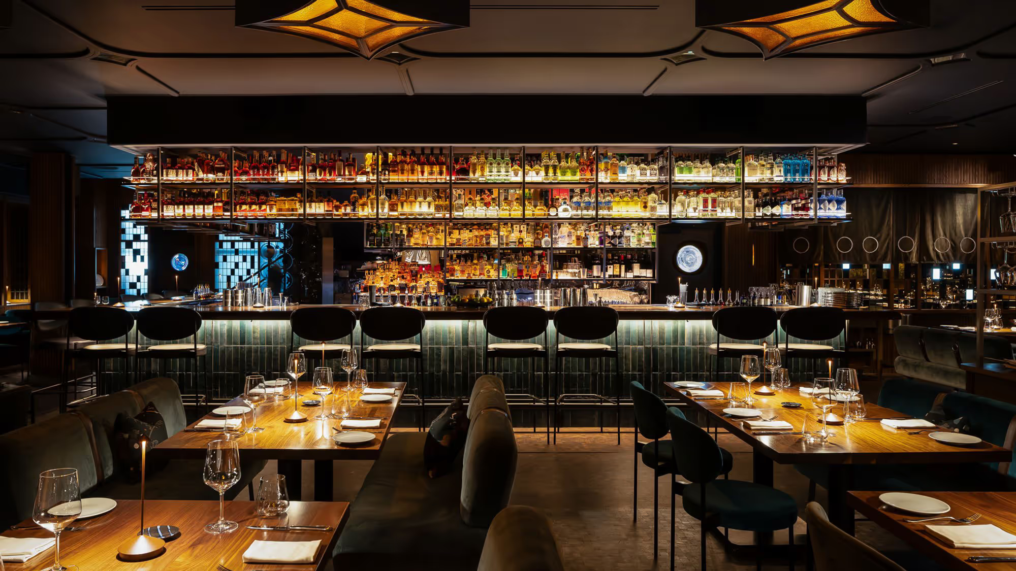
Iron Chef winner Alex Chen was opening Wild Blue - upscale, seafood-forward Pacific Northwest cuisine in Whistler. The positioning problem: Vancouver's established fine dining scene set the quality bar, but mimicking urban refinement would feel inauthentic in a mountain town. Go too polished, you alienate locals. Stay too casual, you undermine what an exceptional hospitality team is actually delivering. Wild Blue needed to compete with the city's best restaurants while feeling like it belonged in Whistler.
The Discovery:
The food itself showed the way forward. Chen's kitchen operated with surgical precision - sustainable seafood, local sourcing, meticulous technique. That precision didn't need to shout. It could inform the brand quietly: refined without being precious, elevated without losing warmth.
The Insight:
Mountain town authenticity and fine dining excellence aren't opposites. Wild Blue could hold both - if the brand matched the kitchen's philosophy. Let craft speak through material choices and typographic refinement, not decorative excess.
The Outcome:
We developed a custom wordmark where typographic forms subtly nod to the sea. The identity extends through menus and signage with careful attention to texture and materiality - mirroring the restaurant's commitment to sustainable ingredients and precise execution. Nothing superfluous. The brand earns its credibility through restraint.
Wild Blue opened August 2022 and was quickly recognized: #2 Canada's Best New Restaurant (enRoute / Air Canada Magazine), #4 Best New Restaurant (Canada's 100 Best), #31 overall ranking nationally for 2024.
Credits:
Creative Direction — Glasfurd & Walker
Photography — Leila Kwok
Creative Direction — Glasfurd & Walker
Photography — Leila Kwok
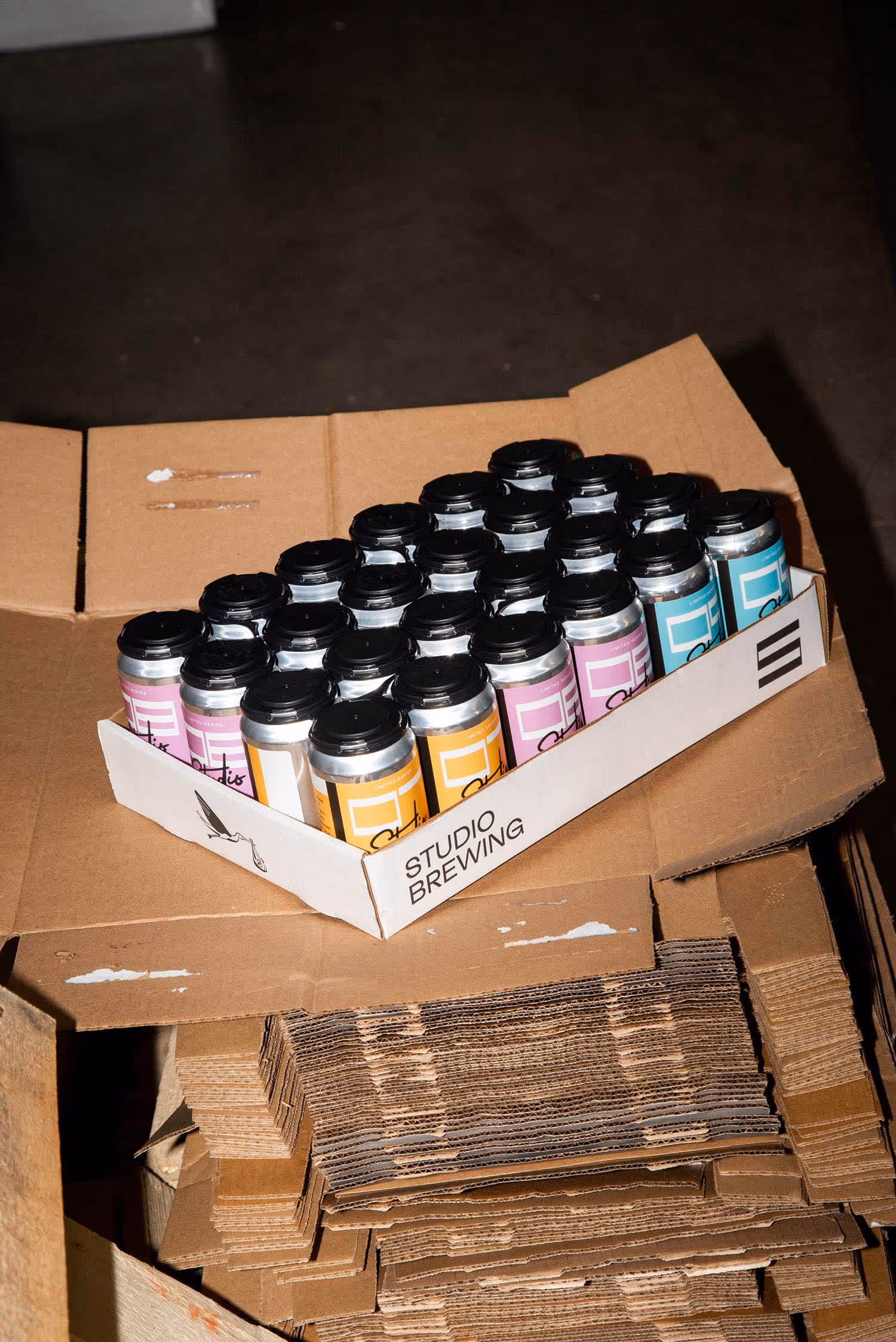
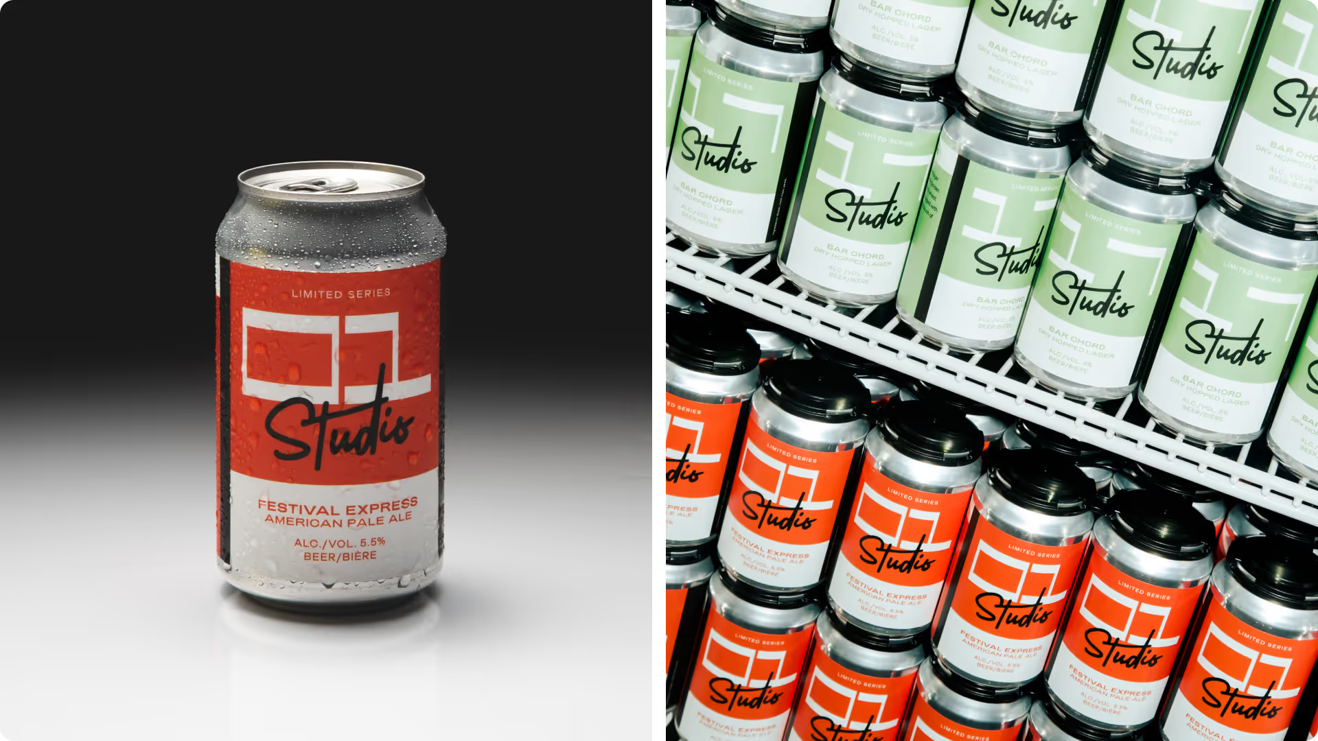

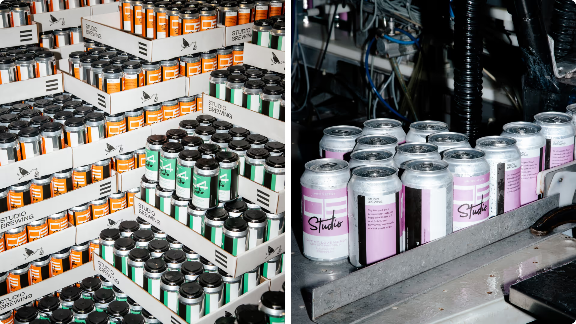
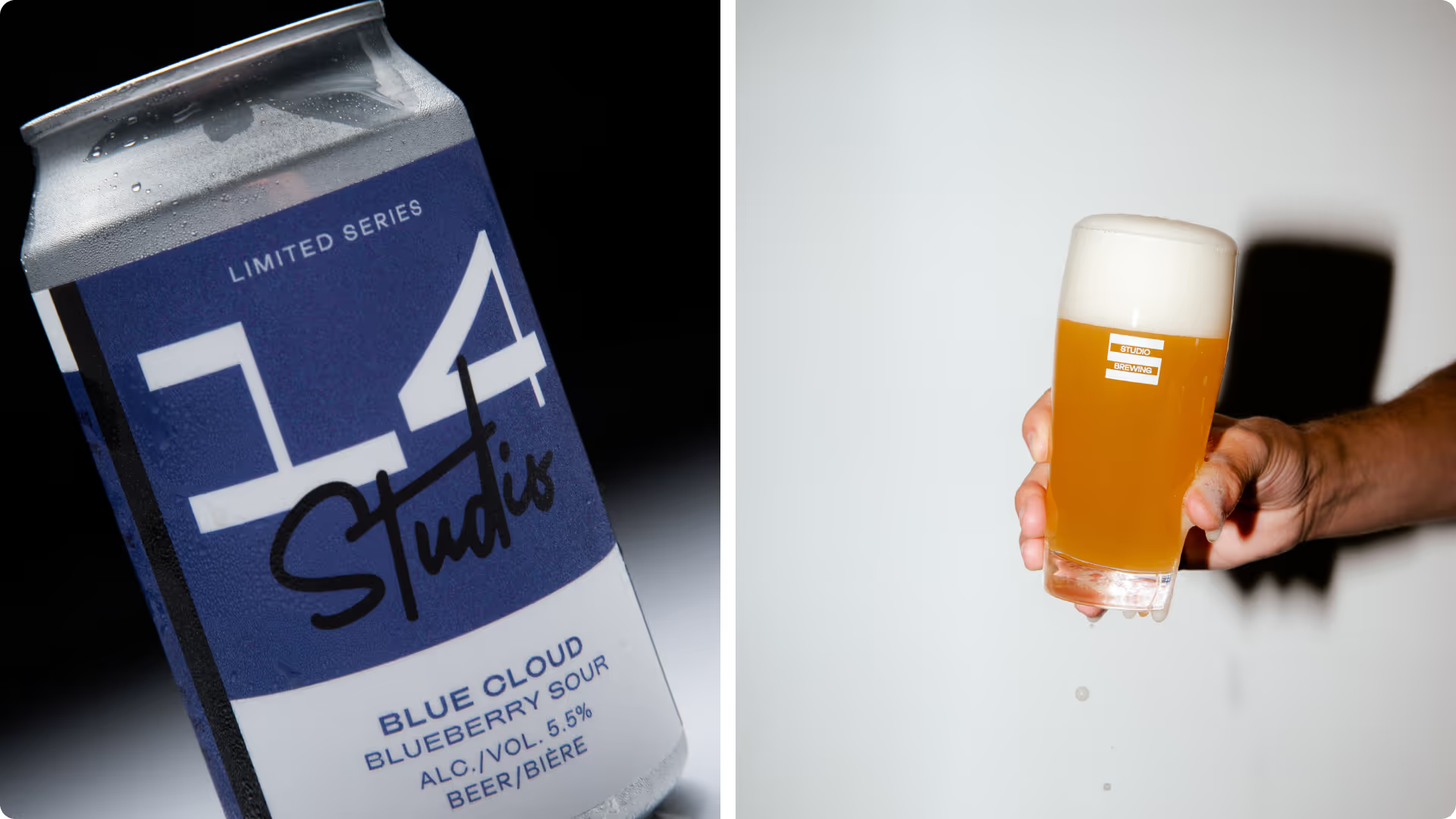
Studio Brewing
Packaging System
Burnaby, Canada
Credits:
Creative Direction — Skeleton Crew Creative Studio
Photography — Maksee
Creative Direction — Skeleton Crew Creative Studio
Photography — Maksee
The Challenge:
Studio Brewing was launching Burnaby's first craft brewery with an operational model that would break most brand systems: constantly rotating taps, limited-run experiments, new releases demanding rapid-fire label production. Traditional brewery branding - illustrated labels, unique artwork per beer, complex approval processes - would collapse under that release velocity. They needed a brand that could move as fast as their brewing schedule without losing coherence.
The Discovery:
Most breweries in the Lower Mainland's crowded market compete through visual complexity - intricate illustrations, elaborate names, storytelling on every can. Studio's ambitious release schedule made that approach impossible. But what if the constraint was actually the advantage? What if a system refined to its essentials could stand out more than decorative excess?
The Insight:
The brewery's name already suggested the approach: Studio as workshop, as laboratory, as numbered experiments. Each beer could be treated as a release in a series rather than a one-off product demanding unique creative. Consistency through system, not repetition.
The Outcome:
We extracted the thick-thin stroke contrast from the Studio wordmark and developed a custom numeral system around it. Each beer gets assigned a number. That's the entire labeling logic. New release? Next number. The system keeps pace with constant experimentation while maintaining unmistakable shelf presence.
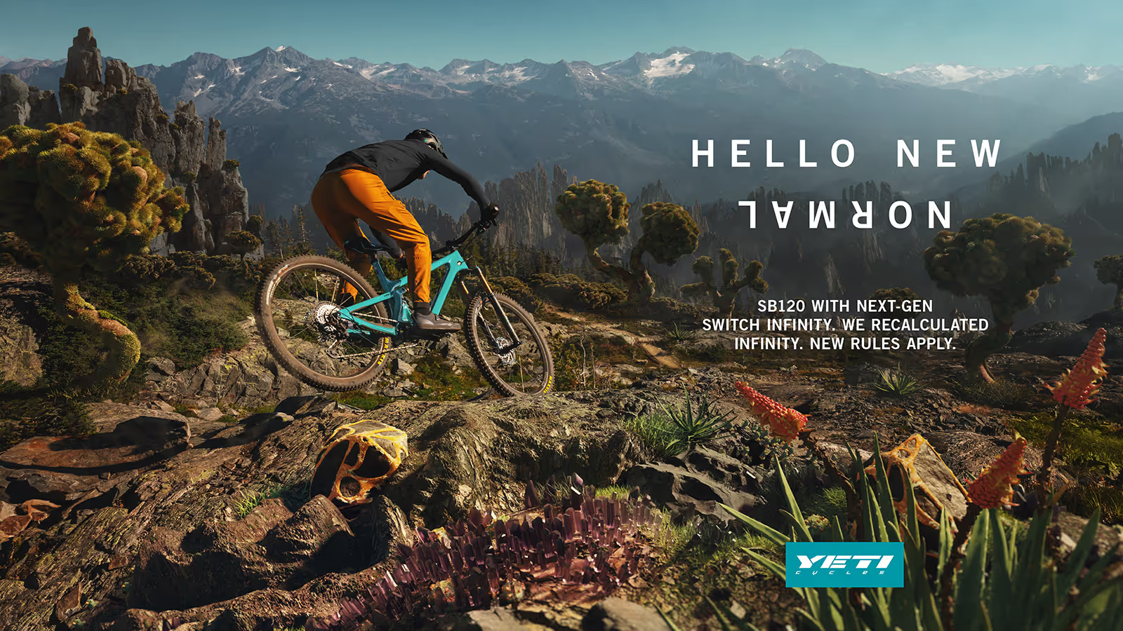
Yeti Cycles
Campaign Art Direction
Colorado, US
Credits:
Creative Direction —Good Fortune Collective
3D Artist – Plastic Bionic
Photographers – Dave Trumpore , Eyeroam, Ben Page
Retouching – Cassey Kerrick
Creative Direction —Good Fortune Collective
3D Artist – Plastic Bionic
Photographers – Dave Trumpore , Eyeroam, Ben Page
Retouching – Cassey Kerrick
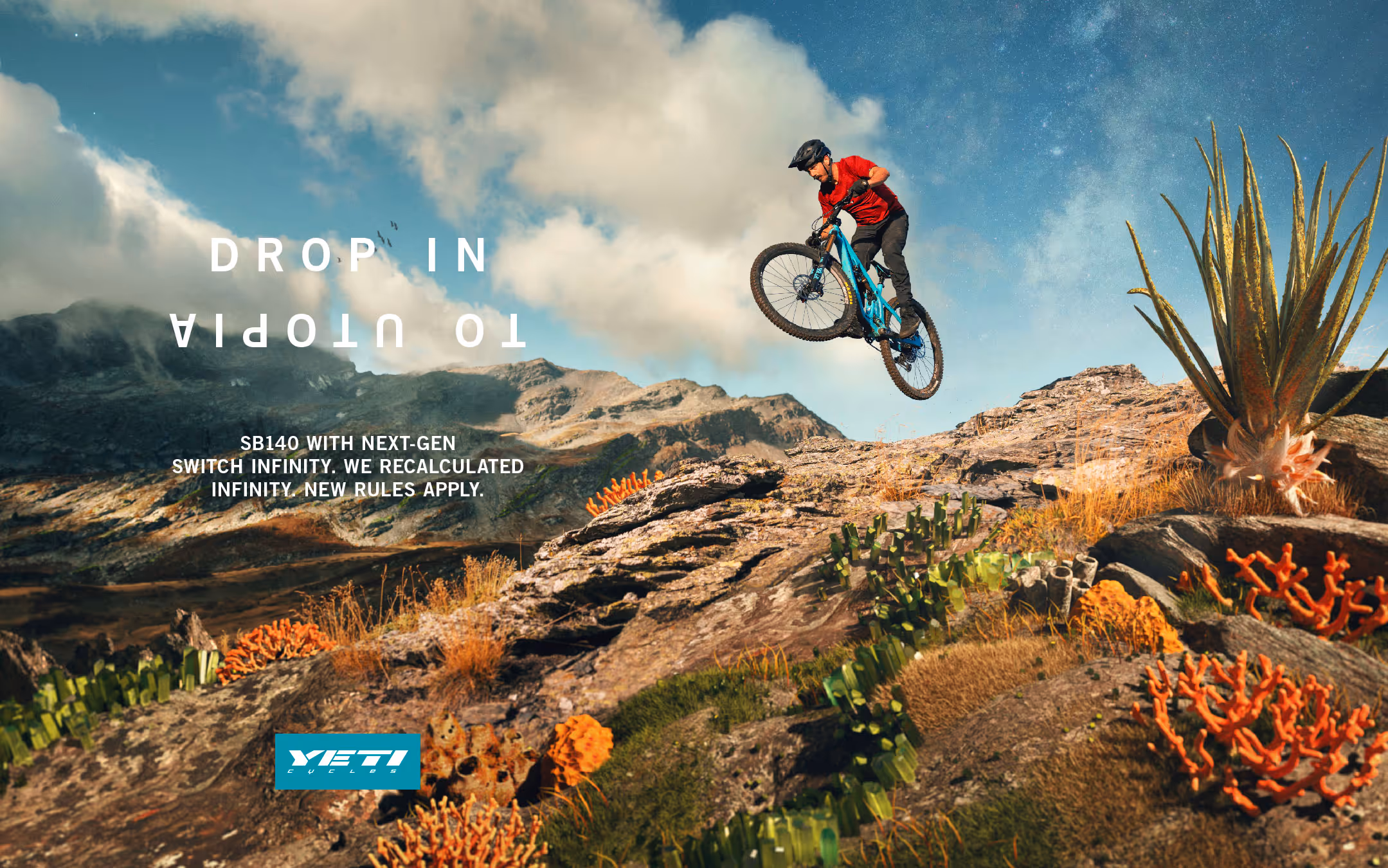
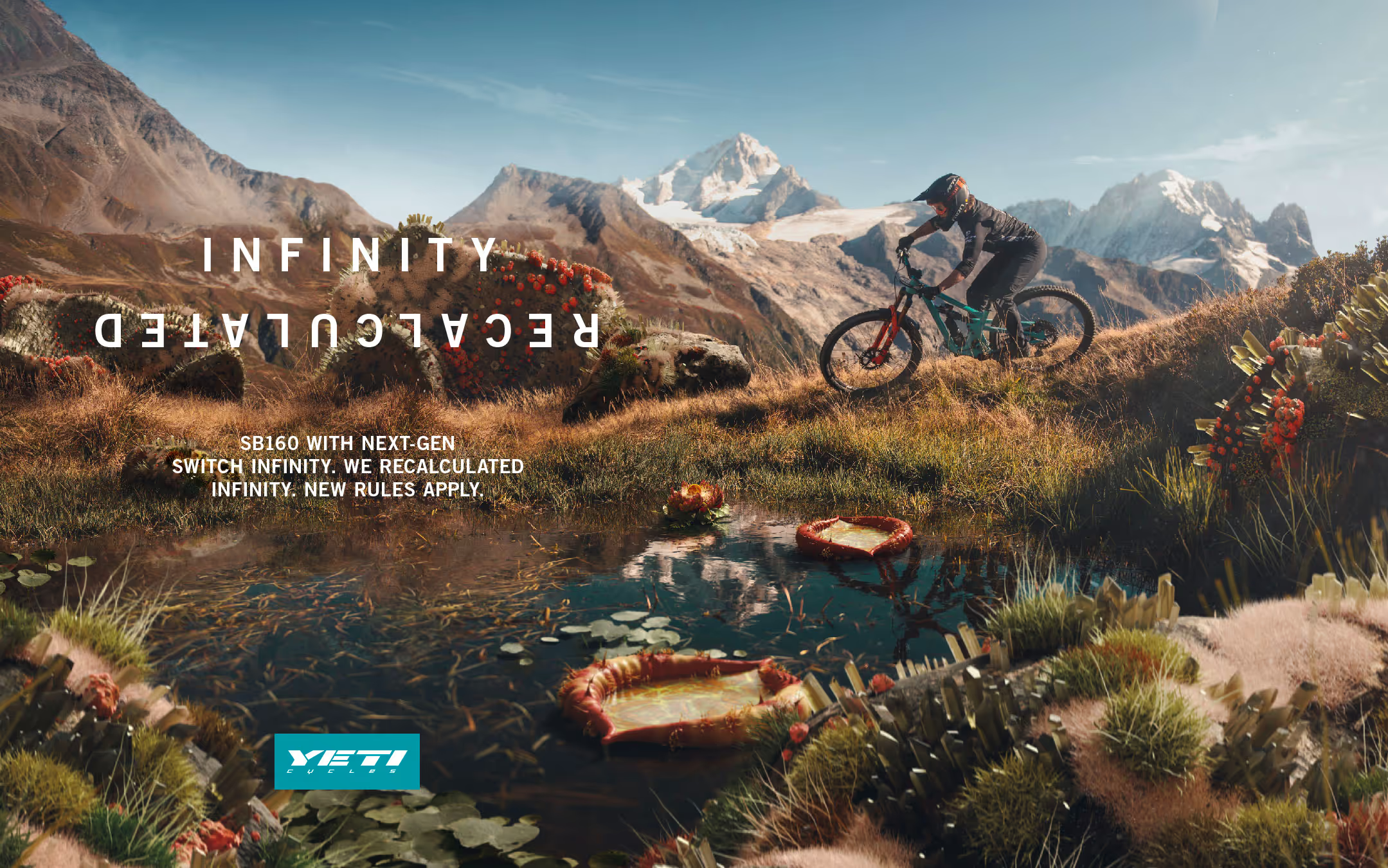
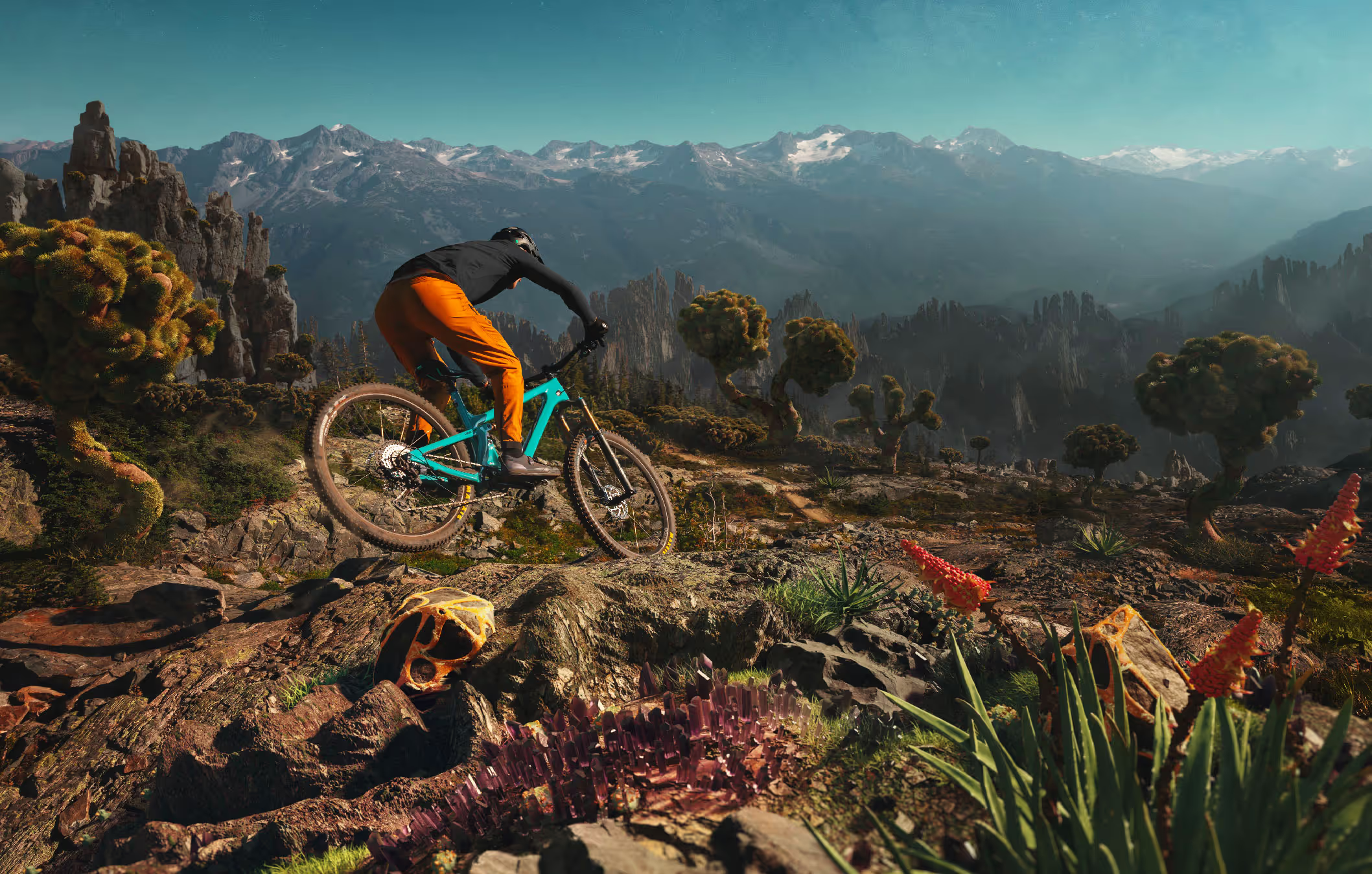
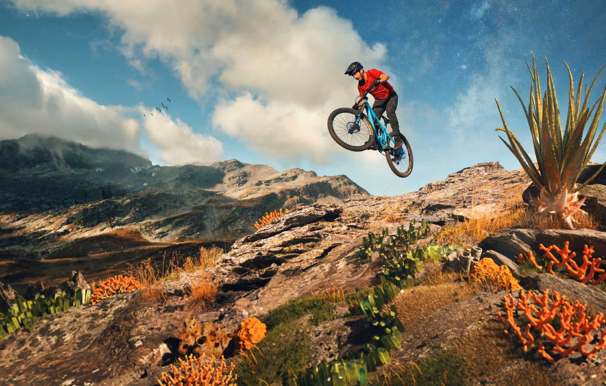
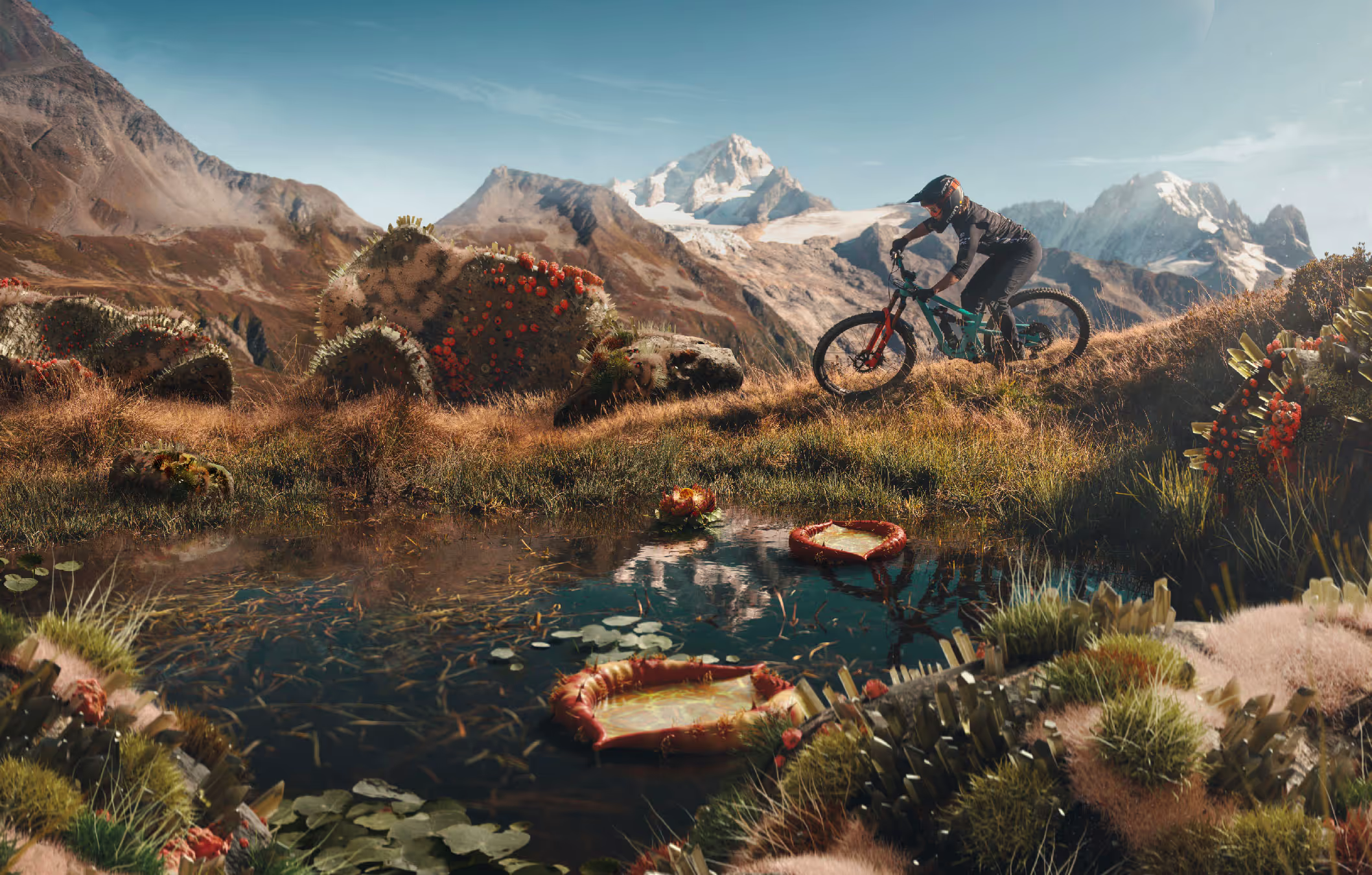
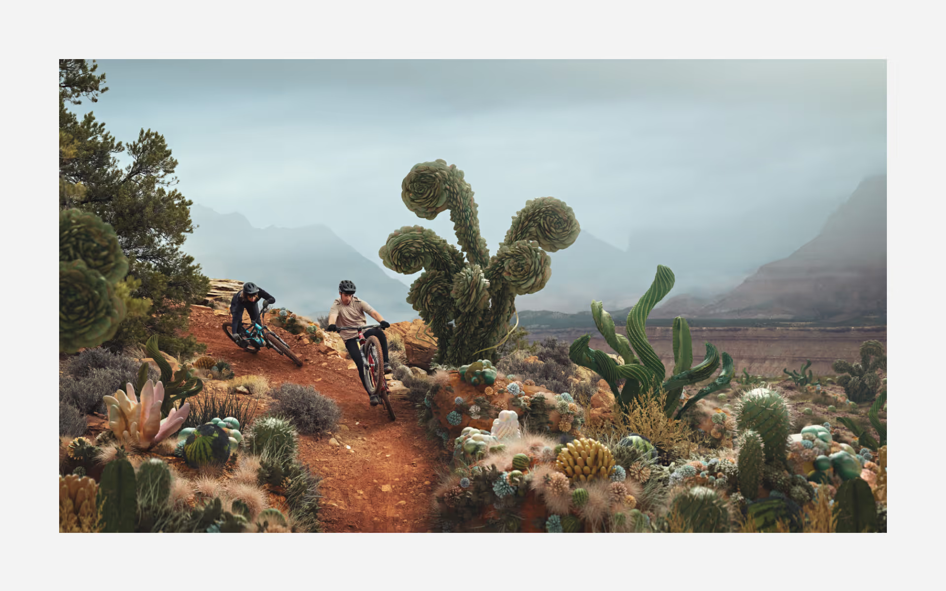
The Challenge:
Yeti had redesigned their Switch Infinity suspension system from the ground up - a fundamental engineering shift, not incremental improvement. The SB140-160 range represented genuinely new performance territory. But how do you communicate that the physics have changed when every mountain bike brand claims revolutionary innovation? Technical specs alone wouldn't cut through. The campaign needed to make people feel that the old rules no longer applied.
The Discovery:
Suspension technology is invisible until you're on the trail. You can't photograph it. You can't demonstrate it in a static image. And yet, the redesigned Switch Infinity fundamentally altered how these bikes moved through terrain. The marketing challenge: make the invisible transformation visible without resorting to exploded diagrams or engineer-speak that only industry insiders care about.
The Insight:
When engineering fundamentals shift, familiar terrain stops behaving the way you expect. What if we showed that literally? Not through before/after comparisons or technical animation, but through environments where nature itself had evolved beyond normal parameters. Recognizable enough to understand as "a trail ride," but mutated enough to register as "a completely different experience."
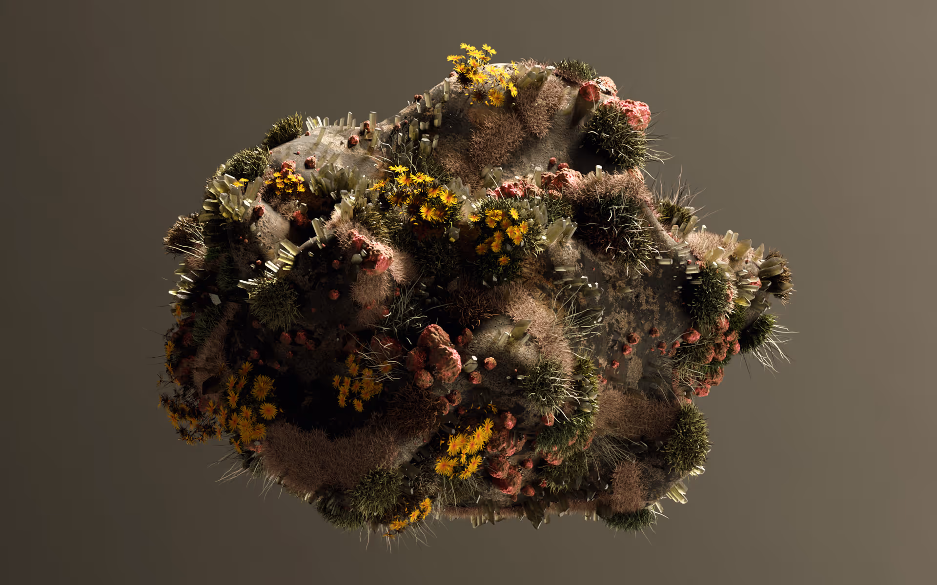
The Outcome:
Working with 3D artist Plastic Bionic, we built three otherworldly landscapes where the real and surreal occupy the same frame. Desert trails bloom with oversized succulent formations and crystalline cacti. Flora scales beyond reason, twisting into sculptural forms that feel both organic and impossible. The environments don't break - they evolve into something that shouldn't exist but somehow does.
Yeti had redesigned their Switch Infinity suspension system from the ground up - a fundamental engineering shift, not incremental improvement. The SB140-160 range represented genuinely new performance territory. But how do you communicate that the physics have changed when every mountain bike brand claims revolutionary innovation? Technical specs alone wouldn't cut through. The campaign needed to make people feel that the old rules no longer applied.
The Discovery:
Suspension technology is invisible until you're on the trail. You can't photograph it. You can't demonstrate it in a static image. And yet, the redesigned Switch Infinity fundamentally altered how these bikes moved through terrain. The marketing challenge: make the invisible transformation visible without resorting to exploded diagrams or engineer-speak that only industry insiders care about.
The Insight:
When engineering fundamentals shift, familiar terrain stops behaving the way you expect. What if we showed that literally? Not through before/after comparisons or technical animation, but through environments where nature itself had evolved beyond normal parameters. Recognizable enough to understand as "a trail ride," but mutated enough to register as "a completely different experience."
The Outcome:
Working with 3D artist Plastic Bionic, we built three otherworldly landscapes where the real and surreal occupy the same frame. Desert trails bloom with oversized succulent formations and crystalline cacti. Flora scales beyond reason, twisting into sculptural forms that feel both organic and impossible. The environments don't break - they evolve into something that shouldn't exist but somehow does.
Research & Experimentation
Creative Experiments
Not everything needs a brief to justify its existence.
I set aside time to explore outside client constraints: generative tools, animation experiments, AI image creation, photography, music production. Some of it finds its way into client projects.
Most of it just teaches me something new about visual language, process, or what's possible. This is where ideas happen before they have to solve problems.
Creative tools
Benjamin Smith
I work with founders who know their brand should feel a certain way - but can't quite articulate what that is.
Through conversation and strategic discovery, I find the authentic character already present in your business. Then I build the identity systems to express it: brand, physical spaces, digital experiences.

Have a project in mind?
Get in touch at benj@benj-design.com
Services
Brand Identity
Brand Discovery & Positioning
Brand Identity Systems
Visual Language Development (patterns, illustration, photography direction)
Brand Guidelines / Brand Book
Applied Design
Packaging Design
Web Design & Development (Webflow)
Animation / Motion Graphics
Social Media & Marketing
Environmental
Creative Direction
Brand Direction / Ongoing support
Campaign Creative Direction
Art Direction
Brand Support
Brand Audits & Consulting
Identity Refresh (refining existing brands)