Studio Brewing
The Challenge
Studio Brewing was launching Burnaby's first craft brewery with an operational model that would break most brand systems: constantly rotating taps, limited-run experiments, new releases demanding rapid-fire label production. Traditional brewery branding, with illustrated labels, unique artwork per beer and complex approval processes, would collapse under that release velocity. They needed a brand that could move as fast as their brewing schedule without losing coherence.
The Discovery
Most breweries in the Lower Mainland's crowded market compete through visual complexity: intricate illustrations, elaborate names, storytelling on every can. Studio's ambitious release schedule made that approach impossible. But what if the constraint was actually the advantage? What if a system refined to its essentials could stand out more than decorative excess?
The Insight
The brewery's name already suggested the approach: Studio as workshop, as laboratory, as numbered experiments. Each beer could be treated as a release in a series rather than a one-off product demanding unique creative. Consistency through system, not repetition.
The Outcome
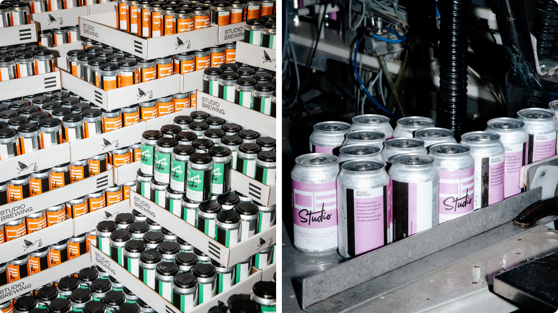
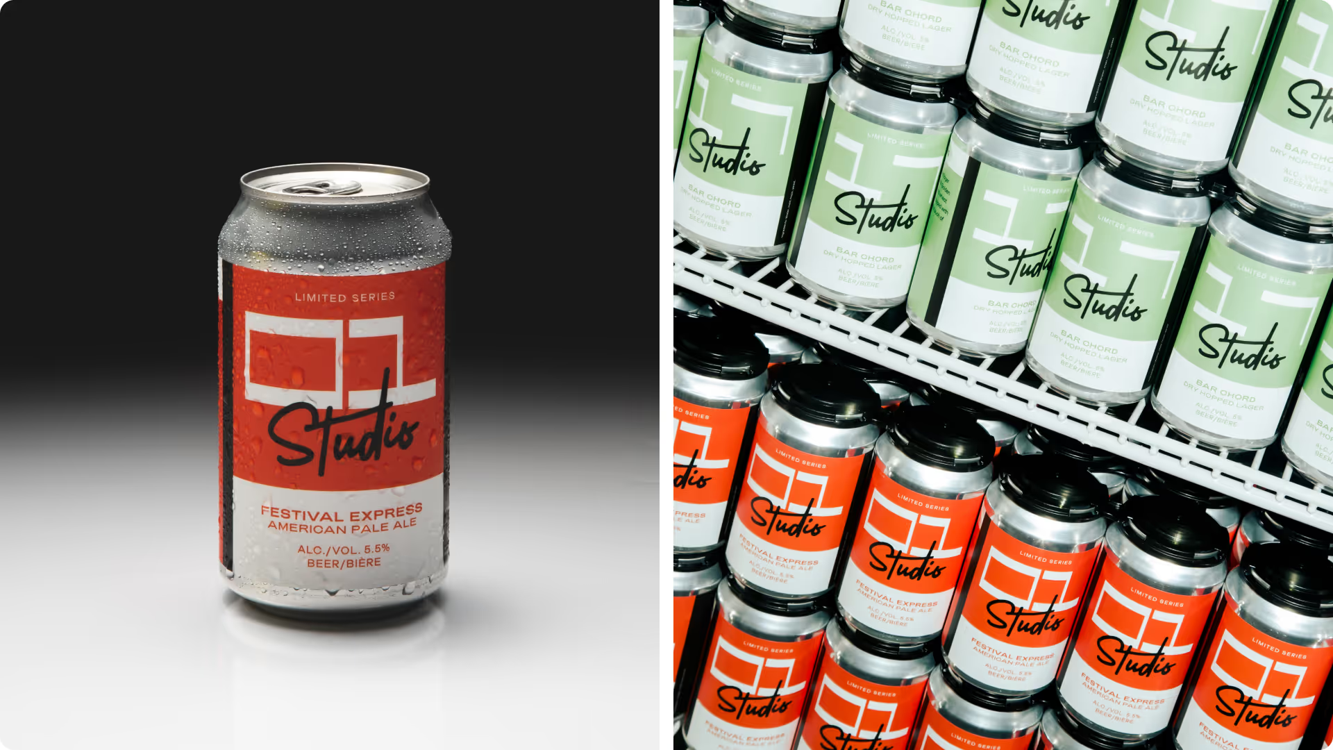
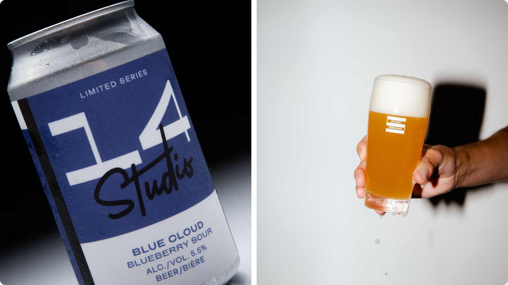
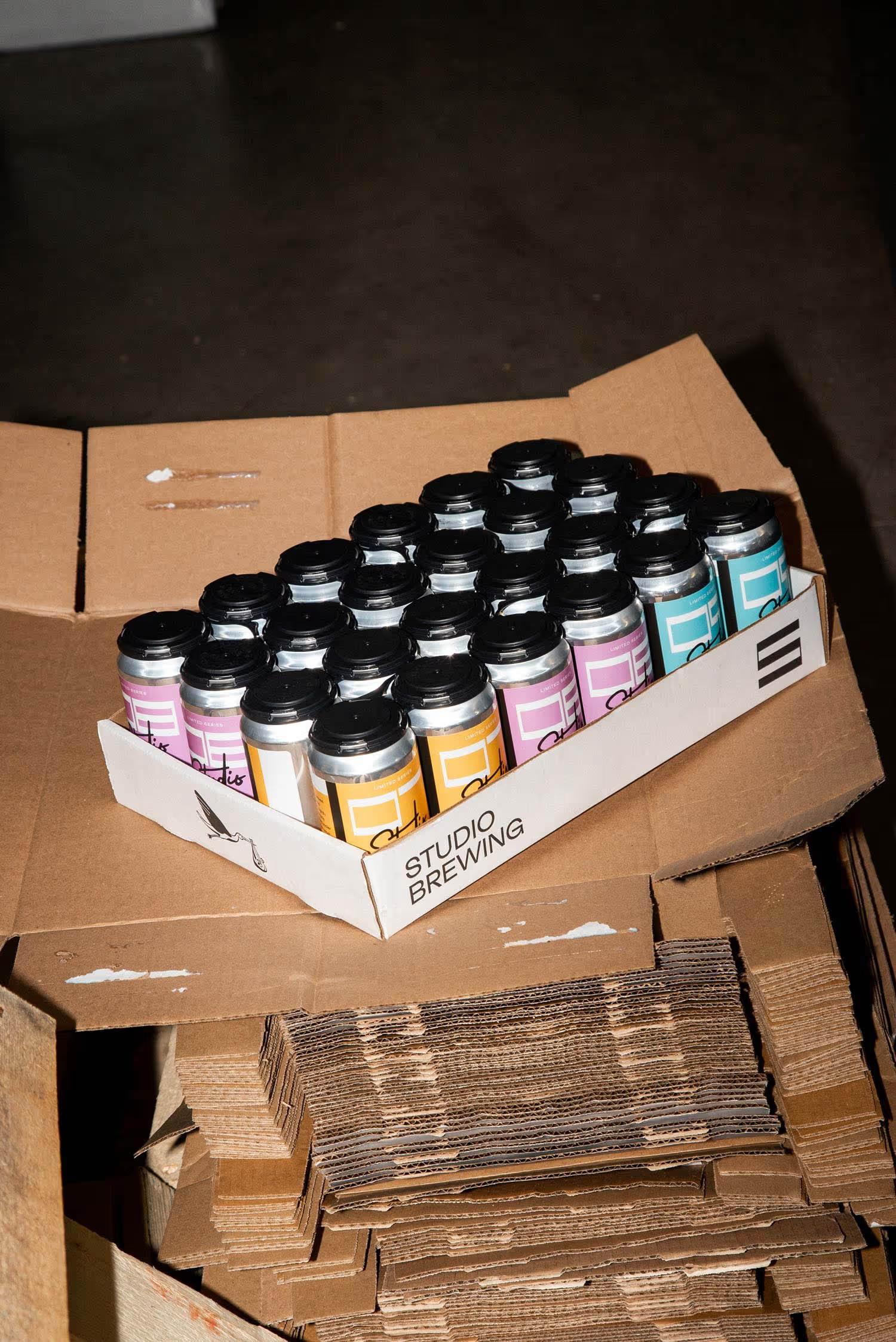
We extracted the thick-thin stroke contrast from the Studio wordmark and developed a custom numeral system around it. Each beer gets assigned a number. That's the entire labelling logic. New release? Next number. The system keeps pace with constant experimentation while maintaining unmistakable shelf presence.
Credits
Creative Direction: Skeleton Crew Creative Studio Photography: Maksee