Mountain Joe
The Challenge
Park Distillery's 'Shaft' cocktail had become a Banff legend, outselling beer on tap at their restaurant, but existed only behind the bar. The founders wanted to can it for wider distribution, but faced a fundamental branding problem: how do you bottle a local sensation without losing what made it special? The drink belonged to Banff. Could a packaged product carry that sense of place?
The Discovery
Through conversations with the Park Distillery team, we uncovered what made the Shaft more than just a cocktail. It was part of Banff's après culture. The rituals after a day on the mountain. The energy of the town at the base of Mount Rundle. Spend any time in the Rockies and you notice the repetition: Parks Canada ranger uniforms become synonymous with the region itself. The drink wasn't succeeding because of what was in it, but because of where it came from.
The Insight
Mountain Joe needed to feel like an intrinsic extension of the Rockies, not a product trying to reference them. The brand couldn't gesture towards Banff. It had to be Banff.
The Outcome
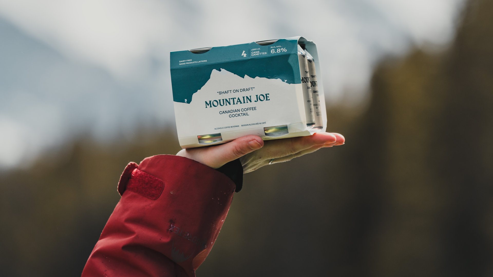
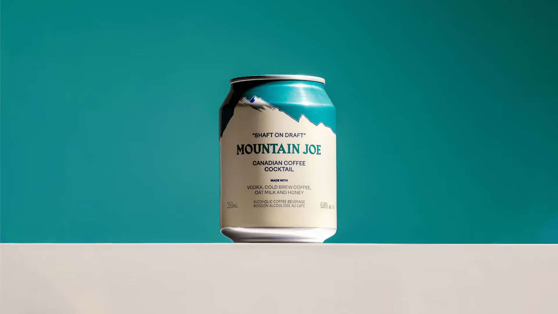
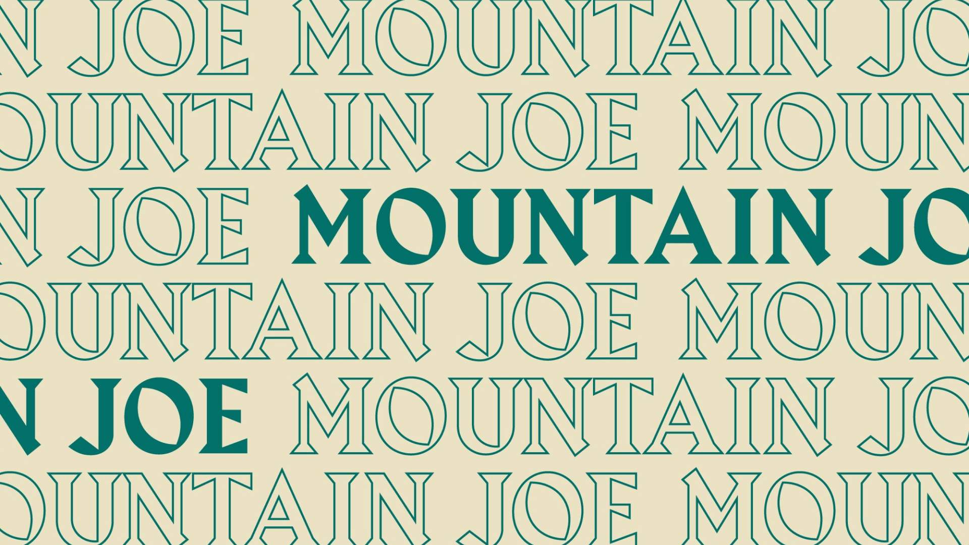
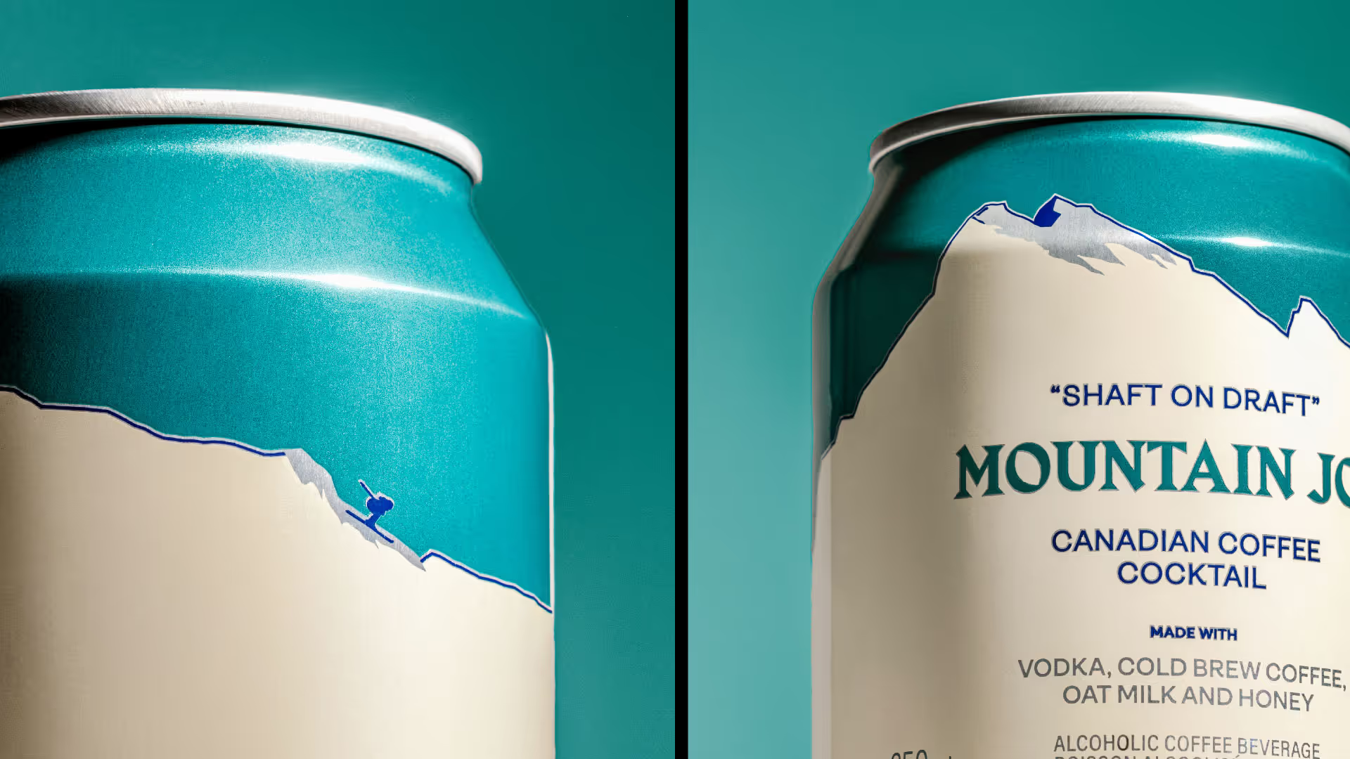
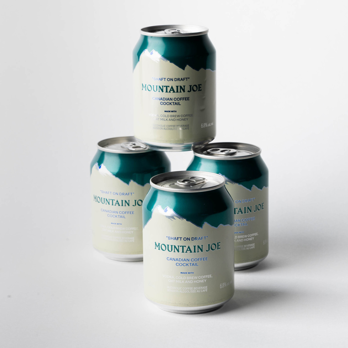
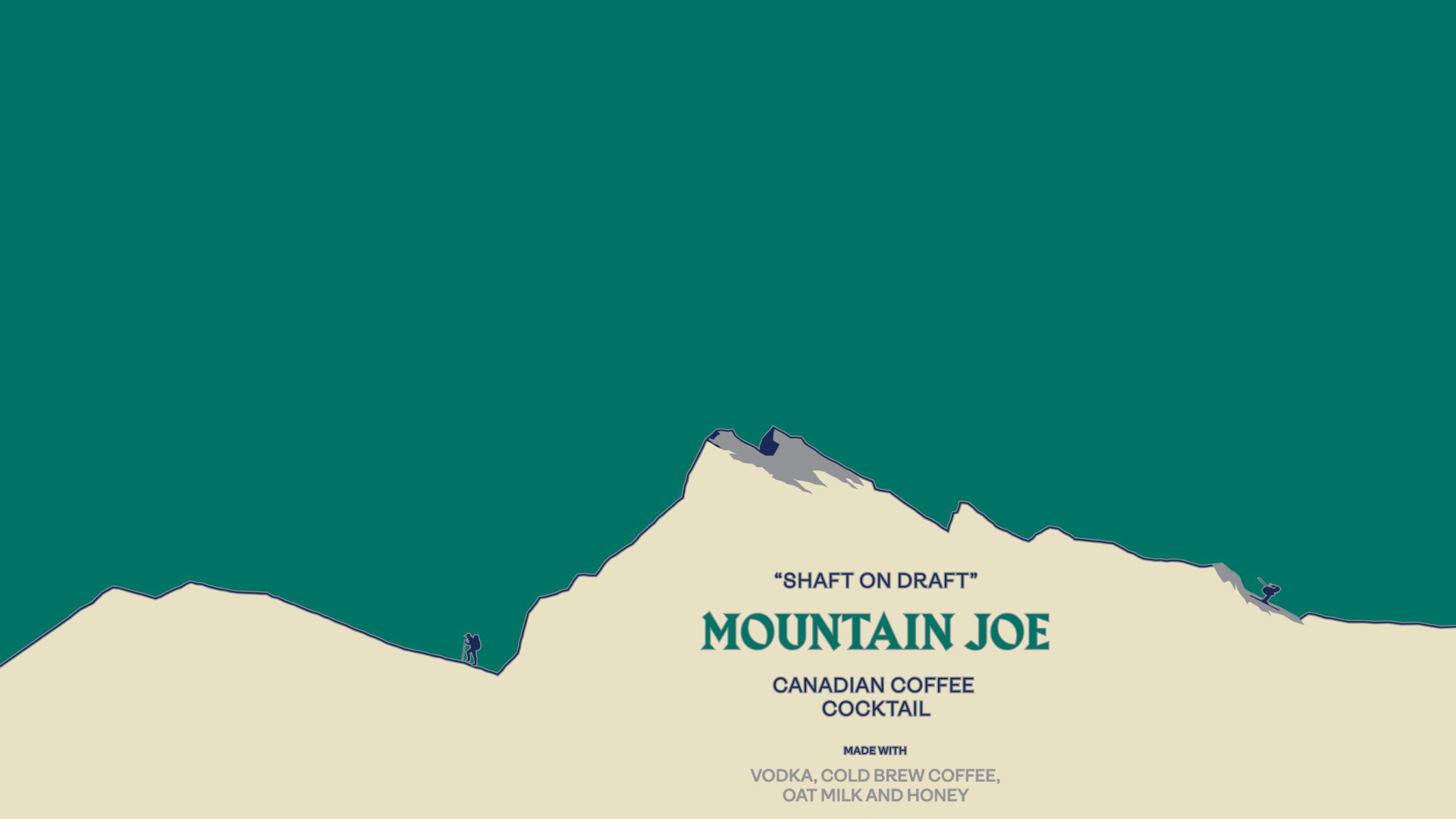
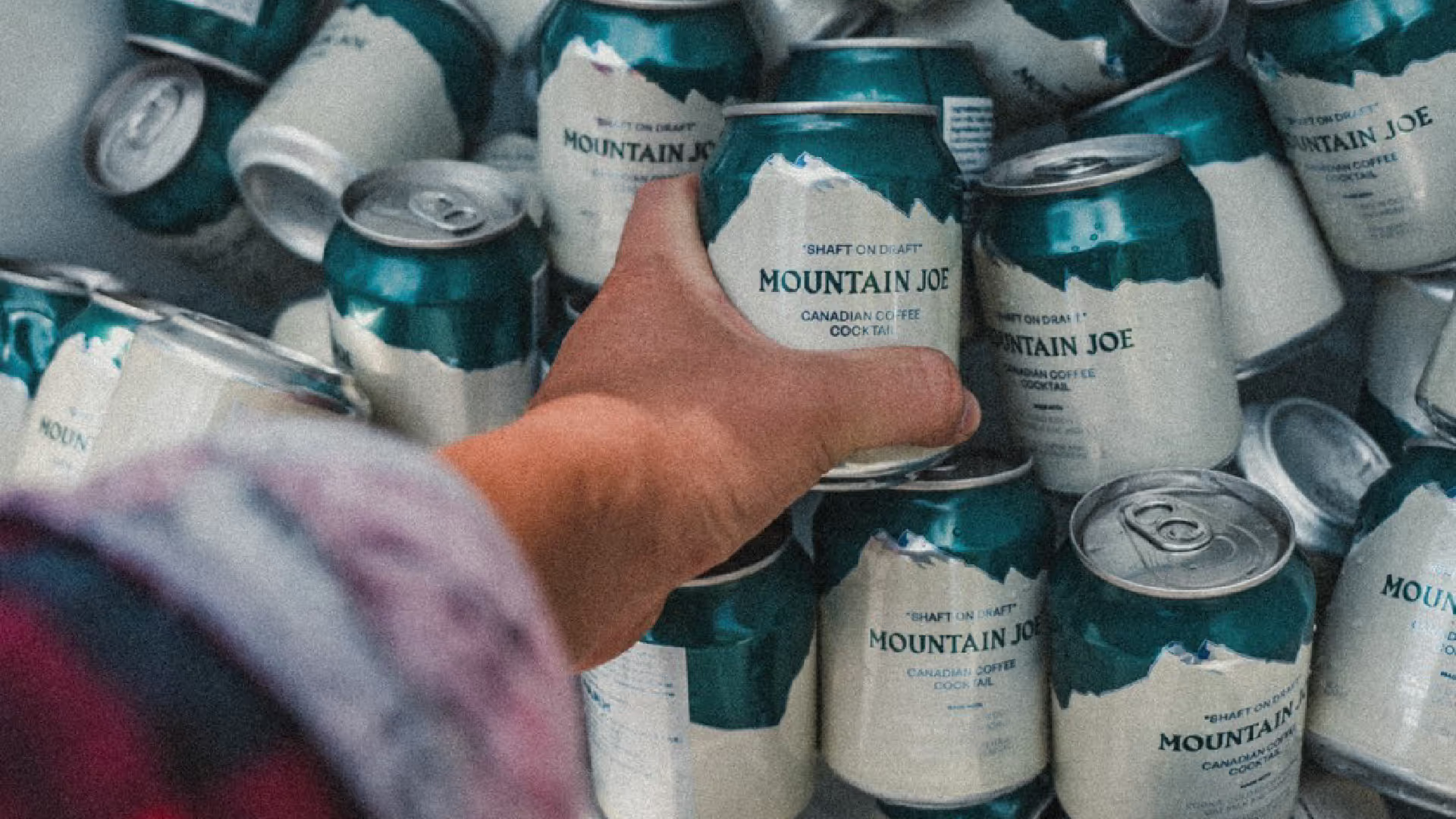
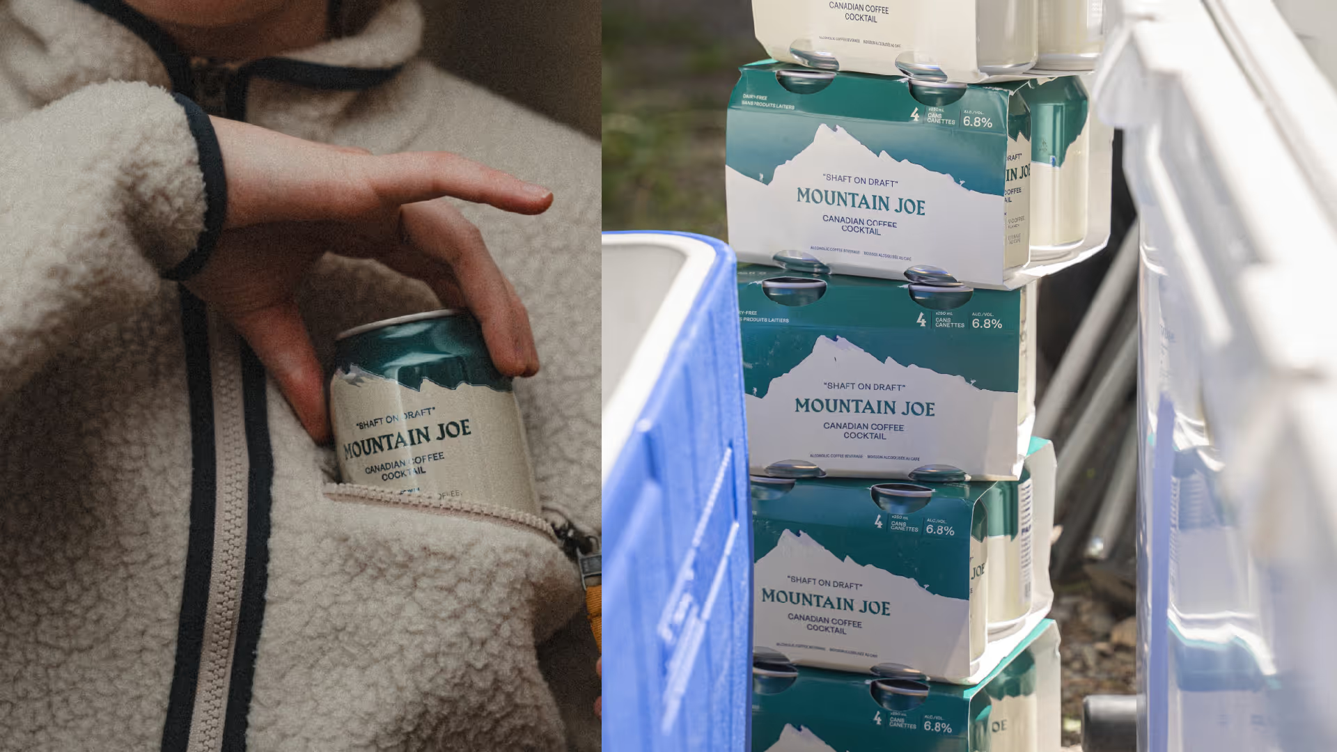
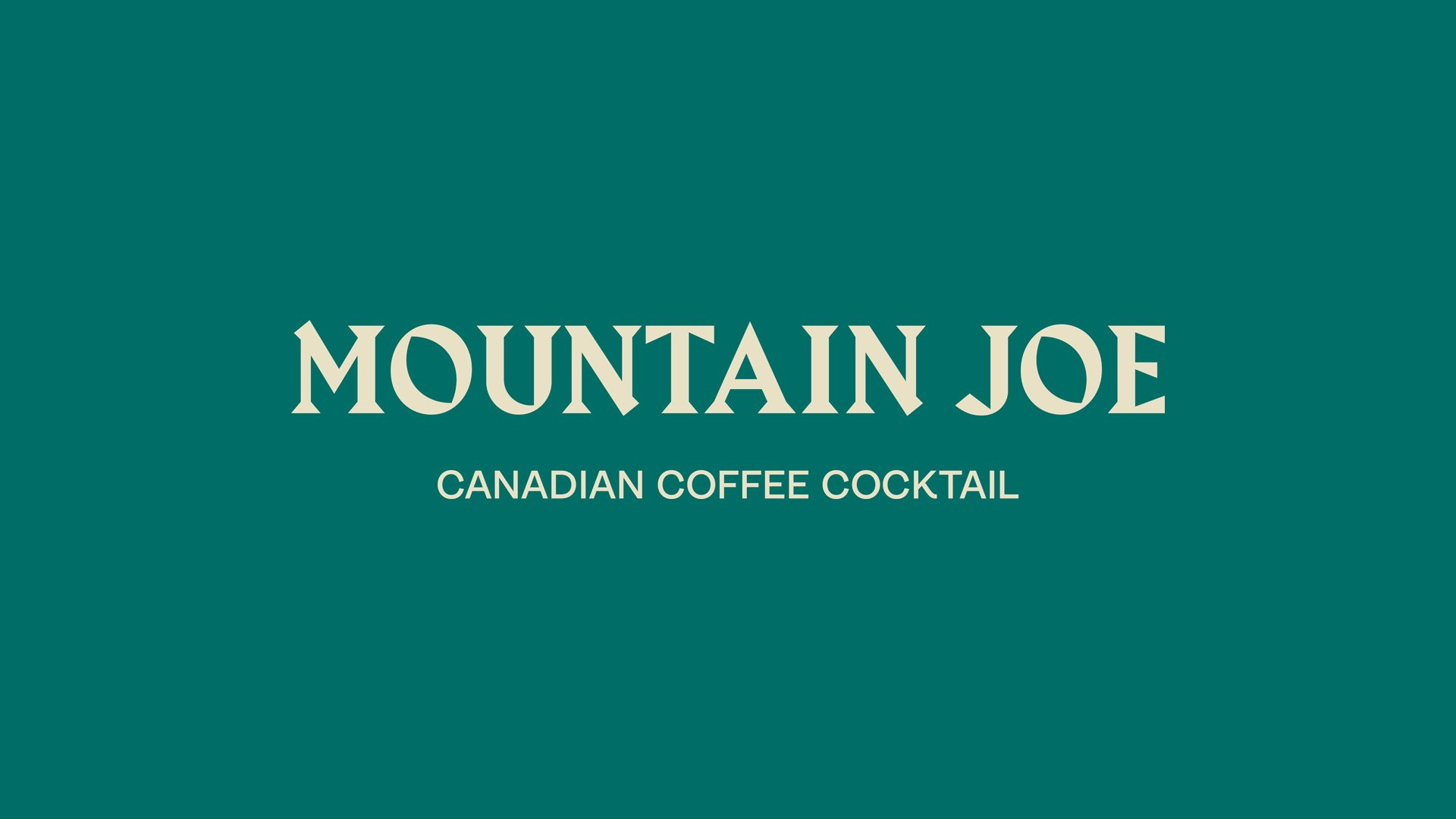
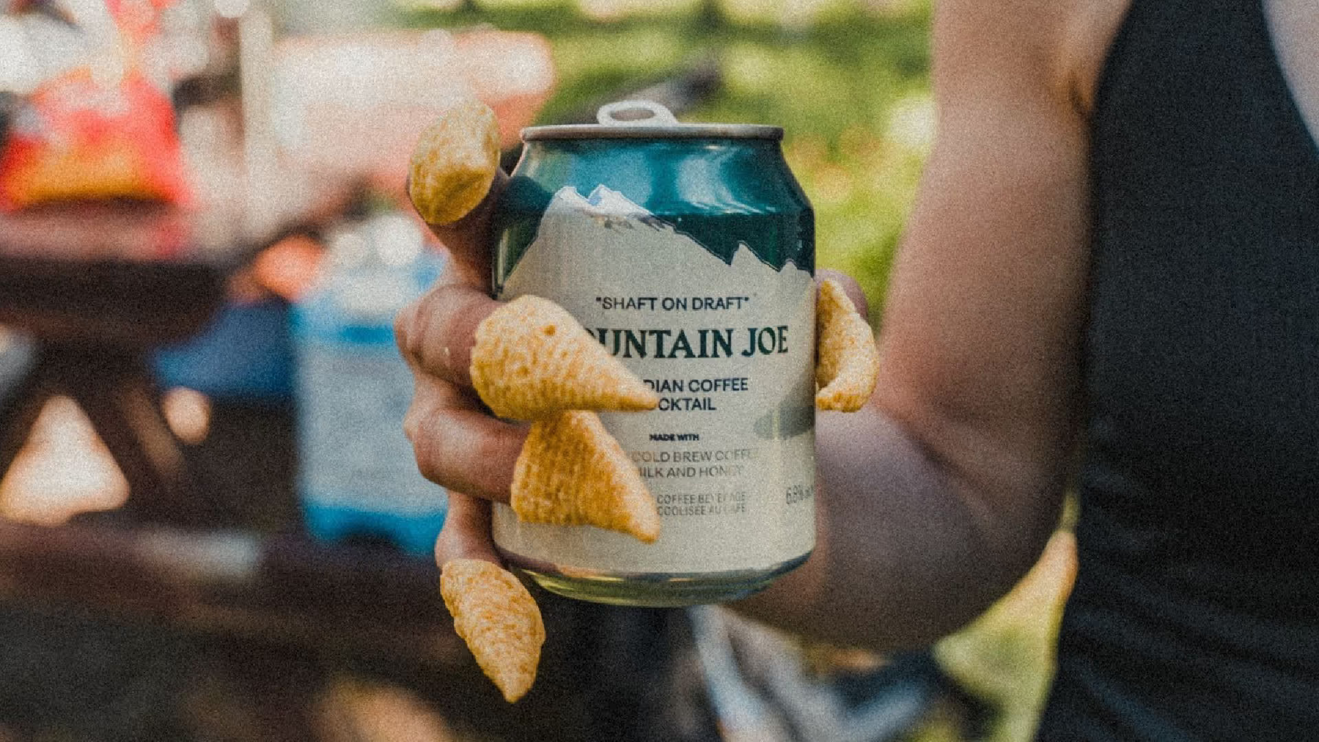
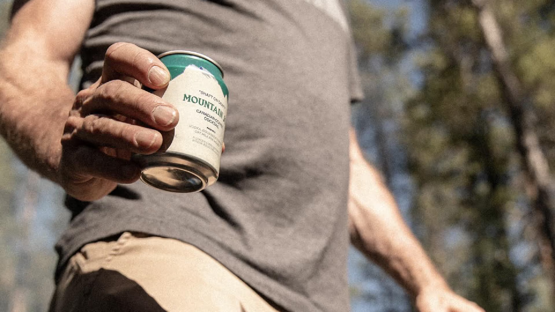
We built the entire identity from the region itself. Mount Rundle's distinctive profile became the structural foundation of the can design. The colour palette came directly from those ubiquitous Parks Canada ranger uniforms, the visual shorthand for the Rockies. The name referenced the coffee-spiked cocktail while grounding it in mountain culture rather than craft cocktail preciousness.
Credits
Creative Direction: Glasfurd & Walker Photography: Ian Lanterman & Park Distillery