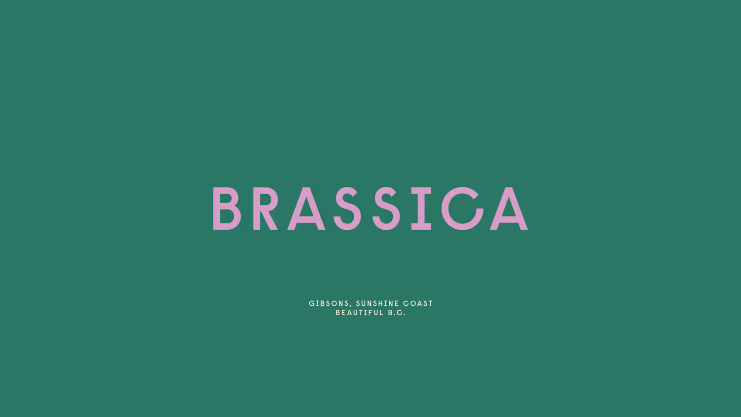
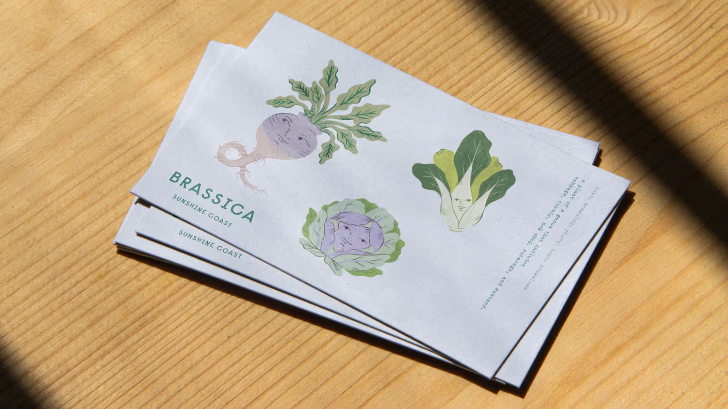
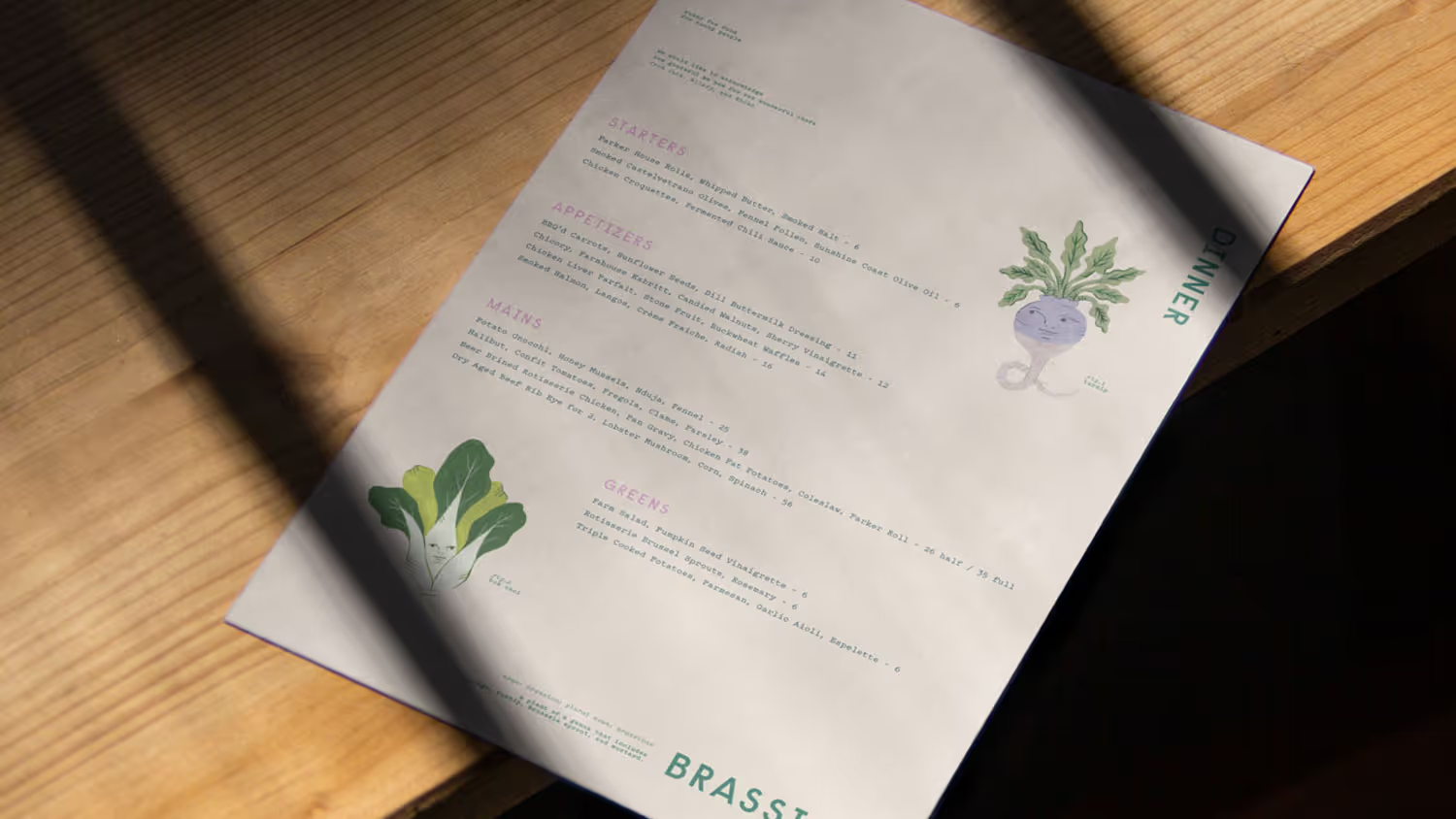
Brassica
The Challenge
Farm-to-table restaurants had locked themselves into two tired positions: overly rustic (reclaimed wood, kraft paper, hand-lettered chalkboards) or clinically minimal (white plates, sans-serif, "let the food speak"). Brassica's seasonal, locally-sourced approach deserved something more honest. It needed a brand that reflected their actual philosophy: healthy food doesn't need to be precious.
The Discovery
The restaurant's name itself offered a way out of category clichés. 'Brassica', the genus covering cabbages, mustards and the foundational vegetables of their menu, could become more than botanical reference. It could be the organising principle for a brand that took seasonal produce seriously without taking itself too seriously.
The Insight
Brassica needed to feel approachable and thoughtful simultaneously. Rooted in the Sunshine Coast's agricultural landscape, but warm and personality-driven rather than earnest or austere. The vegetables themselves could carry that tone: playful without being cartoonish, whimsical without being childish.
The Outcome
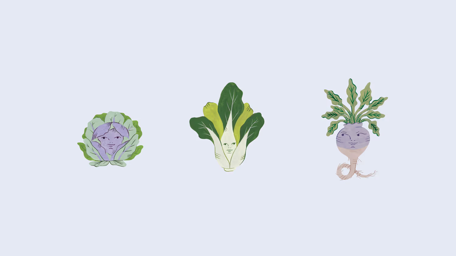
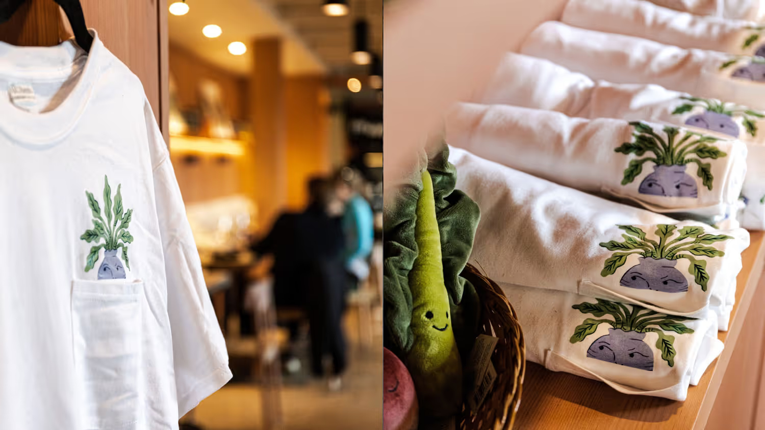
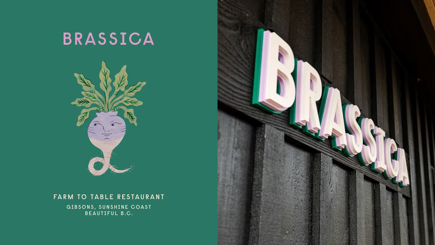
Working with illustrator Estée Preda, we personified the vegetables that define the restaurant's seasonal menu. The illustrations bring character and warmth while staying grounded in the actual produce. The identity extends into the physical space itself. Even the restaurant signage drew from the layered structure of a cabbage, constructed from three stacked wooden layers that create depth and dimension.
Credits
Creative Direction: Glasfurd & Walker Photography: Leila Kwok Illustration: Estée Preda